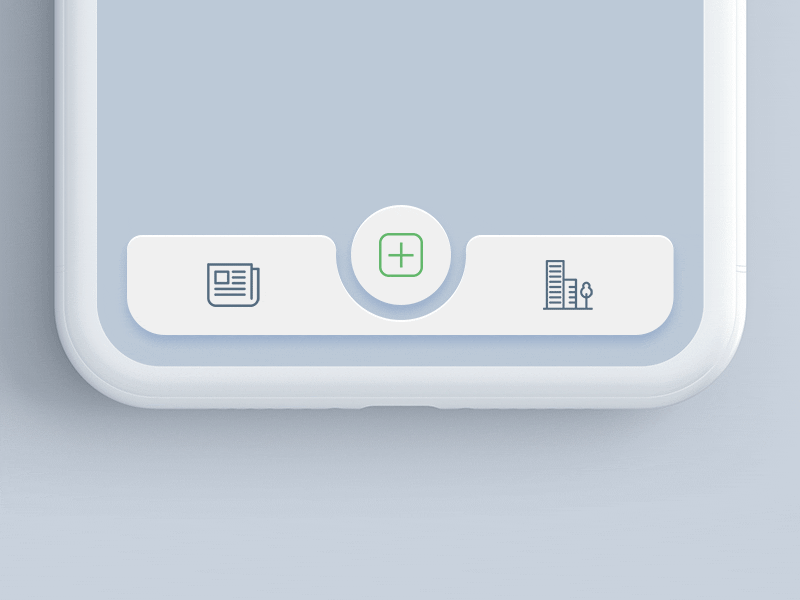
# React Native Tabbar Interaction [](https://www.npmjs.com/package/@mindinventory/react-native-tab-bar-interaction)
Beautiful Tabbar Interaction with Sliding Inset FABs,
made for React Native with RTL support.
Check it out on Béhance (https://www.behance.net/gallery/68043143/Tab-bar-interaction-with-animated-icons)
Check it out on Dribbble (https://dribbble.com/shots/4844696-Tab-bar-interaction-with-animated-icons)
 # Installation
using npm:
```
npm install @mindinventory/react-native-tab-bar-interaction
```
using yarn:
```
yarn add @mindinventory/react-native-tab-bar-interaction
```
## Dependencies
- `react-native-reanimated`
### Supported platform
- Android
- Ios
# Usage
```js
import {
TabBar,
TabsType,
} from "@mindinventory/react-native-tab-bar-interaction";
...
const tabs = [
{
name: 'Home',
activeIcon: ,
inactiveIcon:
},
{
name: 'list',
activeIcon: ,
inactiveIcon:
},
{
name: 'camera',
activeIcon: ,
inactiveIcon:
},
{
name: 'Notification',
activeIcon: ,
inactiveIcon:
},
{
name: 'Profile',
activeIcon: ,
inactiveIcon:
},
];
...
return (
console.log('Tab changed')}
/>
);
```
## Component props
### Tabbar
| prop | value | required/optional | description |
| -------------------------- | -------- | ----------------- | -------------------------------------------------------------------- |
| tabs | array | required | It is user for showing icon and label. |
| tabBarContainerBackground | string | optional | Use for change tabBar container color. |
| onTabChange | function | required | Use to perform any action when click on tab. |
| containerBottomSpace | number | optional | Use to add space between tabBar container and from bottom of screen. |
| containerWidth | number | required | Use for set width of tabBar container |
| containerTopRightRadius | number | optional | Use for add top right radius on tabBar container |
| containerTopLeftRadius | number | optional | Use for add top left radius on tabBar container |
| containerBottomLeftRadius | number | optional | Use for add bottom left radius on tabBar container |
| containerBottomRightRadius | number | optional | Use for add bottom right radius on tabBar container |
| defaultActiveTabIndex | number | optional | Use to set default active tab |
| transitionSpeed | number | optional | Use to set transition speed |
| circleFillColor | string | optional | Use to set background color for circle |
### tabs
| properties | value | required/optional | description |
| ------------ | --------- | ----------------- | -------------------------------------------- |
| name | string | required | use for showing tab label. |
| activeIcon | component | required | Use for showing tab active icon/image. |
| inactiveIcon | component | required | Use for showing tab inactiveIcon icon/image. |
# LICENSE!
React-native-tabbar-interaction is [MIT-licensed](https://github.com/Mindinventory/react-native-tabbar-interaction/blob/master/LICENSE).
# Let us know!
We’d be really happy if you send us links to your projects where you use our component. Just send an email to sales@mindinventory.com And do let us know if you have any questions or suggestion regarding our work.
# Installation
using npm:
```
npm install @mindinventory/react-native-tab-bar-interaction
```
using yarn:
```
yarn add @mindinventory/react-native-tab-bar-interaction
```
## Dependencies
- `react-native-reanimated`
### Supported platform
- Android
- Ios
# Usage
```js
import {
TabBar,
TabsType,
} from "@mindinventory/react-native-tab-bar-interaction";
...
const tabs = [
{
name: 'Home',
activeIcon: ,
inactiveIcon:
},
{
name: 'list',
activeIcon: ,
inactiveIcon:
},
{
name: 'camera',
activeIcon: ,
inactiveIcon:
},
{
name: 'Notification',
activeIcon: ,
inactiveIcon:
},
{
name: 'Profile',
activeIcon: ,
inactiveIcon:
},
];
...
return (
console.log('Tab changed')}
/>
);
```
## Component props
### Tabbar
| prop | value | required/optional | description |
| -------------------------- | -------- | ----------------- | -------------------------------------------------------------------- |
| tabs | array | required | It is user for showing icon and label. |
| tabBarContainerBackground | string | optional | Use for change tabBar container color. |
| onTabChange | function | required | Use to perform any action when click on tab. |
| containerBottomSpace | number | optional | Use to add space between tabBar container and from bottom of screen. |
| containerWidth | number | required | Use for set width of tabBar container |
| containerTopRightRadius | number | optional | Use for add top right radius on tabBar container |
| containerTopLeftRadius | number | optional | Use for add top left radius on tabBar container |
| containerBottomLeftRadius | number | optional | Use for add bottom left radius on tabBar container |
| containerBottomRightRadius | number | optional | Use for add bottom right radius on tabBar container |
| defaultActiveTabIndex | number | optional | Use to set default active tab |
| transitionSpeed | number | optional | Use to set transition speed |
| circleFillColor | string | optional | Use to set background color for circle |
### tabs
| properties | value | required/optional | description |
| ------------ | --------- | ----------------- | -------------------------------------------- |
| name | string | required | use for showing tab label. |
| activeIcon | component | required | Use for showing tab active icon/image. |
| inactiveIcon | component | required | Use for showing tab inactiveIcon icon/image. |
# LICENSE!
React-native-tabbar-interaction is [MIT-licensed](https://github.com/Mindinventory/react-native-tabbar-interaction/blob/master/LICENSE).
# Let us know!
We’d be really happy if you send us links to your projects where you use our component. Just send an email to sales@mindinventory.com And do let us know if you have any questions or suggestion regarding our work.