Всё же ищете документацию на v3? [Вы можете найти её здесь](https://material-ui.com/versions/).
> Этот документ пока находится в стадии разработки. Вы обновили свой сайт и столкнулись с чем-то, что здесь не рассматривается? [Добавьте ваши изменения на GitHub](https://github.com/mui-org/material-ui/blob/master/docs/src/pages/guides/migration-v3/migration-v3.md).
## Вступление
This is a reference for upgrading your site from Material-UI v3 to v4. While there's a lot covered here, you probably won't need to do everything for your site. We'll do our best to keep things easy to follow, and as sequential as possible so you can quickly get rocking on v4!
## Why you should migrate
This documentation page covers the *how* of migrating from v3 to v4. The *why* is covered in the [release blog post on Medium](https://medium.com/material-ui/material-ui-v4-is-out-4b7587d1e701).
## Updating your dependencies
The very first thing you will need to do is to update your dependencies.
### Update Material-UI version
You need to update your `package.json` to use the latest version of Material-UI.
```json
"dependencies": {
"@material-ui/core": "^4.0.0"
}
```
Or run
```sh
npm install @material-ui/core
or
yarn add @material-ui/core
```
### Update React version
The minimum required version of React was increased from `react@^16.3.0` to `react@^16.8.0`. This allows us to rely on [Hooks](https://reactjs.org/docs/hooks-intro.html) (we no longer use the class API).
### Update Material-UI Styles version
If you were previously using `@material-ui/styles` with v3 you need to update your `package.json` to use the latest version of Material-UI Styles.
```json
"dependencies": {
"@material-ui/styles": "^4.0.0"
}
```
Or run
```sh
npm install @material-ui/styles
or
yarn add @material-ui/styles
```
## Handling breaking changes
### Core
- Every component forward their ref. This is implemented by using `React.forwardRef()`. This affects the internal component tree and display name and therefore might break shallow or snapshot tests. `innerRef` will no longer return a ref to the instance (or nothing if the inner component is a function component) but a ref to its root component. The corresponding API docs list the root component.
### Стили
- ⚠️ Material-UI depends on JSS v10. JSS v10 is not backward compatible with v9. Make sure JSS v9 is not installed in your environment. The StylesProvider component replaces the JssProvider one. (Removing `react-jss` from your `package.json` can help).
- Remove the first option argument of `withTheme()`. (The first argument was a placeholder for a potential future option that never arose.)
It matches the [emotion API](https://emotion.sh/docs/introduction) and the [styled-components API](https://www.styled-components.com).
```diff
-const DeepChild = withTheme()(DeepChildRaw);
+const DeepChild = withTheme(DeepChildRaw);
```
- Rename `convertHexToRGB` to `hexToRgb`.
```diff
-import { convertHexToRgb } from '@material-ui/core/styles/colorManipulator';
+import { hexToRgb } from '@material-ui/core/styles';
```
- Scope the [keyframes API](https://cssinjs.org/jss-syntax/#keyframes-animation). You should apply the following changes in your codebase.
It helps isolating the animation logic:
```diff
rippleVisible: {
opacity: 0.3,
- animation: 'mui-ripple-enter 100ms cubic-bezier(0.4, 0, 0.2, 1)',
+ animation: '$mui-ripple-enter 100ms cubic-bezier(0.4, 0, 0.2, 1)',
},
'@keyframes mui-ripple-enter': {
'0%': {
opacity: 0.1,
},
'100%': {
opacity: 0.3,
},
},
```
### Theme
- The `theme.palette.augmentColor()` method no longer performs a side effect on its input color.
To use it correctly, you have to use the returned value.
```diff
-const background = { main: color };
-theme.palette.augmentColor(background);
+const background = theme.palette.augmentColor({ main: color });
console.log({ background });
```
- You can safely remove the next variant from the theme creation:
```diff
typography: {
- useNextVariants: true,
},
```
- `theme.spacing.unit` usage is deprecated, you can use the new API:
```diff
label: {
[theme.breakpoints.up('sm')]: {
- paddingTop: theme.spacing.unit * 12,
+ paddingTop: theme.spacing(12),
},
}
```
*Tip: you can provide more than 1 argument: `theme.spacing(1, 2) // = '8px 16px'`*.
You can use [the migration helper](https://github.com/mui-org/material-ui/tree/master/packages/material-ui-codemod/README.md#theme-spacing-api) on your project to make this smoother.
### Layout
- [Grid] In order to support arbitrary spacing values and to remove the need to mentally count by 8, we are changing the spacing API:
```diff
/**
* Defines the space between the type `item` component.
* It can only be used on a type `container` component.
*/
- spacing: PropTypes.oneOf([0, 8, 16, 24, 32, 40]),
+ spacing: PropTypes.oneOf([0, 1, 2, 3, 4, 5, 6, 7, 8, 9, 10]),
```
Going forward, you can use the theme to implement [a custom Grid spacing transformation function](https://material-ui.com/system/spacing/#transformation).
- [Container] Moved from `@material-ui/lab` to `@material-ui/core`.
```diff
-import Container from '@material-ui/lab/Container';
+import Container from '@material-ui/core/Container';
```
### TypeScript
#### `value` type
Normalized `value` prop type for input components to use `unknown`. This affects
`InputBase`, `NativeSelect`, `OutlinedInput`, `Radio`, `RadioGroup`, `Select`, `SelectInput`, `Switch`, `TextArea`, and `TextField`.
```diff
function MySelect({ children }) {
- const handleChange = (event: any, value: string) => {
+ const handleChange = (event: any, value: unknown) => {
// handle value
};
return
}
```
This change is explained in more detail in the [TypeScript guide](/guides/typescript/#handling-value-and-event-handlers)
### Button
- [Button] Remove the deprecated button variants (flat, raised and fab):
```diff
-
+
```
```diff
-
+
```
```diff
-import Button from '@material-ui/core/Button';
-
+import Fab from '@material-ui/core/Fab';
+
```
```diff
-import Button from '@material-ui/core/Button';
-
+import Fab from '@material-ui/core/Fab';
+
```
- [ButtonBase] The component passed to the `component` prop needs to be able to hold a ref. The [composition guide](/guides/composition/#caveat-with-refs) explains the migration strategy.
This also applies to `BottomNavigationAction`, `Button`, `CardActionArea`, `Checkbox`, `ExpansionPanelSummary`, `Fab`, `IconButton`, `MenuItem`, `Radio`, `StepButton`, `Tab`, `TableSortLabel` as well as `ListItem` if the `button` prop is true.
### Card (карточка)
- [CardActions] Rename the `disableActionSpacing` prop to `disableSpacing`.
- [CardActions] Remove the `disableActionSpacing` CSS class.
- [CardActions] Rename the `action` CSS class to `spacing`.
### ClickAwayListener
- [ClickAwayListener] Hide react-event-listener props.
### Dialog
- [DialogActions] Rename the `disableActionSpacing` prop to `disableSpacing`.
- [DialogActions] Rename the `action` CSS class to `spacing`.
- [DialogContentText] Use typography variant `body1` instead of `subtitle1`.
- [Dialog] The child needs to be able to hold a ref. The [composition guide](/guides/composition/#caveat-with-refs) explains the migration strategy.
### Divider
- [Divider] Remove the deprecated `inset` prop.
```diff
-
+
```
### ExpansionPanel
- [ExpansionPanelActions] Rename the `action` CSS class to `spacing`.
- [ExpansionPanel] Increase the CSS specificity of the `disabled` and `expanded` style rules.
- [ExpansionPanel] Rename the `CollapseProps` prop to `TransitionProps`.
### Список
- [List] Rework the list components to match the specification:
- The `ListItemAvatar` component is required when using an avatar.
- The `ListItemIcon` component is required when using a left checkbox.
- The `edge` property should be set on the icon buttons.
- [List] `dense` no longer reduces the top and bottom padding of the `List` element.
- [ListItem] Increase the CSS specificity of the `disabled` and `focusVisible` style rules.
### Menu
- [MenuItem] Remove the fixed height of the MenuItem. The padding and line-height are used by the browser to compute the height.
### Modal
- [Modal] The child needs to be able to hold a ref. The [composition guide](/guides/composition/#caveat-with-refs) explains the migration strategy.
This also applies to `Dialog` and `Popover`.
- [Modal] Remove the classes customization API for the Modal component (-74% bundle size reduction when used standalone).
- [Modal] event.defaultPrevented is now ignored. The new logic closes the Modal even if `event.preventDefault()` is called on the key down escape event. `event.preventDefault()` is meant to stop default behaviors like clicking a checkbox to check it, hitting a button to submit a form, and hitting left arrow to move the cursor in a text input etc. Only special HTML elements have these default behaviors. You should use `event.stopPropagation()` if you don't want to trigger an `onClose` event on the modal.
### Paper
- [Paper] Reduce the default elevation. Change the default Paper elevation to match the Card and the Expansion Panel:
```diff
-
+
```
This affects the `ExpansionPanel` as well.
### Portal
- [Portal] The child needs to be able to hold a ref when `disablePortal` is used. The [composition guide](/guides/composition/#caveat-with-refs) explains the migration strategy.
### Slide
- [Slide] The child needs to be able to hold a ref. The [composition guide](/guides/composition/#caveat-with-refs) explains the migration strategy.
### Slider
- [Slider] Move from `@material-ui/lab` to `@material-ui/core`.
```diff
-import Slider from '@material-ui/lab/Slider'
+import Slider from '@material-ui/core/Slider'
```
### Switch (переключатель)
- [Switch] Refactor the implementation to make it easier to override the styles. Rename the class names to match the specification wording:
```diff
-icon
-bar
+thumb
+track
```
### Snackbar
- [Snackbar] Match the new specification.
- Change the dimensions
- Change the default transition from `Slide` to `Grow`.
### SvgIcon
- [SvgIcon] Rename nativeColor -> htmlColor. React solved the same problem with the `for` HTML attribute, they have decided to call the prop `htmlFor`. This change follows the same reasoning.
```diff
-
+
```
### Вкладки
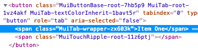
- [Tab] Remove the `labelContainer`, `label` and `labelWrapped` class keys for simplicity. This has allowed us to remove 2 intermediary DOM elements. You should be able to move the custom styles to the `root` class key.
- [Tabs] Remove deprecated fullWidth and scrollable props:
```diff
-
+
```
### Table (tаблица)
- [TableCell] Remove the deprecated `numeric` property:
```diff
-{row.calories}
+{row.calories}
```
- [TableRow] Remove the fixed height CSS property. The cell height is computed by the browser using the padding and line-height.
- [TableCell] Move the `dense` mode to a different property:
```diff
-
+
```
- [TablePagination] The component no longer tries to fix invalid (`page`, `count`, `rowsPerPage`) property combinations. It raises a warning instead.
### Текстовое поля
- [InputLabel] You should be able to override all the styles of the FormLabel component using the CSS API of the InputLabel component. The `FormLabelClasses` property has been removed.
```diff
Foo
```
- [InputBase] Change the default box sizing model. It uses the following CSS now:
```css
box-sizing: border-box;
```
This solves issues with the `fullWidth` prop.
- [InputBase] Remove the `inputType` class from `InputBase`.
### Tooltip
- [Tooltip] The child needs to be able to hold a ref. The [composition guide](/guides/composition/#caveat-with-refs) explains the migration strategy.
- [Tooltip] Appears only after focus-visible focus instead of any focus.
### Оформление текста
- [Typography] Remove the deprecated typography variants. You can upgrade by performing the following replacements:
- display4 => h1
- display3 => h2
- display2 => h3
- display1 => h4
- headline => h5
- title => h6
- subheading => subtitle1
- body2 => body1
- body1 (default) => body2 (default)
- [Typography] Remove the opinionated `display: block` default typography style. You can use the new `display?: 'initial' | 'inline' | 'block';` property.
- [Typography] Rename the `headlineMapping` property to `variantMapping` to better align with its purpose.
```diff
-
+
```
- [Typography] Change the default variant from `body2` to `body1`. A font size of 16px is a better default than 14px. 14px like Ant Design uses is understandable, as Chinese users have a different alphabet. Bootstrap, material.io, and even the documentation use 16px as a default font size. 12px is recommended as the default font size for Japanese.
- [Typography] Remove the default color from the typography variants. The color should inherit most of the time. It's the default behavior of the web.
- [Typography] Rename `color="default"` to `color="initial"` following the logic of [this thread](https://github.com/mui-org/material-ui/issues/13028). The usage of *default* should be avoided, it lacks semantic.
### Node
- [Drop node 6 support](https://github.com/nodejs/Release/blob/eb91c94681ea968a69bf4a4fe85c656ed44263b3/README.md#release-schedule), you should upgrade to node 8.
### UMD
- This change eases the use of Material-UI with a CDN:
```diff
const {
Button,
TextField,
-} = window['material-ui'];
+} = MaterialUI;
```
It's consistent with other React projects:
- material-ui => MaterialUI
- react-dom => ReactDOM
- prop-types => PropTypes