¿Buscando la documentación de v3? [Encuéntralos aquí](https://material-ui.com/versions/).
> Este documento es un trabajo en curso. ¿Ha actualizado su sitio y se ha topado con algo que no está cubierto aquí? [Añade tus cambios en GitHub](https://github.com/mui-org/material-ui/blob/master/docs/src/pages/guides/migration-v3/migration-v3.md).
## Introducción
Esta es una referencia para actualizar su sitio de Material-UI v3 a v4. Aunque hay mucho cubierto aquí, probablemente no tendrá que hacer todo por su sitio. Haremos todo lo posible para mantener las cosas fáciles de seguir, y tan secuencial como sea posible para que usted pueda rápidamente ponerse rocando en la v4!
## Por qué debería migrar
Esta página de documentación cubre *cómo* migrar de v3 a v4. La *razón * está cubierta en la publicación del blog [de lanzamiento en Medium](https://medium.com/material-ui/material-ui-v4-is-out-4b7587d1e701).
## Actualizando tus dependencias
Lo primero que necesitará hacer es actualizar sus dependencias.
### Actualizar versión de Material-UI
Necesitas actualizar tu `package.json` para usar la última versión de Material-UI.
```json
"dependencies": {
"@material-ui/core": "^4.0.0"
}
```
Or run
```sh
npm install @material-ui/core
o
yarn add @material-ui/core
```
### Actualizar versión de React
La versión mínima requerida de React se incrementó de `react@^16.3.0` a `react@^16.8.0`. Esto nos permite confiar en [Hooks](https://reactjs.org/docs/hooks-intro.html) (ya no usamos la API de clase).
### Actualizar la versión de los estilos de Material-UI
Si previamente estaba usando `@material-ui/styles` con v3, necesita actualizar su `package.json` para usar la última versión de los estilos Material-UI.
```json
"dependencies": {
"@material-ui/styles": "^4.0.0"
}
```
Or run
```sh
npm install @material-ui/styles
o
yarn add @material-ui/styles
```
## Handling breaking changes
### Core
- Every component forward their ref. This is implemented by using `React.forwardRef()`. This affects the internal component tree and display name and therefore might break shallow or snapshot tests. `innerRef` will no longer return a ref to the instance (or nothing if the inner component is a function component) but a ref to its root component. The corresponding API docs list the root component.
### Estilos
- ⚠️ Material-UI depends on JSS v10. JSS v10 is not backward compatible with v9. Make sure JSS v9 is not installed in your environment. The StylesProvider component replaces the JssProvider one. (Removing `react-jss` from your `package.json` can help).
- Remove the first option argument of `withTheme()`. (The first argument was a placeholder for a potential future option that never arose.)
It matches the [emotion API](https://emotion.sh/docs/introduction) and the [styled-components API](https://www.styled-components.com).
```diff
-const DeepChild = withTheme()(DeepChildRaw);
+const DeepChild = withTheme(DeepChildRaw);
```
- Rename `convertHexToRGB` to `hexToRgb`.
```diff
-import { convertHexToRgb } from '@material-ui/core/styles/colorManipulator';
+import { hexToRgb } from '@material-ui/core/styles';
```
- Scope the [keyframes API](https://cssinjs.org/jss-syntax/#keyframes-animation). You should apply the following changes in your codebase.
It helps isolating the animation logic:
```diff
rippleVisible: {
opacity: 0.3,
- animation: 'mui-ripple-enter 100ms cubic-bezier(0.4, 0, 0.2, 1)',
+ animation: '$mui-ripple-enter 100ms cubic-bezier(0.4, 0, 0.2, 1)',
},
'@keyframes mui-ripple-enter': {
'0%': {
opacity: 0.1,
},
'100%': {
opacity: 0.3,
},
},
```
### Theme
- The `theme.palette.augmentColor()` method no longer performs a side effect on its input color.
To use it correctly, you have to use the returned value.
```diff
-const background = { main: color };
-theme.palette.augmentColor(background);
+const background = theme.palette.augmentColor({ main: color });
console.log({ background });
```
- You can safely remove the next variant from the theme creation:
```diff
typography: {
- useNextVariants: true,
},
```
- `theme.spacing.unit` usage is deprecated, you can use the new API:
```diff
label: {
[theme.breakpoints.up('sm')]: {
- paddingTop: theme.spacing.unit * 12,
+ paddingTop: theme.spacing(12),
},
}
```
*Tip: you can provide more than 1 argument: `theme.spacing(1, 2) // = '8px 16px'`*.
You can use [the migration helper](https://github.com/mui-org/material-ui/tree/master/packages/material-ui-codemod/README.md#theme-spacing-api) on your project to make this smoother.
### Layout
- [Grid] In order to support arbitrary spacing values and to remove the need to mentally count by 8, we are changing the spacing API:
```diff
/**
* Defines the space between the type `item` component.
* It can only be used on a type `container` component.
*/
- spacing: PropTypes.oneOf([0, 8, 16, 24, 32, 40]),
+ spacing: PropTypes.oneOf([0, 1, 2, 3, 4, 5, 6, 7, 8, 9, 10]),
```
Going forward, you can use the theme to implement [a custom Grid spacing transformation function](https://material-ui.com/system/spacing/#transformation).
- [Container] Moved from `@material-ui/lab` to `@material-ui/core`.
```diff
-import Container from '@material-ui/lab/Container';
+import Container from '@material-ui/core/Container';
```
### TypeScript
#### `value` type
Normalized `value` prop type for input components to use `unknown`. This affects
`InputBase`, `NativeSelect`, `OutlinedInput`, `Radio`, `RadioGroup`, `Select`, `SelectInput`, `Switch`, `TextArea`, and `TextField`.
```diff
function MySelect({ children }) {
- const handleChange = (event: any, value: string) => {
+ const handleChange = (event: any, value: unknown) => {
// handle value
};
return
}
```
Este cambio se explica con más detalle en la [guía TypeScript](/guides/typescript/#handling-value-and-event-handlers)
### Button
- [Button] Quitar las variantes de botón obsoletas (plano, elevado y fab):
```diff
-
+
```
```diff
-
+
```
```diff
-import Button from '@material-ui/core/Button';
-
+import Fab from '@material-ui/core/Fab';
+
```
```diff
-import Button from '@material-ui/core/Button';
-
+import Fab from '@material-ui/core/Fab';
+
```
- [ButtonBase] The component passed to the `component` prop needs to be able to hold a ref. The [composition guide](/guides/composition/#caveat-with-refs) explains the migration strategy.
This also applies to `BottomNavigationAction`, `Button`, `CardActionArea`, `Checkbox`, `ExpansionPanelSummary`, `Fab`, `IconButton`, `MenuItem`, `Radio`, `StepButton`, `Tab`, `TableSortLabel` as well as `ListItem` if the `button` prop is true.
### Card (tarjeta)
- [CardActions] Rename the `disableActionSpacing` prop to `disableSpacing`.
- [CardActions] Remove the `disableActionSpacing` CSS class.
- [CardActions] Rename the `action` CSS class to `spacing`.
### ClickAwayListener
- [ClickAwayListener] Hide react-event-listener props.
### Dialog
- [DialogActions] Rename the `disableActionSpacing` prop to `disableSpacing`.
- [DialogActions] Rename the `action` CSS class to `spacing`.
- [DialogContentText] Use typography variant `body1` instead of `subtitle1`.
- [Dialog] The child needs to be able to hold a ref. The [composition guide](/guides/composition/#caveat-with-refs) explains the migration strategy.
### Divider
- [Divider] Remove the deprecated `inset` prop.
```diff
-
+
```
### ExpansionPanel
- [ExpansionPanelActions] Rename the `action` CSS class to `spacing`.
- [ExpansionPanel] Increase the CSS specificity of the `disabled` and `expanded` style rules.
- [ExpansionPanel] Rename the `CollapseProps` prop to `TransitionProps`.
### List
- [List] Rework the list components to match the specification:
- The `ListItemAvatar` component is required when using an avatar.
- The `ListItemIcon` component is required when using a left checkbox.
- The `edge` property should be set on the icon buttons.
- [List] `dense` no longer reduces the top and bottom padding of the `List` element.
- [ListItem] Increase the CSS specificity of the `disabled` and `focusVisible` style rules.
### Menu
- [MenuItem] Remove the fixed height of the MenuItem. The padding and line-height are used by the browser to compute the height.
### Modal
- [Modal] The child needs to be able to hold a ref. The [composition guide](/guides/composition/#caveat-with-refs) explains the migration strategy.
This also applies to `Dialog` and `Popover`.
- [Modal] Remove the classes customization API for the Modal component (-74% bundle size reduction when used standalone).
- [Modal] event.defaultPrevented is now ignored. The new logic closes the Modal even if `event.preventDefault()` is called on the key down escape event. `event.preventDefault()` is meant to stop default behaviors like clicking a checkbox to check it, hitting a button to submit a form, and hitting left arrow to move the cursor in a text input etc. Only special HTML elements have these default behaviors. You should use `event.stopPropagation()` if you don't want to trigger an `onClose` event on the modal.
### Paper
- [Paper] Reduce the default elevation. Change the default Paper elevation to match the Card and the Expansion Panel:
```diff
-
+
```
This affects the `ExpansionPanel` as well.
### Portal
- [Portal] The child needs to be able to hold a ref when `disablePortal` is used. The [composition guide](/guides/composition/#caveat-with-refs) explains the migration strategy.
### Slide
- [Slide] The child needs to be able to hold a ref. The [composition guide](/guides/composition/#caveat-with-refs) explains the migration strategy.
### Slider
- [Slider] Move from `@material-ui/lab` to `@material-ui/core`.
```diff
-import Slider from '@material-ui/lab/Slider'
+import Slider from '@material-ui/core/Slider'
```
### Switch
- [Switch] Refactor the implementation to make it easier to override the styles. Rename the class names to match the specification wording:
```diff
-icon
-bar
+thumb
+track
```
### Snackbar
- [Snackbar] Match the new specification.
- Change the dimensions
- Change the default transition from `Slide` to `Grow`.
### SvgIcon
- [SvgIcon] Rename nativeColor -> htmlColor. React solved the same problem with the `for` HTML attribute, they have decided to call the prop `htmlFor`. This change follows the same reasoning.
```diff
-
+
```
### Pestañas
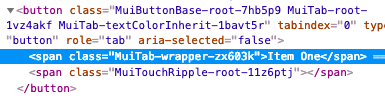
- [Tab] Remove the `labelContainer`, `label` and `labelWrapped` class keys for simplicity. This has allowed us to remove 2 intermediary DOM elements. You should be able to move the custom styles to the `root` class key.
- [Tabs] Remove deprecated fullWidth and scrollable props:
```diff
-
+
```
### Table (Tabla)
- [TableCell] Remove the deprecated `numeric` property:
```diff
-{row.calories}
+{row.calories}
```
- [TableRow] Remove the fixed height CSS property. The cell height is computed by the browser using the padding and line-height.
- [TableCell] Move the `dense` mode to a different property:
```diff
-
+
```
- [TablePagination] The component no longer tries to fix invalid (`page`, `count`, `rowsPerPage`) property combinations. It raises a warning instead.
### TextField
- [InputLabel] You should be able to override all the styles of the FormLabel component using the CSS API of the InputLabel component. The `FormLabelClasses` property has been removed.
```diff
Foo
```
- [InputBase] Change the default box sizing model. It uses the following CSS now:
```css
box-sizing: border-box;
```
This solves issues with the `fullWidth` prop.
- [InputBase] Remove the `inputType` class from `InputBase`.
### Tooltip
- [Tooltip] The child needs to be able to hold a ref. The [composition guide](/guides/composition/#caveat-with-refs) explains the migration strategy.
- [Tooltip] Appears only after focus-visible focus instead of any focus.
### Tipografía
- [Typography] Remove the deprecated typography variants. You can upgrade by performing the following replacements:
- display4 => h1
- display3 => h2
- display2 => h3
- display1 => h4
- headline => h5
- title => h6
- subheading => subtitle1
- body2 => body1
- body1 (default) => body2 (default)
- [Typography] Remove the opinionated `display: block` default typography style. You can use the new `display?: 'initial' | 'inline' | 'block';` property.
- [Typography] Rename the `headlineMapping` property to `variantMapping` to better align with its purpose.
```diff
-
+
```
- [Typography] Change the default variant from `body2` to `body1`. A font size of 16px is a better default than 14px. 14px like Ant Design uses is understandable, as Chinese users have a different alphabet. Bootstrap, material.io, and even the documentation use 16px as a default font size. 12px is recommended as the default font size for Japanese.
- [Typography] Remove the default color from the typography variants. The color should inherit most of the time. It's the default behavior of the web.
- [Typography] Rename `color="default"` to `color="initial"` following the logic of [this thread](https://github.com/mui-org/material-ui/issues/13028). The usage of *default* should be avoided, it lacks semantic.
### Node
- [Drop node 6 support](https://github.com/nodejs/Release/blob/eb91c94681ea968a69bf4a4fe85c656ed44263b3/README.md#release-schedule), you should upgrade to node 8.
### UMD
- This change eases the use of Material-UI with a CDN:
```diff
const {
Button,
TextField,
-} = window['material-ui'];
+} = MaterialUI;
```
It's consistent with other React projects:
- material-ui => MaterialUI
- react-dom => ReactDOM
- prop-types => PropTypes