# @lmc-eu/spirit-web-react
[](https://bundlephobia.com/package/@lmc-eu/spirit-web-react)
[](https://bundlephobia.com/package/@lmc-eu/spirit-web-react)
[](https://bundlephobia.com/package/@lmc-eu/spirit-web-react)
[](https://bundlephobia.com/package/@lmc-eu/spirit-web-react)
[](https://bundlephobia.com/package/@lmc-eu/spirit-web-react)
> React implementation of Spirit Design System components.
## Install
Expecting you have `react` and `react-dom` installed in your app, run:
```shell
yarn add @lmc-eu/spirit-web @lmc-eu/spirit-web-react
```
or
```shell
npm install --save @lmc-eu/spirit-web @lmc-eu/spirit-web-react
```
## Usage
Link Spirit CSS (see [`spirit-web` docs][web-docs] for more options):
```html
```
⚠️ Make sure to load all CSS files above and in the same order.
Import React components in your app:
```jsx
import { Button } from '@lmc-eu/spirit-web-react/components/Button';
```
### Prefixing CSS Classes in Components
If you want to prefix the component classes with your own namespace, you can use the `ClassNamePrefixProvider` context to provide a prefix to all components in your app.
Check [`spirit-web` docs][web-pkg-prefixes] to learn how to prefix CSS class names.
```jsx
import { ClassNamePrefixProvider } from '@lmc-eu/spirit-web-react/context/ClassNamePrefixContext';
;
```
## Additional Attributes
All components accept additional attributes that are passed down to the root element of the component.
This is useful for adding custom event handlers, accessibility attributes, or other attributes that
are not supported by the component API.
ℹ️ If you need to pass down event handlers to the native form elements in our form components,
you can use the `inputProps` prop.
Supported attributes are:
- `on*` (eg. `onClick`)
- `data-*`
- `aria-*`
- `id`
If the component sets a value for any of these attributes, the value passed in will be overwritten.
Most components also accept native HTML attributes based on the component's element type.
## Testing
### Accessibility Testing
- Accessibility tests live alongside component specs under `src/components/**/__tests__/*accessibility.test.tsx`.
- Use `runAxe` from `@local/tests` and assert with `expect(results).toHaveNoAxeViolations()` to guard against regressions.
- Detailed authoring guidance is available in [`docs/contribution/accessibility-testing.md`][accessibility-testing].
## Styling
Spirit components are designed to be consistent across all Alma Career applications. They include built-in styling that has been
considered carefully, and extensively tested. In general, customizing Spirit design is discouraged, but most components
do offer control over layout and other aspects. In addition, you can use Spirit defined design tokens to ensure your
application conforms to design requirements, and is adaptive across platform scales and color schemes.
### Style Props
All Spirit components accept a set of props that can be used to control their outer spacing and display. The props are:
#### Theme Prop
- `theme`
The `theme` prop applies a theme utility class generated from the design tokens.
Use kebab-case values that mirror the token keys (eg. `theme-light-default`, `theme-light-on-brand`).
You can apply the `theme` prop at any nest level where the component consumes style props and children components inherit the theme.
#### Spacing Props
- `margin`
- `marginTop`
- `marginRight`
- `marginBottom`
- `marginLeft`
- `marginX`
- `marginY`
These props accept a spacing token (eg. `space-100`), `auto` or an object with breakpoint keys and spacing token
values or `auto`. We use these props to set global CSS utility classes on the root element of the component.
#### Display Props
- `hideOn` - Hide the component only at specific breakpoint(s)
- `hideFrom` - Hide the component from a specific breakpoint and up
The `hideOn` prop accepts either a single breakpoint token (eg. `mobile`, `tablet`, `desktop`) or an array of breakpoint tokens.
The `hideFrom` prop accepts a single breakpoint token.
The component will be hidden from the specified breakpoints up using CSS display utilities.
#### Examples
```jsx
// Spacing examples
// Hide examples
// Hidden only on mobile
// Hidden only on mobile and tablet
// Hidden from tablet breakpoint and up
// Theme examples
```
If you need even more control over the component styling, use [escape hatches](#escape-hatches).
## Types Generated From Design Tokens
Some props (e.g. color, radii, container sizes, …) use types generated from design tokens.
They restrict values to those defined in the design system and stay up to date with every token change.
If you need additional values, you’ll need to coordinate with a designer so they can be added to the Figma and become available through tokens.
### Escape Hatches
While we encourage teams to utilize Spirit design as it is, we do realize that sometimes product specific customizations
may be needed. In these cases, we encourage you or your designers to **talk to us**. We may be able to suggest
an alternative implementation strategy, or perhaps your design can help propose future Spirit additions.
While the traditional className and style props are not supported in Spirit Web React components, there are two escape
hatches that you can **use at your own risk**. These are UNSAFE_className and UNSAFE_style. Use of these props should be
considered **a last resort**. They can be used to work around bugs or limitations in Spirit Web React, but should
not be used in the long term.
The reasoning behind this is that future updates to Spirit design may cause unintended breaking changes in products.
If the internal DOM structure or CSS properties of a Spirit Web React component change, this may lead to conflicts
with CSS overrides in products. For this reason, className and style are unsafe, and if you use them know that you
are doing so at your own risk.
Please consult additional styling with [web package documentation][web-pkg-rebrand].
## Controlled vs Uncontrolled Components
- A [Controlled Component][react-controlled] is one that takes its current
value through props and notifies changes through callbacks like onChange.
A parent component "controls" it by handling the callback and managing its own
state and passing the new values as props to the controlled component.
You could also call this a "dumb component".
- An [Uncontrolled Component][react-uncontrolled] is one that stores its own
state internally, and you query the DOM using a ref to find its current value
when you need it. This is a bit more like traditional HTML.
All components are by default provided as _controlled_ components so you must provide your own controlling or toggle functionality to make them work as you want.
For a better developer experience there is also an _uncontrolled_ variant of the component provided.
You can use the `Uncontrolled` variant for faster development.
## Deprecations
This package uses the deprecation warnings for props, functions and components that will be removed or replaced in the next major release.
Check your browser console to see if you are using any of the deprecated functionality.
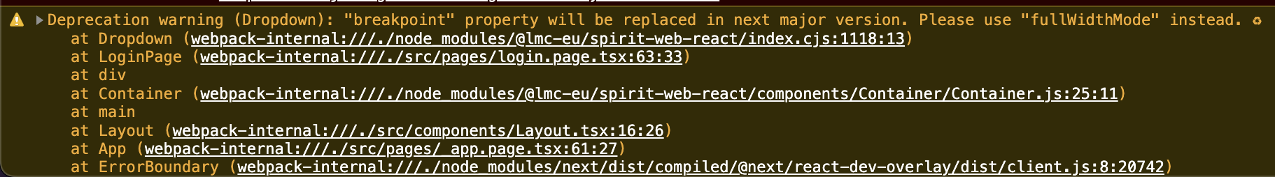
👉 [See the DEPRECATIONS file][all-deprecations] for the list of all deprecations.
### Warnings in Environments
#### Production
The `warning` utility which is used for deprecation warnings checks the `process.env.NODE_ENV` variable to determine if the warnings should be shown.
If the environment variable is set to the `production` the warnings will not be shown.
#### Testing
While running tests, you likely will see the deprecation warnings.
You can suppress the warnings by simply mocking the implementation of the `warning` utility or `console.warn` function.
But we strongly discourage you from doing so, as the deprecation warnings are there to help you to prepare for the next major release.
Example for Jest:
```ts
beforeEach(() => {
jest.spyOn(console, 'warn').mockImplementation(() => {});
});
afterEach(() => {
console.warn.mockRestore();
});
```
## Examples
👀 See [examples][examples] for a live demo.
## License
See the [LICENSE](LICENSE.md) file for information.
[accessibility-testing]: https://github.com/lmc-eu/spirit-design-system/tree/main/docs/contribution/accessibility-testing.md
[all-deprecations]: https://github.com/lmc-eu/spirit-design-system/tree/main/packages/web-react/DEPRECATIONS.md
[examples]: https://spirit-design-system-storybook.netlify.app
[react-controlled]: https://reactjs.org/docs/forms.html#controlled-components
[react-uncontrolled]: https://reactjs.org/docs/uncontrolled-components.html
[web-docs]: https://github.com/lmc-eu/spirit-design-system/tree/main/packages/web#readme
[web-pkg-rebrand]: https://github.com/lmc-eu/spirit-design-system/tree/main/packages/web#rebranding
[web-pkg-prefixes]: https://github.com/lmc-eu/spirit-design-system/blob/main/packages/web/README.md#prefixing-css-class-names