







React Native Chat
The most complete chat UI for React Native & Web
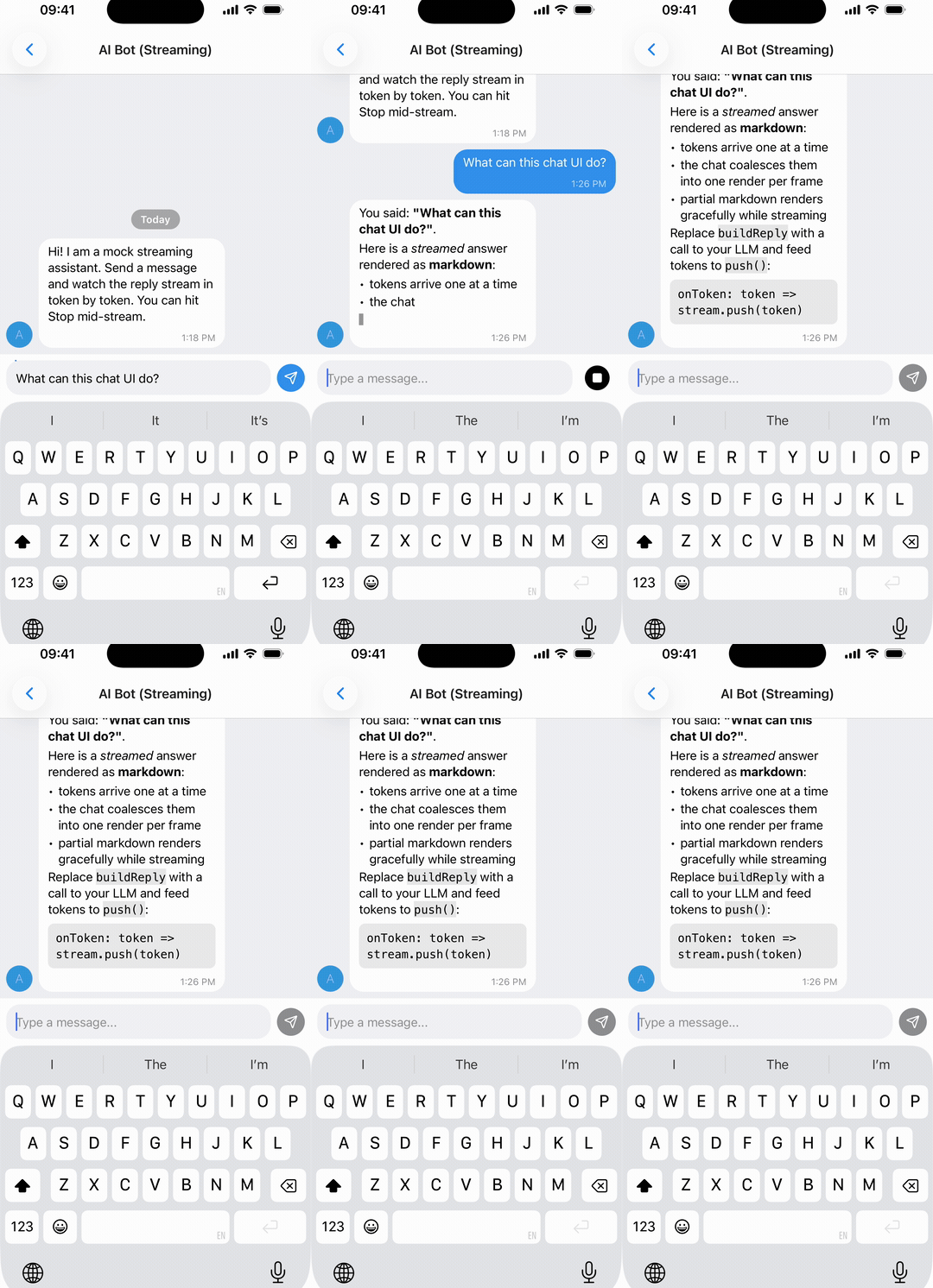

Coming from react-native-gifted-chat? This is a drop-in replacement -
same IMessage, same props, a few renamed exports.
Migrate in one command with the codemod →
📖 Documentation ·
Installation ·
Usage ·
Props ·
Guides
Using it in production? A ⭐ helps other developers find the library.


Scan to install


|
### Support my work
**[cryptoc](https://cryptoc-app.web.app/)** - my crypto portfolio app. Your coins on the home screen, lock screen and watch face. iPhone, iPad, Mac, Apple Watch, Android, Android tablet and Wear OS.
- Portfolio with average buy price and 24h / 180-day / all-time P&L
- Widgets in three sizes, refreshed in the background - most days you never open the app
- Price alerts on 5,000+ coins, delivered while the app is closed
- **No account, no email, no exchange API keys, no ads.** Your holdings never reach a server - they sync through your own iCloud or Google Drive
- Free for 3 holdings, and that is not a trial timer
Downloading it is what pays for the time that goes into these libraries.
|
## Quick start
```bash
npx expo install @kesha-antonov/react-native-chat react-native-reanimated react-native-gesture-handler react-native-safe-area-context react-native-keyboard-controller
```
```jsx
import { useCallback, useState } from 'react'
import { Chat } from '@kesha-antonov/react-native-chat'
export function Example () {
const [messages, setMessages] = useState([
{
_id: 1,
text: 'Hello developer',
createdAt: new Date(),
user: { _id: 2, name: 'John Doe', avatar: 'https://placeimg.com/140/140/any' },
},
])
const onSend = useCallback((newMessages = []) => {
setMessages(previous => Chat.append(previous, newMessages))
}, [])
return
}
```
That is the whole setup - everything below is optional.
---
## ✨ Features
- 🌗 **[Dark mode & theming](#theming--dark-mode)** - full light/dark token system, switchable at runtime
- 🤖 **[Streaming AI messages](#streaming-ai-messages)** - token-by-token replies with a typing caret and stop control
- 😀 **[Emoji reactions](#emoji-reactions)** - long-press picker and reaction pills
- 🎥 **[Video & audio messages](#-whats-new-vs-react-native-gifted-chat)** - real inline playback, with a tappable fallback
- 🎙️ **[Voice & video recording](#-whats-new-vs-react-native-gifted-chat)** - Telegram-style hold-to-record notes (opt-in)
- 📍 **[Location messages](#-whats-new-vs-react-native-gifted-chat)** - map card that opens the system maps app
- ↩️ **[Swipe to reply](#reply-to-messages)** - reply preview and message threading
- 📋 **[Long-press actions](#message-actions-long-press-context-menu)** - themed context menu anchored to the bubble
- ⚡ **[Quick replies](#quick-replies)** - bot-style reply buttons
- 🔗 **[Smart link parsing](#smart-link-parsing)** - URLs, emails, phones, hashtags, mentions
- 👤 **[Avatars](#avatars)** - user initials or custom images
- ✍️ **[Typing indicator](#typing-indicator)** - show when someone is typing
- ⏮️ **[Load earlier messages](#load-earlier-messages)** - pagination and infinite scroll
- ⬇️ **[Scroll to bottom](#scroll-to-bottom)** - quick jump back to the latest
- ✅ **[Message status](#message-status)** - ticks for sent, delivered and read
- 💬 **[System messages](#system-messages)** - in-line notifications
- 🌍 **[Localized dates & i18n](#localization-i18n)** - Day.js dates, translated UI strings
- ⌨️ **[Keyboard handling](#keyboard--layout)** - smart avoidance on every platform
- 🎨 **[Fully customizable](#-props-reference)** - override any component with your own
- 📱 **[Expo](#-installation)** & 🌐 **[Web](#web-react-native-web)** - works with Expo and react-native-web
- 📝 **[TypeScript](#typescript)** - complete definitions, generic over your message type
Actively maintained, New Architecture ready, built for the latest Reanimated / Gesture Handler.


---
## 🆕 What's new vs react-native-gifted-chat
Kept in sync with upstream [`react-native-gifted-chat`](https://github.com/FaridSafi/react-native-gifted-chat)'s latest `master`, so you **keep everything it already has** - and the same `IMessage` model and prop names. Everything added here is **non-breaking and opt-in**; the media and recording features only activate once you install their optional peer deps.
Side-by-side comparison
| Added in this fork | react-native-gifted-chat | @kesha-antonov/react-native-chat |
| --- | :---: | :---: |
| Active maintenance | 💤 sporadic | ✅ active |
| Modern default UI (Telegram-inspired) | dated 2020 look | ✅ modern, fully overridable |
| Light/Dark **theme system** | per-component color props | ✅ `theme` / `darkTheme` tokens, runtime switch |
| Streaming (AI) messages | ❌ | ✅ token-by-token + typing cursor |
| Emoji reactions | ❌ | ✅ long-press picker + reaction pills |
| Swipe-to-reply + reply preview | ❌ | ✅ built in |
| **Video / audio messages** | "not implemented, render your own" | ✅ inline players + tappable fallback |
| **Voice notes** (hold-to-record + waveform) | ❌ | ✅ optional, Telegram-style |
| **Video messages** (round camera notes) | ❌ | ✅ optional, Telegram-style |
| **Location messages** | ❌ ignored | ✅ map card → opens system maps |
| Bubble tails + tighter message grouping | flat bubbles | ✅ |
### Theming in one line
Override any token, light and dark
```jsx
// Modern defaults out of the box, or override any token (light + dark):
```
### Voice, video and location
Opt-in recording and media playback
```jsx
```
```bash
# Optional inline media playback + recording:
npx expo install expo-video expo-audio expo-image-picker
```
### Custom icons (e.g. Lucide)
Override any built-in icon
Built-in icons are the official [Lucide](https://lucide.dev) glyphs, rendered via the optional `react-native-svg` peer when it is installed, or drawn with `View`s (no dependency) otherwise. Override any of them via the `icons` prop - the built-in icon is used for anything you don't override:
```tsx
import { Send, Mic } from 'lucide-react-native'
,
mic: ({ color, size }) => ,
}}
{...props}
/>
```
Overridable names: `send`, `mic`, `camera`, `play`, `pause`, `check`, `checkAll`, `clock`, `pin`, `plus`, `close`, `chevronLeft`, `chevronDown`, `emoji`, `paperclip`, `reply`, `pencil`, `lock`, `trash`.
---
Support This Project
I maintain this project in my free time with no compensation. If you find it useful and want to help keep it alive, please consider sponsoring. Your support means a lot! 💖

---
> **Using an AI coding agent?** [`llms.txt`](llms.txt) is a condensed integration guide for
> agents adding this library to an app, and [`AGENTS.md`](AGENTS.md) covers working inside
> this repository.
## 📖 Table of Contents
- [Quick start](#quick-start)
- [Features](#-features)
- [What's new vs react-native-gifted-chat](#-whats-new-vs-react-native-gifted-chat)
- [Requirements](#-requirements)
- [Installation](#-installation)
- [Migrating from react-native-gifted-chat](#-migrating-from-react-native-gifted-chat)
- [Usage](#-usage)
- [Data Structure](#-data-structure)
- [Props Reference](#-props-reference)
- [Guides](#-guides)
- [Reply to Messages](#reply-to-messages)
- [Maintaining Scroll Position (AI Chatbots)](#maintaining-scroll-position-ai-chatbots)
- [Streaming (AI) Messages](#streaming-ai-messages)
- [Emoji Reactions](#emoji-reactions)
- [Smart Link Parsing](#smart-link-parsing)
- [Message actions](#message-actions-long-press-context-menu)
- [Theming & Dark Mode](#theming--dark-mode)
- [Localization (i18n)](#localization-i18n)
- [Message Status](#message-status)
- [TypeScript](#typescript)
- [Platform Notes](#-platform-notes)
- [Performance](#-performance)
- [Testing](#-testing)
- [Example App](#-example-app)
- [Troubleshooting](#-troubleshooting)
- [Contributing](#-contributing)
- [Authors](#-authors)
- [License](#-license)
---
## 📋 Requirements
| React Native | iOS | Android | Expo | TypeScript |
|---|---|---|---|---|
| >= 0.70.0 | >= 13.4 | API 21+ (5.0) | SDK 50+ | >= 5.0 (optional) |
---
## 📦 Installation
### Expo Projects
```bash
npx expo install @kesha-antonov/react-native-chat react-native-reanimated react-native-gesture-handler react-native-safe-area-context react-native-keyboard-controller
```
### Bare React Native Projects
Three steps
**1.** Install the packages:
```bash
yarn add @kesha-antonov/react-native-chat react-native-reanimated react-native-gesture-handler react-native-safe-area-context react-native-keyboard-controller
```
```bash
npm install --save @kesha-antonov/react-native-chat react-native-reanimated react-native-gesture-handler react-native-safe-area-context react-native-keyboard-controller
```
**2.** Install iOS pods:
```bash
npx pod-install
```
**3.** Add Reanimated's Babel plugin, following the [react-native-reanimated installation guide](https://docs.swmansion.com/react-native-reanimated/docs/fundamentals/getting-started/#step-2-add-reanimateds-babel-plugin).
---
## 🔄 Migrating from react-native-gifted-chat
**The API, props, and `IMessage` model are unchanged** - migrating is a package swap plus renaming the `GiftedChat*` identifiers. Full guide with a codemod: **[docs/MIGRATION.md](docs/MIGRATION.md)**.
What to rename
```bash
yarn remove react-native-gifted-chat
yarn add @kesha-antonov/react-native-chat
```
| react-native-gifted-chat | @kesha-antonov/react-native-chat |
| --- | --- |
| `react-native-gifted-chat` | `@kesha-antonov/react-native-chat` |
| `GiftedChat` | `Chat` |
| `GiftedAvatar` | `ChatAvatar` |
| `GiftedChatContext` | `ChatContext` |
| `IMessage`, `User`, `useChatContext`, … | unchanged |
---
## 🚀 Usage
### Basic Example
See [Quick start](#quick-start) above for the minimal setup. More examples - Slack-style messages, quick replies, custom components - live in the [`example`](example) directory.
---
## 📊 Data Structure
Messages, system messages, and quick replies follow the structure defined in [Models.ts](src/Models.ts).
Message object structure
```typescript
interface IMessage {
_id: string | number
text: string
createdAt: Date | number
user: User
image?: string
video?: string
audio?: string
system?: boolean
sent?: boolean
received?: boolean
pending?: boolean
/** True while the text is still streaming in (shows a typing cursor) */
streaming?: boolean
quickReplies?: QuickReplies
replyMessage?: ReplyMessage
reactions?: MessageReaction[]
location?: {
latitude: number
longitude: number
}
}
interface ReplyMessage {
_id: string | number
text: string
user: User
image?: string
audio?: string
}
interface MessageReaction {
emoji: string
userIds: (string | number)[]
}
interface User {
_id: string | number
name?: string
avatar?: string | number | (() => React.ReactNode)
}
```
---
## 📖 Props Reference
Every group below is collapsed - open the one you need.
Core configuration, refs & theming
### Core Configuration
- **`messages`** _(Array)_ - Messages to display
- **`user`** _(Object)_ - User sending the messages: `{ _id, name, avatar }`
- **`onSend`** _(Function)_ - Callback when sending a message
- **`messageIdGenerator`** _(Function)_ - Generate an id for new messages. Defaults to a simple random string generator.
- **`locale`** _(String)_ - Locale to localize the dates. You need first to import the locale you need (ie. `require('dayjs/locale/de')` or `import 'dayjs/locale/fr'`)
- **`colorScheme`** _('light' | 'dark')_ - Force color scheme (light/dark mode). When set to `'light'` or `'dark'`, it overrides the system color scheme. When `undefined`, it uses the system color scheme. Default is `undefined`.
- **`theme`** _(Object)_ - Override the default light theme tokens (`colors` / `radii` / `spacing` / `typography` / `avatar` / `sendButton` / `composer` / `voice`). Deep-merged over `defaultLightTheme`; any subset is allowed. See [Theming & Dark Mode](#theming--dark-mode).
- **`darkTheme`** _(Object)_ - Same as `theme`, applied when the resolved color scheme is dark (deep-merged over `defaultDarkTheme`).
- **`icons`** _(Object)_ - Icon override registry. Supply a render function for any built-in icon to replace it (e.g. with `lucide-react-native`). See [Custom icons](#custom-icons-eg-lucide).
- **`labels`** _(Object)_ - Override any UI string. See [Localization (i18n)](#localization-i18n).
### Refs
- **`messagesContainerRef`** _(FlatList ref)_ - Ref to the flatlist
- **`textInputRef`** _(TextInput ref)_ - Ref to the text input
Keyboard & layout
### Keyboard & Layout
- **`keyboardProviderProps`** _(Object)_ - Props to be passed to the [`KeyboardProvider`](https://kirillzyusko.github.io/react-native-keyboard-controller/docs/api/keyboard-provider) for keyboard handling. No defaults are applied - in particular Chat does **not** set `statusBarTranslucent` / `navigationBarTranslucent`, because on Android those change the *activity window* and the change outlives the chat screen ([#2755](https://github.com/FaridSafi/react-native-gifted-chat/issues/2755)). `react-native-keyboard-controller` turns them on by itself when the app is genuinely edge-to-edge, so there is nothing to set in a normal app.
Only used when Chat mounts the provider itself. If your app already mounts a `KeyboardProvider` (the setup `react-native-keyboard-controller` recommends - once, at the root), Chat detects it and reuses it instead of nesting a second one, and this prop is ignored. Configure the provider where you mount it.
- **`enableKeyboardProvider`** _(Bool)_ - Render the built-in `KeyboardProvider`; default is `true`. You do **not** need to turn this off just because your app mounts its own provider - that case is detected and reused. Set it to `false` only to opt out completely, e.g. when the provider's edge-to-edge behavior causes layout shift or a header jump on Android/Expo.
- **`enableGestureHandlerRootView`** _(Bool)_ - Render the `GestureHandlerRootView` Chat mounts around itself; default is `true`. Unlike `KeyboardProvider`, an existing one can't be auto-detected - `react-native-gesture-handler` doesn't expose that publicly - so set this to `false` yourself if your app (or a library it uses, e.g. a bottom sheet) already mounts one at the root. Nesting a second one changes the native view hierarchy around the composer, which has been observed to make a rare Fabric/Yoga layout assertion on iOS more likely, especially when Chat is mounted and unmounted while the keyboard is open ([#17](https://github.com/kesha-antonov/react-native-chat/issues/17)).
- **`keyboardAvoidingViewProps`** _(Object)_ - Props to be passed to the [`KeyboardAvoidingView`](https://kirillzyusko.github.io/react-native-keyboard-controller/docs/api/components/keyboard-avoiding-view). See **keyboardVerticalOffset** below for proper keyboard handling.
- **`isAlignedTop`** _(`boolean | 'auto'`)_ - Where the bubbles sit **while the whole conversation fits on screen**; once it is taller than the list this has no effect. `false` (default) keeps the usual bottom-anchored chat, `true` pins the messages to the top, and `'auto'` pins them to the top while the keyboard is closed and re-anchors them to the bottom while it is open - so a short conversation starts under the header and moves above the keyboard when the composer is focused ([#2736](https://github.com/FaridSafi/react-native-gifted-chat/issues/2736)). Works with either `isInverted` setting; ignored when `isFlashListEnabled` is set, since FlashList positions its own items.
- **`isInverted`** _(Bool)_ - Reverses display order of `messages`; default is `true`
#### Understanding `keyboardVerticalOffset`
[`keyboardVerticalOffset`](https://kirillzyusko.github.io/react-native-keyboard-controller/docs/api/components/keyboard-avoiding-view#keyboardverticaloffset) tells the KeyboardAvoidingView how far down the screen its container starts. That distance depends on the navigation header and on anything else you render above the chat.
**You do not normally need to set it.** Chat measures its own position on screen and uses that, so the input toolbar sits on the keyboard whether the chat is full-screen or under a navigation header. The measurement comes from the `SafeAreaProvider` frame and updates on rotation and layout changes.
Pass your own value only to add extra space above the keyboard - it replaces the measured one:
```jsx
```
If you do, sanity-check it on device: a toolbar behind the keyboard means the value is too small, a gap above the keyboard means it is too large. `useHeaderHeight()` is the usual source, but some navigator setups report a value that does not match the header you actually render.
> **Upgrading from 4.1.0 or earlier:** the default used to be `insets.top`, which could not account for a navigation header - so most apps passed `useHeaderHeight()` to compensate. That is no longer needed; drop it and let Chat measure, or the toolbar will float above the keyboard by the header height.
Text input, composer & actions
### Text Input & Composer
- **`text`** _(String)_ - Input text; default is `undefined`, but if specified, it will override Chat's internal state. Useful for managing text state outside of Chat (e.g. with Redux). Don't forget to implement `textInputProps.onChangeText` to update the text state.
- **`initialText`** _(String)_ - Initial text to display in the input field
- **`isSendButtonAlwaysVisible`** _(Bool)_ - Always show send button in input text composer; default `false`, show only when text input is not empty
- **`isTextOptional`** _(Bool)_ - Allow sending messages without text (useful for media-only messages); default `false`. Use with `isSendButtonAlwaysVisible` for media attachments.
- **`isMultiline`** _(Bool)_ - Whether the composer accepts multiple lines; default `true`. With `true` the return key inserts a newline and you send with the send button. Set `false` for a single-line composer whose **return key sends the message** (the keyboard's return key becomes "send" and stays open afterwards).
- **`renderInputToolbar`** _(Component | Function)_ - Custom message composer container
- **`renderComposer`** _(Component | Function)_ - Custom text input message composer
- **`renderSend`** _(Component | Function)_ - Custom send button; you can pass children to the original `Send` component quite easily, for example, to use a custom icon ([example](https://github.com/kesha-antonov/react-native-chat/pull/487))
- **`renderActions`** _(Component | Function)_ - Custom action button on the left of the message composer
- **`renderAccessory`** _(Component | Function)_ - Custom second line of actions below the message composer
- **`onPressEmoji`** _(Function)_ - Callback for the optional emoji button on the left of the composer field. When omitted, the emoji button is hidden.
- **`audioRecording`** _(Object)_ - Enable Telegram-style hold-to-record voice notes. `{ isEnabled, minDurationMs?, onError? }`. Requires the optional `expo-audio` peer (and `react-native-audio-api` for the playback waveform); the mic button is hidden when it is absent.
- **`videoRecording`** _(Object)_ - Enable record-and-send video messages. `{ isEnabled, maxDuration?, onError? }`. Uses `react-native-vision-camera` for round camera notes, falling back to `expo-image-picker`'s system camera.
- **`textInputProps`** _(Object)_ - props to be passed to the [``](https://reactnative.dev/docs/textinput).
> **Composer height** - there are no height props. The composer starts one line tall and grows with its content. Constrain it through `textInputProps.style` (e.g. `{ maxHeight: 120 }`), which is applied after the measured height and wins.
### Actions & Action Sheet
- **`actions`** _(Array)_ - Action options for the composer "+" button. Array of `{ title, action }`; add `icon` (and optional `color`) to an action to render a Telegram-style attachment **grid** (tiles) instead of a list. Opens the built-in themed `AttachmentSheet` - no extra dependency.
- **`onPressActionButton`** _(Function)_ - Callback when the "+" button is pressed (if set, the built-in `AttachmentSheet` is not shown)
- **`actionSheet`** _(Function)_ - Escape hatch for a custom system action sheet. **The bundled `@expo/react-native-action-sheet` dependency was removed**, so `context.actionSheet()` defaults to a no-op; pass your own implementation (with `ActionSheetProvider` in your tree) if you relied on it.
- **`actionSheetOptionTintColor`** _(String)_ - Tint color for action labels in the attachment sheet
Messages, container & bubbles
### Messages & Message Container
- **`messagesContainerStyle`** _(Object)_ - Custom style for the messages container
- **`renderMessage`** _(Component | Function)_ - Custom message container
- **`renderLoading`** _(Component | Function)_ - Render a loading view when initializing
- **`renderChatEmpty`** _(Component | Function)_ - Custom component to render in the ListView when messages are empty
- **`renderChatFooter`** _(Component | Function)_ - Custom component to render below the MessagesContainer (separate from the ListView)
- **`listProps`** _(Object)_ - Extra props to be passed to the messages [``](https://reactnative.dev/docs/flatlist). Supports all FlatList props including `maintainVisibleContentPosition` for keeping scroll position when new messages arrive (useful for AI chatbots).
- **`isFlashListEnabled`** _(Bool)_ - Render messages with [`@shopify/flash-list`](https://shopify.github.io/flash-list/) v2 instead of `FlatList`; default is `false`. See [FlashList](#flashlist-opt-in).
### Message Bubbles & Content
- **`renderBubble`** _(Component | Function(`props: BubbleProps`))_ - Custom message bubble. Receives [BubbleProps](src/Bubble/types.ts) as parameter.
- **`renderMessageText`** _(Component | Function)_ - Custom message text
- **`renderMessageImage`** _(Component | Function)_ - Custom message image
- **`renderMessageVideo`** _(Component | Function)_ - Custom message video
- **`renderMessageAudio`** _(Component | Function)_ - Custom message audio
- **`renderMessageLocation`** _(Component | Function)_ - Custom renderer for `IMessage.location`; defaults to a map card that opens the system maps app on tap
- **`messageActions`** _(Array | Function(`message`))_ - Telegram-style long-press context menu. Each item is `{ label, icon?, onPress, destructive? }`. See [Message actions](#message-actions-long-press-context-menu).
- **`renderCustomView`** _(Component | Function)_ - Custom view inside the bubble
- **`isCustomViewBottom`** _(Bool)_ - Determine whether renderCustomView is displayed before or after the text, image and video views; default is `false`
- **`onPressMessage`** _(Function(`context`, `message`))_ - Callback when a message bubble is pressed
- **`onLongPressMessage`** _(Function(`context`, `message`))_ - Callback when a message bubble is long-pressed; you can use this to show action sheets (e.g., copy, delete, reply)
- **`isMessageGestureEnabled`** _(Bool | Function(`message`))_ - Whether the bubble itself is part of the row's tap / long-press surface that `reactions` and `messageActions` rely on; default is `true`. Pass `false`, or a predicate, for messages that render natively interactive content - the row beside the bubble stays pressable either way. See [Interactive content inside bubbles](#interactive-content-inside-bubbles-video-players-maps).
- **`imageProps`** _(Object)_ - Extra props to be passed to the [``](https://reactnative.dev/docs/image) component created by the default `renderMessageImage`
- **`imageStyle`** _(Object)_ - Custom style for message images
- **`videoProps`** _(Object)_ - Extra props to be passed to the video component created by the required `renderMessageVideo`
- **`messageTextProps`** _(Object)_ - Extra props to be passed to the MessageText component. Useful for customizing link parsing behavior, text styles, and matchers:
- `matchers` - Custom matchers for linking message content (like URLs, phone numbers, hashtags, mentions)
- `linkStyle` - Custom style for links
- `email` / `phone` / `url` - Enable/disable parsing (default: true)
- `hashtag` / `mention` - Enable/disable parsing (default: false)
- `hashtagUrl` / `mentionUrl` - Base URLs (e.g. `'https://x.com/hashtag'`)
- `stripPrefix` - Strip 'http://' or 'https://' from URL display (default: false)
- `TextComponent` - Custom Text component to use (e.g., from react-native-gesture-handler)
A custom matcher, replacing the default phone linking with an action sheet:
```tsx
{
return replacerArgs[0].replace(/[\-\(\) ]/g, '')
},
getLinkText: (replacerArgs: ReplacerArgs): string => {
return replacerArgs[0]
},
style: styles.linkStyle,
onPress: (match: CustomMatch) => {
const url = match.getAnchorHref()
const options: {
title: string
action?: () => void
}[] = [
{ title: 'Copy', action: () => setStringAsync(url) },
{ title: 'Call', action: () => Linking.openURL(`tel:${url}`) },
{ title: 'Send SMS', action: () => Linking.openURL(`sms:${url}`) },
{ title: 'Cancel' },
]
showActionSheetWithOptions({
options: options.map(o => o.title),
cancelButtonIndex: options.length - 1,
}, (buttonIndex?: number) => {
if (buttonIndex === undefined)
return
const option = options[buttonIndex]
option.action?.()
})
},
},
],
linkStyle: { left: { color: 'blue' }, right: { color: 'lightblue' } },
}}
/>
```
See the full example in [LinksExample](example/components/chat-examples/LinksExample.tsx).
Avatars, username, date & time, system messages
### Avatars
- **`renderAvatar`** _(Component | Function)_ - Custom message avatar; set to `null` to not render any avatar for the message
- **`isUserAvatarVisible`** _(Bool)_ - Whether to render an avatar for the current user; default is `false`, only show avatars for other users
- **`isAvatarVisibleForEveryMessage`** _(Bool)_ - When false, avatars will only be displayed when a consecutive message is from the same user on the same day; default is `false`
- **`onPressAvatar`** _(Function(`user`))_ - Callback when a message avatar is tapped
- **`onLongPressAvatar`** _(Function(`user`))_ - Callback when a message avatar is long-pressed
- **`isAvatarOnTop`** _(Bool)_ - Render the message avatar at the top of consecutive messages, rather than the bottom; default is `false`
### Username
- **`isUsernameVisible`** _(Bool)_ - Indicate whether to show the user's username inside the message bubble; default is `false`
- **`renderUsername`** _(Component | Function)_ - Custom Username container
### Date & Time
- **`timeFormat`** _(String)_ - Format to use for rendering times; default is `'LT'` (see [Day.js Format](https://day.js.org/docs/en/display/format))
- **`dateFormat`** _(String)_ - Format to use for rendering dates; default is `'D MMMM'` (see [Day.js Format](https://day.js.org/docs/en/display/format))
- **`dateFormatCalendar`** _(Object)_ - Format to use for rendering relative times; default is `{ sameDay: '[Today]' }` (see [Day.js Calendar](https://day.js.org/docs/en/plugin/calendar))
- **`renderDay`** _(Component | Function)_ - Custom day above a message. This is also how the day label is styled - it receives `DayProps` (`createdAt`, `dateFormat`, `dateFormatCalendar`, `containerStyle`, `wrapperStyle`, `textProps`, `isAnimated`), so render the built-in `Day` with the styles you want:
```tsx
import { Chat, Day, DayProps } from '@kesha-antonov/react-native-chat'
(
)}
/>
```
`isAnimated` is `true` for the floating header that sticks to the top while scrolling and `false` for the inline separators, so one function can style them differently.
- **`renderTime`** _(Component | Function)_ - Custom time inside a message
- **`timeTextStyle`** _(Object)_ - Custom text style for time inside messages (supports left/right styles)
- **`isDayAnimationEnabled`** _(Bool)_ - Enable animated day label that appears on scroll; default is `true`
### System Messages
- **`renderSystemMessage`** _(Component | Function)_ - Custom system message
Load earlier, typing indicator, quick replies, scroll to bottom
### Load Earlier Messages
- **`loadEarlierMessagesProps`** _(Object)_ - Props to pass to the LoadEarlierMessages component. The button is only visible when `isAvailable` is `true`:
- `isAvailable` - Controls button visibility (default: false)
- `onPress` - Callback when button is pressed
- `isLoading` - Display loading indicator (default: false)
- `isInfiniteScrollEnabled` - Enable infinite scroll up when reaching the top of messages container, automatically calls `onPress` (not yet supported for web)
- `label` - Override the default "Load earlier messages" text
- `containerStyle` / `wrapperStyle` / `textStyle` - Custom styles for the button
- `activityIndicatorStyle` - Custom style for the loading indicator
- `activityIndicatorColor` - Color of the loading indicator (default: 'white')
- `activityIndicatorSize` - Size of the loading indicator (default: 'small')
- **`renderLoadEarlier`** _(Component | Function)_ - Custom "Load earlier messages" button
### Typing Indicator
- **`isTyping`** _(Bool)_ - Typing Indicator state; default `false`. If you use `renderFooter` it will override this.
- **`renderTypingIndicator`** _(Component | Function)_ - Custom typing indicator component
- **`typingIndicatorStyle`** _(StyleProp)_ - Custom style for the TypingIndicator component.
- **`renderFooter`** _(Component | Function)_ - Custom footer component on the ListView, e.g. `'User is typing...'`; see [CustomizedRenderingExample.tsx](example/components/chat-examples/CustomizedRenderingExample.tsx) for an example. Overrides default typing indicator that triggers when `isTyping` is true.
### Quick Replies
See the [quick replies example in messages.ts](example/example-expo/data/messages.ts).
- **`onQuickReply`** _(Function)_ - Callback when sending a quick reply (to backend server)
- **`renderQuickReplies`** _(Function)_ - Custom all quick reply view
- **`quickReplyStyle`** _(StyleProp)_ - Custom quick reply view style
- **`quickReplyTextStyle`** _(StyleProp)_ - Custom text style for quick reply buttons
- **`quickReplyContainerStyle`** _(StyleProp)_ - Custom container style for quick replies
- **`renderQuickReplySend`** _(Function)_ - Custom quick reply **send** view
### Scroll to Bottom
- **`isScrollToBottomEnabled`** _(Bool)_ - Enables the scroll to bottom Component (Default is false)
- **`scrollToBottomComponent`** _(Function)_ - Custom Scroll To Bottom Component container
- **`scrollToBottomOffset`** _(Integer)_ - Custom Height Offset upon which to begin showing Scroll To Bottom Component (Default is 200)
- **`scrollToBottomStyle`** _(Object)_ - Custom style for Scroll To Bottom wrapper (position, bottom, right, etc.)
- **`scrollToBottomContentStyle`** _(Object)_ - Custom style for Scroll To Bottom content (size, background, shadow, etc.)
---
## 🧩 Guides
### Reply to Messages
Swipe-to-reply, reply preview and threading
Swipe on a message to reply to it, showing a reply preview in the input toolbar and the replied message above the new bubble. Uses `ReanimatedSwipeable` from `react-native-gesture-handler` plus `react-native-reanimated`.
#### Basic Usage
```tsx
```
#### Reply Props (Grouped)
```typescript
interface ReplyProps {
// Swipe gesture configuration
swipe?: {
isEnabled?: boolean // Enable swipe-to-reply; default false
direction?: 'left' | 'right' // Swipe direction; default 'left'
onSwipe?: (message: TMessage) => void // Callback when swiped
renderAction?: ( // Custom swipe action component
progress: SharedValue,
translation: SharedValue,
position: 'left' | 'right'
) => React.ReactNode
actionContainerStyle?: StyleProp
}
// Reply preview styling (above input toolbar)
previewStyle?: {
containerStyle?: StyleProp
textStyle?: StyleProp
imageStyle?: StyleProp
}
// In-bubble reply styling
messageStyle?: {
containerStyle?: StyleProp
containerStyleLeft?: StyleProp
containerStyleRight?: StyleProp
textStyle?: StyleProp
textStyleLeft?: StyleProp
textStyleRight?: StyleProp
imageStyle?: StyleProp
}
// Callbacks and state
message?: ReplyMessage // Controlled reply state
onClear?: () => void // Called when reply cleared
onPress?: (message: TMessage) => void // Called when reply preview tapped
// Custom renderers
renderPreview?: (props: ReplyPreviewProps) => React.ReactNode
renderMessageReply?: (props: MessageReplyProps) => React.ReactNode
}
```
#### ReplyMessage Structure
```typescript
interface ReplyMessage {
_id: string | number
text: string
user: User
image?: string
audio?: string
}
```
#### Advanced Example with External State
```tsx
const [replyMessage, setReplyMessage] = useState(null)
{
const newMessages = messages.map(msg => ({
...msg,
replyMessage: replyMessage || undefined,
}))
setMessages(prev => Chat.append(prev, newMessages))
setReplyMessage(null)
}}
user={{ _id: 1 }}
reply={{
swipe: {
isEnabled: true,
direction: 'right',
onSwipe: setReplyMessage,
},
message: replyMessage,
onClear: () => setReplyMessage(null),
onPress: (msg) => scrollToMessage(msg._id),
}}
/>
```
#### Smooth Animations
The reply preview animates automatically - it expands from zero height with a fade-in when it appears, collapses with a fade-out when cleared, and transitions smoothly when you reply to a different message. These use `react-native-reanimated` for 60fps performance.
### Maintaining Scroll Position (AI Chatbots)
Keep the reading position while long answers stream in
For AI chat interfaces where long responses arrive and you don't want to disrupt the user's reading position, use [`maintainVisibleContentPosition`](https://reactnative.dev/docs/scrollview#maintainvisiblecontentposition) via `listProps`:
```tsx
// Basic usage - always maintain scroll position
// With auto-scroll threshold - auto-scroll if within 10 pixels of newest content
// Conditionally enable based on scroll state (recommended for chatbots)
const [isScrolledUp, setIsScrolledUp] = useState(false)
{
setIsScrolledUp(event.contentOffset.y > 50)
},
maintainVisibleContentPosition: isScrolledUp
? { minIndexForVisible: 0, autoscrollToTopThreshold: 10 }
: undefined,
}}
/>
```
### Streaming (AI) Messages
Render AI assistant replies token-by-token. Incoming chunks are batched with `requestAnimationFrame` (one render per frame, only the streaming bubble re-renders) and a blinking caret shows while a message is still streaming.
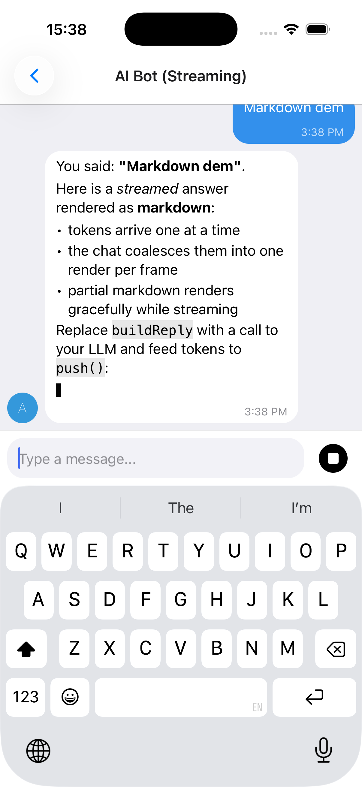
useStreamingMessages, stop control and a full example
The reply above streams in token-by-token (note the caret `▋`) and renders as **markdown** - bold, italics, lists, inline and fenced code - while the composer's send button turns into a **Stop** control mid-stream. See [Markdown rendering for AI replies](#markdown-rendering-for-ai-replies) to enable markdown.
- **`IMessage.streaming`** - flag a message as streaming (shows the caret)
- **`useStreamingMessages(...)`** - owns the message list, rAF-batches `push()`, and supports stop via `AbortController`. It returns `{ messages, setMessages, append, startStream, isStreaming, stop }`; `setMessages` is there for anything the hook does not cover, so you can patch a message with a plain `map`.
```tsx
import { useCallback } from 'react'
import { Chat, IMessage, useStreamingMessages } from '@kesha-antonov/react-native-chat'
function Bot () {
const { messages, append, startStream, isStreaming, stop } = useStreamingMessages()
const onSend = useCallback((newMessages: IMessage[] = []) => {
append(newMessages[0]) // show the user's message
const stream = startStream({ user: { _id: 2, name: 'Assistant' } }) // empty streaming bubble
runMyModel(newMessages[0].text, {
signal: stream.signal, // aborts when stop() is called
onToken: token => stream.push(token), // batched, one render per frame
onDone: () => stream.done(), // clears the streaming flag
})
}, [append, startStream])
return
}
```
See **[docs/STREAMING.md](./docs/STREAMING.md)** for the full hook API and a real Claude streaming adapter (via a backend proxy). A runnable demo lives in `example/components/chat-examples/AIBotExample.tsx`.
#### Markdown rendering for AI replies
Built-in renderer, or react-native-streamdown
AI/LLM replies are usually markdown (bold, lists, fenced code). Enable markdown with `messageTextProps={{ markdown: true }}` (streamed messages auto-render as markdown unless you pass `markdown={false}`):
```tsx
// Force markdown for every message:
// Streamed messages auto-render as markdown; disable with markdown: false.
```
There are two renderers and you get the best available one automatically:
- **Built-in, zero-dependency renderer** (default). Covers headings, bullet/ordered lists, blockquotes, fenced + inline code, bold/italic/strikethrough, and links. It handles streaming-incomplete markdown gracefully (a half-written `**bold` or an unclosed code fence renders as plain text until complete), so it's safe to feed token-by-token. Nothing to install. Exposed as `BasicMarkdown` if you want to use it directly.
- **[`react-native-streamdown`](https://github.com/software-mansion-labs/react-native-streamdown)** (optional upgrade). When installed it's used instead, for richer streaming-safe markdown (tables, partial-table handling, etc.). It is a native module with its own peers - install the full set:
```bash
npx expo install react-native-streamdown react-native-enriched-markdown remend katex
```
It also requires `react-native-worklets >= 0.8.3` (i.e. `react-native-reanimated >= 4.3`), and `react-native-enriched-markdown` is a native module, so a dev build / prebuild is required (it does not work in Expo Go). Pass through Streamdown's own theming/rules via `markdownProps`:
```tsx
```
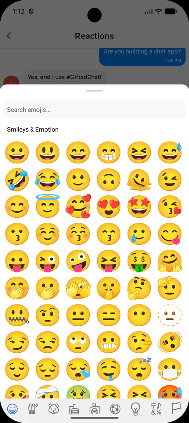
### Emoji Reactions
Long-press a message to open a quick emoji picker; selected reactions render as pills below the bubble and toggle on tap. The quick picker ships in the core with no extra dependencies; a full emoji browser is optional via the `renderReactionPicker` override.
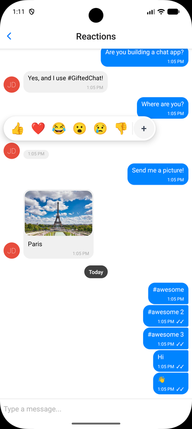
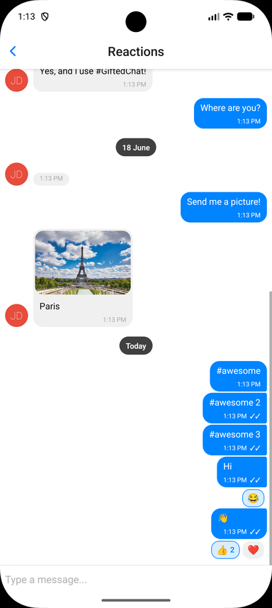
Wiring up the toggle, and the full prop list
Store reactions on each message as a `reactions` array, then enable the feature and handle the toggle. Reaction state is owned by you, so it works with any backend:
```tsx
interface IChatMessage extends IMessage {
reactions?: MessageReaction[] // { emoji: string, userIds: (string | number)[] }[]
}
const CURRENT_USER_ID = 1
const handleReactionPress = useCallback((message: IChatMessage, emoji: string) => {
setMessages(prev =>
prev.map(m => {
if (m._id !== message._id)
return m
const existing = (m.reactions ?? []).find(r => r.emoji === emoji)
if (!existing)
return { ...m, reactions: [...(m.reactions ?? []), { emoji, userIds: [CURRENT_USER_ID] }] }
const userIds = existing.userIds.includes(CURRENT_USER_ID)
? existing.userIds.filter(id => id !== CURRENT_USER_ID)
: [...existing.userIds, CURRENT_USER_ID]
return {
...m,
reactions: userIds.length === 0
? (m.reactions ?? []).filter(r => r.emoji !== emoji)
: (m.reactions ?? []).map(r => (r.emoji === emoji ? { ...r, userIds } : r)),
}
})
)
}, [])
,
}}
/>
```
#### Reactions Props (Grouped)
- **`isEnabled`** _(Bool)_ - Enable emoji reactions (default `false`)
- **`emojis`** _(String[])_ - Emojis shown in the quick picker (default `['👍', '❤️', '😂', '😮', '😢', '👎']`)
- **`onReactionPress`** _(Function)_ - `(message, emoji) => void` called when an emoji is selected or a pill is tapped. Toggle logic is left to you
- **`renderReactions`** _(Function)_ - Override the reactions-display component rendered below the bubble
- **`renderReactionPicker`** _(Function)_ - Override the picker shown on long-press (use for a full emoji browser)
- **`containerStyle`**, **`reactionStyle`**, **`reactionActiveStyle`**, **`reactionTextStyle`**, **`reactionCountStyle`** - Styles for the reaction pills
- **`pickerContainerStyle`**, **`pickerEmojiStyle`** - Styles for the quick picker
### Smart Link Parsing
URLs, emails, phones, hashtags and mentions
Message text is automatically scanned for URLs, emails, and phone numbers; hashtags and mentions are opt-in. Configure it via `messageTextProps`:
```tsx
{
// type: 'url' | 'email' | 'phone' | 'mention' | 'hashtag'
Linking.openURL(url)
},
}}
/>
```
For full control, pass custom `matchers` (`{ type, pattern, getLinkUrl?, getLinkText?, renderLink?, onPress? }[]`) to add or override patterns. See the Links example in the [example app](#-example-app).
### Message actions (long-press context menu)
Telegram-style floating menu
Long-press a message to open a floating, themed context menu anchored to the bubble. Provide the actions via `messageActions` - an array, or a function of the message - each `{ label, icon?, onPress, destructive? }`. When reactions are enabled, a reactions row is shown on top of the menu automatically.
```tsx
import { setStringAsync } from 'expo-clipboard'
import { Copy, Trash2 } from 'lucide-react-native' // optional icons
[
{ label: 'Copy', icon: ({ color, size }) => , onPress: () => setStringAsync(message.text) },
{ label: 'Delete', destructive: true, onPress: () => deleteMessage(message) },
]}
/>
```
> **Note:** This library no longer depends on `@expo/react-native-action-sheet`. Prefer `messageActions` above. If you specifically want a native action sheet, install it yourself, wrap your tree in `ActionSheetProvider`, and either call `useActionSheet()` in your own `onLongPressMessage` or pass an `actionSheet` prop - the `actionSheet` prop / `context.actionSheet()` escape hatch still works when you provide an implementation. The composer "+" actions use the built-in themed `AttachmentSheet` and need no setup.
### Interactive content inside bubbles (video players, maps)
Keeping native controls tappable
When `reactions` or `messageActions` are enabled, the long-press surface spans the **whole message row** - the bubble *and* the empty space beside it, the way Telegram behaves on Android. (A tap gesture is added on top only when `onPressMessage` is set.) Those recognizers do not cancel touches on native subviews, so a `react-native-video` / `expo-video` player rendered through `renderMessageVideo` keeps its native `controls` interactive.
If a message must own every touch that lands on it, set `isMessageGestureEnabled` to `false` for it. The gesture surface then drops *behind* the bubble: the bubble's content takes its touches, and long-pressing the row next to the bubble still opens the picker - so reactions are never lost for that message.
```tsx
}
// the video owns its controls; long-press beside the bubble still reacts
isMessageGestureEnabled={message => !message.video}
/>
```
### Theming & Dark Mode
Token groups, runtime switching and themed components
The chat ships with a modern default look and a full token-based theme. Override any subset of tokens via `theme` (light) and `darkTheme` (dark); your overrides are deep-merged over `defaultLightTheme` / `defaultDarkTheme`, and the resolved theme switches at runtime with the color scheme (system, or forced via `colorScheme`). Explicit per-component style props still win over the theme.
```tsx
```
Token groups: `colors`, `radii`, `spacing`, `typography`, `avatar`, `sendButton`, `composer`, `voice`. Build your own theme-aware components with the exported hooks:
```tsx
import { useTheme, useThemedStyles } from '@kesha-antonov/react-native-chat'
import { StyleSheet } from 'react-native'
const MyBadge = () => {
const theme = useTheme()
const styles = useThemedStyles(t => StyleSheet.create({
badge: { backgroundColor: t.colors.accent, borderRadius: t.radii.bubble },
}))
return
}
```
Also exported: `defaultLightTheme`, `defaultDarkTheme`, and the `ChatTheme` / `PartialChatTheme` types.
### Localization (i18n)
Built-in translations and label overrides
All built-in UI strings (composer placeholder, send/cancel, load earlier, today, voice/video/location labels, slide-to-cancel, reply/edit banner, camera-permission text) route through a label table. Built-in translations ship for `es`, `fr`, `de`, `ru`, `zh`, `ar`, `pt`, `ja`, `ko`, `it`, `tr`, `hi`, `nl`, `pl` and `id`, with English as the default, selected by the existing `locale` prop. A regional tag falls back to its base language, so `pt-BR` resolves to `pt`. Override any individual string with `labels`:
```tsx
```
Exported helpers: `ChatLabels` (type), `defaultLabels`, `translations`, `resolveLabels`, and the `useLabels` hook for reading the resolved labels in custom components.
### Message Status
Tick indicators for sent / delivered / read
Set `sent`, `received`, or `pending` on a message to show its delivery status. By default these render as tick indicators next to the timestamp (`✓` sent, `✓✓` received, `🕓` pending):
```tsx
const message: IMessage = {
_id: 1,
text: 'Delivered!',
createdAt: new Date(),
user: { _id: 1 },
sent: true,
received: true,
}
```
Customize the indicators with `renderTicks` (full override) or `tickStyle` (style only):
```tsx
(message.received ? : null)}
tickStyle={{ color: '#1d9bf0' }}
/>
```
### TypeScript
Generic over your own message type
Chat ships complete type definitions and is generic over your message type. Extend `IMessage` to add custom fields and everything stays typed end to end:
```tsx
import { Chat, IMessage } from '@kesha-antonov/react-native-chat'
interface MyMessage extends IMessage {
reactions?: { emoji: string, userIds: (string | number)[] }[]
}
messages={messages}
onSend={msgs => {/* msgs is typed as MyMessage[] */}}
user={{ _id: 1 }}
/>
```
---
## 📱 Platform Notes
### Android
Keyboard configuration
If you are using Create React Native App / Expo, no Android specific installation steps are required. Otherwise, we recommend modifying your project configuration:
Make sure you have `android:windowSoftInputMode="adjustResize"` in your `AndroidManifest.xml`:
```xml
```
For **Expo**, you can append `KeyboardAvoidingView` after Chat (Android only):
```jsx
{Platform.OS === 'android' && }
```
### Web (react-native-web)
Install the web renderer alongside the library:
```bash
yarn add react-native-web react-dom
```
Expo / Metro (recommended) - no extra config
```bash
npx expo start --web
```
Nothing else to set up. Metro runs Babel over `node_modules`, so this package's JSX and its Reanimated worklets get transpiled the same way your own code does. The [example app](#-example-app) runs on web exactly like this.
Other bundlers (webpack, Vite, Next.js) - the package must be transpiled
The published files are ES modules with JSX left in place, and the component uses Reanimated worklets, which need `react-native-reanimated/plugin` to run. Bundlers that skip `node_modules` when transpiling - webpack's `babel-loader` does by default - will choke on that. So outside Metro you need to:
1. Alias `react-native` to `react-native-web` and let the resolver pick up `.web.js` / `.web.tsx` extensions
2. Run `@kesha-antonov/react-native-chat` - and the React Native packages it depends on - through Babel with `@react-native/babel-preset` and `react-native-reanimated/plugin`, instead of excluding all of `node_modules`
In Next.js that is `transpilePackages` in `next.config.js`; in a plain webpack setup it means widening the `babel-loader` rule's `exclude` so these packages are included.
### React Strict DOM
Works inside an RSD tree - verified on iOS and Expo web
Chat drops into a [React Strict DOM](https://github.com/facebook/react-strict-dom) app unchanged. RSD's native build renders through React Native, so `` is just another RN subtree:
```tsx
import { css, html } from 'react-strict-dom'
import { Chat } from '@kesha-antonov/react-native-chat'
const styles = css.create({
root: { display: 'flex', flexDirection: 'column', height: '100%' },
})
```
Three things to know:
- **Web needs `react-native-web`.** RSD's web build contains no React Native code at all, so Chat does not resolve there on its own. Expo web gives you `react-native-web` already, so RSD (real DOM) and Chat (RNW's DOM output) render side by side in one tree. A Vite or Next.js RSD app has to add the alias and transpile step from the section above
- **Metro needs `unstable_enablePackageExports: true`.** RSD publishes only an `exports` map with no `main`, so with package exports off it fails to resolve. This is the default on recent Expo SDKs
- **StyleX styles do not reach Chat.** It takes React Native style objects and its own `theme` prop, not `css.create` output. On native, `compat.native` is the bridge if you want RSD to drive a wrapper around it
---
## ⚡ Performance
The chat is built for long lists. The one habit that matters most: **memoize your render props and config**, because each message row is `React.memo`'d with a comparator that deep-compares the message and reference-compares everything else - so an inline function or object re-renders that row on every parent render.
```jsx
// ❌ New reference every render - the row can't skip
} reactions={{ isEnabled: true, onReactionPress }} />
// ✅ Stable references - unchanged rows skip re-renders
const renderBubble = useCallback(props => , [])
const reactions = useMemo(() => ({ isEnabled: true, onReactionPress }), [onReactionPress])
```
Immutability, context props and virtualization tuning
The memoization advice applies to all render props (`renderBubble`, `renderMessageText`, `renderAvatar`, ...), the `reactions` / `audioRecording` / `videoRecording` / `messageActions` config objects, and any style objects.
**Keep messages immutable.** Update messages by creating new arrays/objects (e.g. `Chat.append(...)`), never by mutating an existing message in place - the row comparator relies on value changes to detect updates.
**Theme, icons and labels don't need drilling.** `theme` / `darkTheme`, `icons`, and `labels` are read from context (`useTheme`, `useIcons`, `useLabels`), so passing them once on `` is enough; they don't cause per-row churn.
**Tune virtualization if needed.** Sensible `FlatList` defaults ship out of the box (`removeClippedSubviews` on Android, `initialNumToRender`, `maxToRenderPerBatch`, `windowSize`, `updateCellsBatchingPeriod`). `windowSize` is measured in screen-heights (not messages); the default keeps a few screens of content mounted around the viewport. Override any of them via `listProps`:
```jsx
```
### FlashList (opt-in)
Recycling rows on very long histories
On long histories `FlatList` can log `VirtualizedList: You have a large list that is slow to update`. [FlashList](https://shopify.github.io/flash-list/) v2 recycles rows instead of keeping them mounted, which removes that class of stall. It is supported as an **optional** dependency - install it yourself and flip one prop:
```bash
yarn add @shopify/flash-list
```
```jsx
```
Everything else keeps working: `isInverted`, the floating day header, `loadEarlierMessagesProps` infinite scroll, the scroll-to-bottom button, and `listProps` (spread last, so it overrides the defaults below).
The chat sets FlashList's `maintainVisibleContentPosition` for you - `startRenderingFromBottom` when `isInverted={false}`, plus `autoscrollToBottomThreshold: 0.2` so new messages follow the viewport only when you are already at the bottom. Override it through `listProps` if you want different thresholds:
```jsx
```
Notes:
- FlashList v2 requires the **New Architecture**. On the old architecture it falls back to a slower JS path.
- `FlatList`-only knobs (`windowSize`, `maxToRenderPerBatch`, `initialNumToRender`, `updateCellsBatchingPeriod`, `removeClippedSubviews`) are not forwarded to FlashList - it sizes its own render window.
- If `@shopify/flash-list` is not installed, the prop is ignored, a warning is logged, and `FlatList` is used.
---
## 🧪 Testing
Triggering layout events in tests
`TEST_ID` is exported as constants that can be used in your testing library of choice.
React Native Chat uses `onLayout` to determine the height of the chat container. To trigger `onLayout` during your tests:
```typescript
const WIDTH = 200
const HEIGHT = 2000
const loadingWrapper = getByTestId(TEST_ID.LOADING_WRAPPER)
fireEvent(loadingWrapper, 'layout', {
nativeEvent: {
layout: {
width: WIDTH,
height: HEIGHT,
},
},
})
```
---
## 📦 Example App
Running the demo locally
The repository includes a comprehensive example app demonstrating all features - basic chat, custom bubbles and avatars, swipe-to-reply, quick replies, typing indicators, attachment actions, link parsing with custom matchers, and web compatibility.
```bash
git clone https://github.com/kesha-antonov/react-native-chat.git
cd react-native-chat/example
yarn install
npx expo run:ios # iOS
npx expo run:android # Android
npx expo start --web # Web
```
---
## ❓ Troubleshooting
TextInput is hidden on Android
Make sure you have `android:windowSoftInputMode="adjustResize"` in your `AndroidManifest.xml`. See [Android configuration](#android) above.
How to set Bubble color for each user?
See [this issue](https://github.com/kesha-antonov/react-native-chat/issues/672) for examples.
How to customize InputToolbar styles?
See [this issue](https://github.com/kesha-antonov/react-native-chat/issues/662) for examples.
How to manually dismiss the keyboard?
See [this issue](https://github.com/kesha-antonov/react-native-chat/issues/647) for examples.
How to use renderLoading?
See [this issue](https://github.com/kesha-antonov/react-native-chat/issues/298) for examples.
---
## 🤔 Have a Question?
1. Check this README first
2. Search [existing issues](https://github.com/kesha-antonov/react-native-chat/issues)
3. Ask on [StackOverflow](https://stackoverflow.com/questions/tagged/kesha-antonov/react-native-chat)
4. Open a new issue if needed
---
## 🤝 Contributing
Contributions are welcome - fork, branch, and open a Pull Request.
### Development Setup
Commands
```bash
yarn install # install dependencies
yarn build # build the library
yarn test # run tests
yarn lint # run linting
yarn prepublishOnly # full validation
```
Before opening a PR, please make sure `yarn test`, `yarn lint` and `yarn build` all pass.
---
## 👥 Authors
Based on [FaridSafi/react-native-gifted-chat](https://github.com/FaridSafi/react-native-gifted-chat), which is no longer actively maintained.
**Maintainer:** [Kesha Antonov](https://github.com/kesha-antonov)
I also build **[cryptoc](https://cryptoc-app.web.app/)** - a crypto portfolio app with home screen, lock screen and Watch widgets, no account and no exchange API keys.
> I maintained the original project solo for 2 years before deciding to continue development in this repository. If you find this library useful, please consider [becoming a sponsor](https://github.com/sponsors/kesha-antonov) to support continued development. 💖
---
## 📄 License
[MIT](LICENSE)
---
Built with ❤️ by the React Native community