---
## ✨ What is GlassKit?
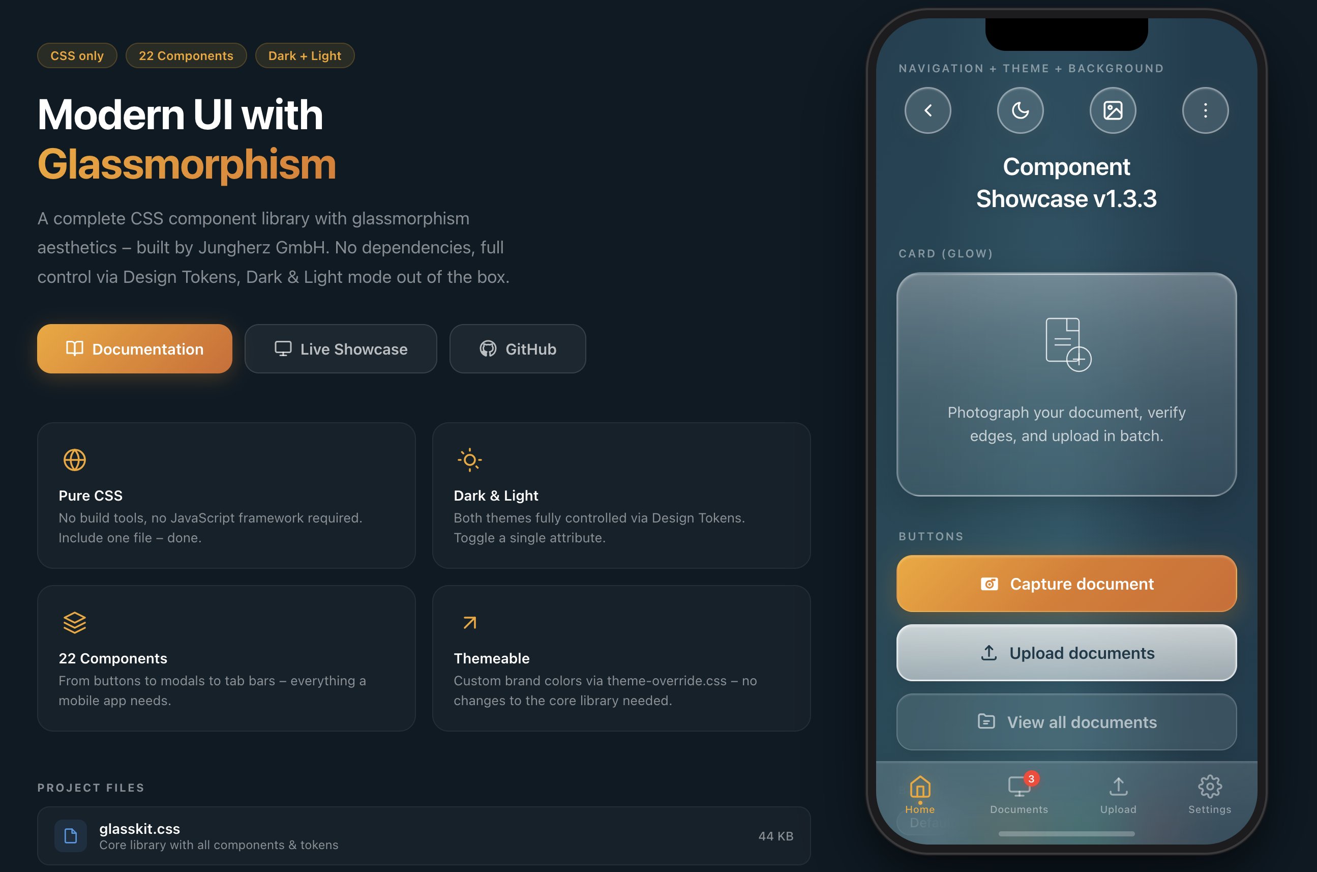
GlassKit is a complete **CSS component library** with glassmorphism aesthetics – inspired by **iOS 26 Liquid Glass** and visionOS. Apple fundamentally redefined glass design with iOS 26: deeper blur effects, luminous borders, and dynamic light reflections on surfaces. GlassKit brings exactly this look to the web – for apps and UIs that feel modern and native.
**One CSS file. No build tools. No dependencies.**
### Why GlassKit?
- 🎨 **Pure CSS** – no JavaScript framework required
- 🌗 **Dark & Light Mode** – toggle with a single attribute
- 🎛️ **Design Tokens** – all values controlled via CSS Custom Properties
- 📱 **Mobile-first** – optimized for touch devices and `safe-area-inset`
- 🔌 **Framework-agnostic** – works with React, Vue, Svelte, plain HTML, or any other stack
- 🧩 **Shadow DOM ready** – Constructable Stylesheet for Web Components included
- 🪶 **Lightweight** – 51 KB raw / 39 KB minified / 6.5 KB gzipped, no external dependencies
- 🎯 **BEM-like naming convention** – `glass-*` prefix, no conflicts with existing CSS
- 🤖 **AI-ready** – ships with [`SKILL.md`](SKILL.md), a structured reference for LLMs & AI copilots
---
## 📥 Installation
GlassKit can be included in several ways – choose the one that best fits your project:
### CDN (recommended for quick start)
No download, no build tool – just include and go:
```html
```
> **Tip:** Replace `@1.5` with `@latest` for the newest version – or pin to a specific version for maximum stability.
### npm / yarn / pnpm
For projects with a build pipeline:
```bash
# npm
npm install @jungherz-de/glasskit
# yarn
yarn add @jungherz-de/glasskit
# pnpm
pnpm add @jungherz-de/glasskit
```
Then import in your CSS or build tool:
```css
/* In your CSS file */
@import '@jungherz-de/glasskit/glasskit.css';
```
```js
// Or in JS (Webpack, Vite, etc.)
import '@jungherz-de/glasskit/glasskit.css';
```
### Direct Download
Download the files directly from the [GitHub Release](https://github.com/JUNGHERZ/GlassKit/releases/latest):
```html
```
---
## 🚀 Quick Start
### 1. Set the theme
```html
```
### 2. Start building
```html
Hello World
This is GlassKit.
```
---
## 📦 Components
### Navigation & Layout
| Component | Class | Description |
|---|---|---|
| **Background** | `.glass-bg` | Aurora gradient with light effects |
| **Nav Bar** | `.glass-nav` | Transparent navigation |
| **Pill Button** | `.glass-pill` | Round glass icon button (46×46) |
| **Tab Bar** | `.glass-tab-bar` | Fixed bottom navigation |
| **Accordion** | `.glass-accordion` | Collapsible content sections |
| **Divider** | `.glass-divider` | Fading separator line |
### Content
| Component | Class | Description |
|---|---|---|
| **Title** | `.glass-title` | Page title with text shadow |
| **Card** | `.glass-card` | Glass container for content |
| **Card (Glow)** | `.glass-card--glow` | Card with light-to-milky gradient |
| **Badge** | `.glass-badge` | Tags & labels |
| **Avatar** | `.glass-avatar` | Glass circle (sm/md/lg) |
| **Status** | `.glass-status` | Notice card with icon |
| **List** | `.glass-list` | iOS-style grouped settings list with auto dividers |
### Actions & Feedback
| Component | Class | Description |
|---|---|---|
| **Button (Primary)** | `.glass-btn--primary` | Colored gradient – primary action |
| **Button (Secondary)** | `.glass-btn--secondary` | Milky white – secondary action |
| **Button (Tertiary)** | `.glass-btn--tertiary` | Subtle glass – tertiary action |
| **Modal** | `.glass-modal` | Centered dialog with blur overlay |
| **Toast** | `.glass-toast` | Temporary notification |
| **Popover** | `.glass-popover` | Anchored dropdown / menu with fade & scale animation |
### Form Elements
| Component | Class | Description |
|---|---|---|
| **Input** | `.glass-input` | Text field with glass background |
| **Textarea** | `.glass-textarea` | Multi-line input |
| **Select** | `.glass-select` | Dropdown with custom chevron |
| **Search** | `.glass-search` | Input with search icon |
| **Toggle** | `.glass-toggle` | iOS-style switch |
| **Checkbox** | `.glass-checkbox` | Animated checkmark |
| **Radio** | `.glass-radio` | Animated dot |
| **Range Slider** | `.glass-range` | Slider with gradient thumb |
| **Progress Bar** | `.glass-progress` | Progress bar with shimmer |
---
## 🌗 Theming
### Dark / Light Mode
GlassKit supports two themes out of the box. Toggle via the `data-theme` attribute:
```js
// Toggle
function toggleTheme() {
const html = document.documentElement;
const current = html.getAttribute('data-theme');
html.setAttribute('data-theme', current === 'dark' ? 'light' : 'dark');
}
```
There's also a ready-made **Theme Toggle component**:
```html
```
### Custom Brand Colors
Create a `theme-override.css` and load it **after** the base library:
```css
/* theme-override.css */
:root {
--gl-color-primary: #007AFF;
--gl-color-primary-dark: #0055CC;
--gl-color-primary-mid: #0066E0;
--gl-border-warm: rgba(0, 122, 255, 0.35);
--gl-border-focus: rgba(0, 122, 255, 0.60);
--gl-shadow-btn-primary: 0 6px 24px rgba(0, 100, 220, 0.35),
0 2px 8px rgba(0, 0, 0, 0.15);
--gl-shadow-focus: 0 0 0 3px rgba(0, 122, 255, 0.3);
}
```
The `theme-override.css` template comes with **4 example themes**:
- 🔵 Ocean Blue
- 🟢 Emerald Green
- 🌹 Rose
- 🎨 Custom (empty, ready to fill)
---
## 🎛️ Design Tokens
All visual values are controlled via CSS Custom Properties:
```css
/* Colors */
--gl-color-primary /* Primary color */
--gl-color-text /* Text color */
--gl-color-text-muted /* Secondary text */
/* Glass surfaces (gradations) */
--gl-surface-1 … --gl-surface-5
/* Blur */
--gl-blur /* 24px – default */
--gl-blur-light /* 16px */
--gl-blur-heavy /* 40px */
/* Radii */
--gl-radius-card /* 24px */
--gl-radius-btn /* 16px */
--gl-radius-input /* 14px */
/* Spacing */
--gl-space-xs … --gl-space-4xl
/* Shadows & Insets */
--gl-shadow-card
--gl-inset-strong
```
The full token reference can be found in the [Documentation](docs.html).
---
## 🛠️ Utility Classes
```css
/* Flex Layout */
.gl-stack /* Vertical stack */
.gl-stack--sm /* Gap: 12px */
.gl-row /* Horizontal row */
.gl-row--sm /* Gap: 12px */
/* Spacing */
.gl-mt-md /* Margin-top: 16px */
.gl-mb-lg /* Margin-bottom: 20px */
.gl-px /* Horizontal padding */
/* Text */
.gl-text-center
.gl-text-muted
.gl-text-sm
/* Layout */
.gl-w-full
.gl-flex-1
```
---
## 🧩 Web Components / Shadow DOM
The Shadow DOM encapsulates styles – external stylesheets like `glasskit.css` are not automatically inherited into the shadow tree. GlassKit therefore ships a ready-made **Constructable Stylesheet** that you can use directly in Web Components.
### The Problem
- CSS classes (`.glass-card`, `.glass-btn`, etc.) do **not** work inside the Shadow DOM
- Only **CSS Custom Properties** (`--gl-*`) penetrate the shadow boundary automatically
- Without a solution, each component would need to load and parse the CSS itself
### The Solution: `glasskit-styles.js`
GlassKit provides an ES module that exports the minified CSS as a [Constructable Stylesheet](https://developer.mozilla.org/en-US/docs/Web/API/CSSStyleSheet/CSSStyleSheet). The stylesheet is held **once** in memory and can be shared across any number of shadow roots – without duplicate parsing.
```js
import { glassSheet } from '@jungherz-de/glasskit/glasskit-styles.js';
// In a Web Component:
class MyCard extends HTMLElement {
constructor() {
super();
const shadow = this.attachShadow({ mode: 'open' });
shadow.adoptedStyleSheets = [glassSheet];
shadow.innerHTML = `
`;
}
}
customElements.define('my-card', MyCard);
```
### Example: Hybrids.js
GlassKit works great with lightweight Web Component frameworks like [Hybrids](https://hybrids.js.org/):
```js
import { define, html } from 'hybrids';
import { glassSheet } from '@jungherz-de/glasskit/glasskit-styles.js';
define({
tag: 'my-card',
render: () => html`
`.css(glassSheet),
});
```
### Example: Lit
```js
import { LitElement, html } from 'lit';
import { glassSheet } from '@jungherz-de/glasskit/glasskit-styles.js';
class MyCard extends LitElement {
static styles = [glassSheet];
render() {
return html`
`;
}
}
customElements.define('my-card', MyCard);
```
### Exports
| Export | Type | Description |
|---|---|---|
| `glassSheet` | `CSSStyleSheet` | Ready-made Constructable Stylesheet – use directly with `adoptedStyleSheets` |
| `css` | `string` | CSS as string – fallback for environments without Constructable Stylesheet support |
### Theming in the Shadow DOM
Since CSS Custom Properties penetrate the shadow boundary, **theme switching works automatically**. Set `data-theme` on the `` element as usual – all GlassKit tokens will be updated across all shadow roots:
```js
// Works globally – including all Web Components
document.documentElement.setAttribute('data-theme', 'light');
```
> **Tip:** For maximum performance with many component instances, import `glassSheet` once and share it across all components. The browser keeps the stylesheet in memory only once.
---
## 📁 Project Structure
```
glasskit/
├── glasskit.css # Core library (all components + tokens)
├── glasskit.min.css # Minified version (auto-generated on release)
├── glasskit-styles.js # Constructable Stylesheet for Shadow DOM (auto-generated)
├── theme-override.css # Template for custom themes
├── build-styles-js.mjs # Build script for glasskit-styles.js
├── package.json # npm package definition
├── index.html # Landing page with iPhone wireframe
├── showcase.html # Interactive showcase of all components
├── docs.html # Full documentation
├── de/ # German translations (index, docs, showcase)
├── SKILL.md # AI-optimized component reference (for LLMs & copilots)
├── LICENSE # MIT License
└── README.md # This file
```
---
## 📖 Documentation
The full documentation with **live previews**, **copy-paste code blocks**, and **class reference tables** is available in `docs.html`:
- Sidebar navigation to all 24 components
- Live previews on a real glassmorphism background
- Design token reference
- Theming guide
- Complete class overview at the end
Live pages:
- 🌐 Home: https://glasskit.jungherz.com/
- 📖 Docs: https://glasskit.jungherz.com/docs.html
- 🧪 Showcase: https://glasskit.jungherz.com/showcase.html
## 🧩 Companion Project: GlassKit Elements
If you want to use GlassKit through **drop-in Web Components** instead of writing the full HTML structure yourself, take a look at **GlassKit Elements**.
GlassKit Elements builds on top of GlassKit CSS and provides a set of vanilla JavaScript custom elements like `glk-button`, `glk-card`, or `glk-input`.
Useful links:
- GitHub: https://github.com/JUNGHERZ/GlassKit-Elements
- Live Demo: https://glasskit-elements.jungherz.com/
- Docs: https://glasskit-elements.jungherz.com/docs.html
---
## 🤖 AI / LLM Reference (`SKILL.md`)
GlassKit ships with an **AI-optimized component reference** in [`SKILL.md`](SKILL.md). This file is designed for LLMs, AI copilots, and code-generation tools to produce correct GlassKit markup without parsing `docs.html`.
### What it provides
- **Copy-paste-ready HTML** for all 24 components with exact nesting rules
- **Complete design token tables** (colors, surfaces, blur, radii, spacing, shadows, typography)
- **State class reference** – which class goes where (`is-active`, `is-open`, `is-visible`, `:checked`)
- **6 composition patterns** – full page layouts (Login, Dashboard, Form, Modal, Settings, Progress)
- **Common mistakes & corrections** – prevents the most frequent AI-generated errors
- **Quick reference table** – all components with their modifiers at a glance
### Usage with AI assistants
Attach or reference `SKILL.md` when asking an AI to generate GlassKit HTML. It provides the structured context needed for production-ready output – correct BEM hierarchy, proper modifier usage, and idiomatic component composition.
> **Tip:** While `docs.html` is built for humans browsing with live previews, `SKILL.md` is built for machines generating code. Both are kept in sync.
---
## 🌐 Browser Compatibility
GlassKit uses `backdrop-filter` for glass effects. Support:
| Browser | Support |
|---|---|
| Safari (iOS/macOS) | ✅ Full |
| Chrome / Edge | ✅ Full |
| Firefox | ✅ From version 103 |
| Samsung Internet | ✅ Full |
> **Note:** In browsers without `backdrop-filter` support, elements will be rendered with the defined background colors – the UI remains usable, just without the blur effect.
---
## 📋 States & Modifiers – Cheat Sheet
```
Interactive States:
.is-active → Tab Bar item, Modal Overlay
.is-open → Accordion item, Popover
.is-visible → Toast
:checked → Toggle, Checkbox, Radio
:focus → Input, Textarea, Select, Range
:disabled → Input
Button Modifiers:
.glass-btn--primary / --secondary / --tertiary
.glass-btn--sm / --lg / --auto
Card Modifiers:
.glass-card--glow
Progress Modifiers:
.glass-progress--sm / --lg
.glass-progress--success / --error
Badge Modifiers:
.glass-badge--primary / --success / --error
Avatar Modifiers:
.glass-avatar--sm / --lg
Toast Modifiers:
.glass-toast--success / --error / --warning
Modal Action Modifiers:
.glass-modal__action--primary / --danger
List Modifiers:
.glass-list--flush / --bare
.glass-list__item--interactive / --center
Popover Modifiers:
.glass-popover--top / --start / --end
Background Modifiers:
.glass-bg--has-tab-bar
```
---
## 🤝 Contributing
Contributions are welcome! Here's how you can help:
1. **Fork** the repository
2. Create a **feature branch** (`git checkout -b feature/my-idea`)
3. **Commit** your changes (`git commit -m 'feat: New component XY'`)
4. **Push** the branch (`git push origin feature/my-idea`)
5. Open a **Pull Request**
### Guidelines
- Follow the **BEM-like naming convention** (`glass-*` prefix)
- Use existing **Design Tokens** instead of hard-coded values
- Make sure new components work in **both Dark and Light Mode**
- Test on **mobile** (touch targets at least 44px)
---
## 📄 License
GlassKit is released under the **MIT License**. See [LICENSE](LICENSE) for details.
Free to use for personal and commercial projects.
---
## 📋 Changelog
All changes, bugfixes, and design decisions are documented in the **[CHANGELOG.md](CHANGELOG.md)**.
---
## 🏢 Credits
Developed by **[Jungherz GmbH](https://www.jungherz.com)**
---
