# change-drop-in
Two components for accepting crypto donations on the web.
## <change-donation-form>
A component for accepting crypto donations for a nonprofit. It weighs < 10 KB gzipped.
### Quick Start
Add the following HTML to your page:
```html
```
You now have a donation form for Make-a-Wish 501(c)(3)!
Change the nonprofit by setting the `nonprofit-id` attribute. To find nonprofit ids for over 200K nonprofits, sign up for free at https://api.getchange.io and navigate to the Nonprofits tab. This component does not require any payment to use on your site.
Once you've signed up, set the `public-key` attribute to match your account. If you're a nonprofit collecting donations for yourself, you can skip the public key. Everyone else, find your account's public key at https://api.getchange.io/developers.
#### All attributes
| Attribute | Description |
| -------- | ----------- |
| public-key (\*required) | The public key of your Change account. You can find your account's public key at https://api.getchange.io/developers. |
| nonprofit-id (\*required) | The ID of the nonprofit you'd like to accept donations for. You can find nonprofit IDs at https://api.getchange.io. |
| title-text | The title text of the element. The default is "Make a donation". |
| success-url | When a coinbase donation is completed, the page containing the `` will redirect to this URL, if provided. |
| quick-amounts | Amounts to display to the user as default donation options. Provide 3 values as a valid JSON array. For example, `quick-amounts='[5, 10, 20]'`. The default is `[10, 20, 50]`. |
| metadata-* | Any attributes starting with "metdata-" will be attached to completed coinbase donations. For example, `metadata-tracking-id="abcd"` will add `tracking-id: abcd` to the resulting donation, so you can see it in your donation reports. |
| solana | Add this attribute to accept SOL (Solana) donations. A second payment method option will appear in the form. |
### Styles
You can change the style of the donation form using CSS custom properties. For example:
```html
```
#### All style properties
| Property | Description |
| -------- | ----------- |
| --color | Text color |
| --background-color | Component background |
| --color-primary | Primary and selected button text color |
| --color-disabled | Disabled button text color |
| --background-color-primary | Primary and selected button background color |
| --background-color-primary-hover | Hovered primary and selected button background color |
| --background-color-disabled | Disabled button background color |
| --input-border-color | Input border color |
| --input-border-radius | Input border radius |
| --input-color | Input text color |
| --input-background-color | Input background color |
| --input-background-color-hover | Hovered input background color. Only applies to button inputs, not text inputs. |
| --input-color-hover | Hovered input text color |
| --input-placeholder-color | Input placeholder color |
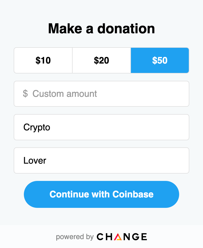
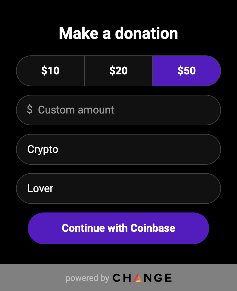
Here's an example of the default look, alongside a fully customized version:
Default | Customized
:----------------------:|:---------------------------:
 | 
## <change-drop-in>
A component for accepting crypto donations for any nonprofit in the Change system. It weighs < 13 KB gzipped.
### Quick Start
Add the following HTML to your page:
```html
```
You now have a searchable donation widget, with access to all 200K vetted nonprofits in the Change system.
Once you've signed up, set the `public-key` attribute to match your account. You can find your account's public key at https://api.getchange.io/developers. This component does not require any payment to use on your site.
#### All attributes
| Property | Description |
| -------- | ----------- |
| public-key (\*required) | The public key of your Change account. You can find your account's public key at https://api.getchange.io/developers. |
| featured-nonprofits | The ids of nonprofits to feature. You can find nonprofit IDs at https://api.getchange.io. Specify ids as a JSON array, like this (the quote types are important): `nonprofit-ids='["n_123", "n_abc"]'` |
| title | The title of the component. |
### Styles
You can change the style of the donation form using CSS custom properties. For example:
```html
```
#### All style properties
| Property | Description |
| -------- | ----------- |
| --color | Text color |
| --background-color | Component background |
| --color-primary | Primary and selected button text color. Affects the donation form. |
| --color-disabled | Disabled button text color. Affects the donation form. |
| --background-color-primary | Primary and selected button background color. Affects the donation form. |
| --background-color-primary-hover | Hovered primary and selected button background color. Affects the donation form. |
| --background-color-disabled | Disabled button background color. Affects the donation form. |
| --input-border-color | Input border color |
| --input-border-radius | Input border radius |
| --input-color | Input text color |
| --input-background-color | Input background color |
| --input-color-hover | Hovered input text color |
| --input-placeholder-color | Input placeholder color |
| --search-result-background-hover | Hovered background color of search results |
| --card-background-color | Card background color |
| --detail-color | Color of detail elements, such as the back button and field titles |