# @futurejj/react-native-checkbox
A papery checkbox for react native
[](https://badge.fury.io/js/%40futurejj%2Freact-native-checkbox)  [](https://github.com/JairajJangle/react-native-checkbox/actions/workflows/ci.yml)    [](https://github.com/JairajJangle/react-native-checkbox/issues?q=is%3Aopen+is%3Aissue)  [](https://snack.expo.dev/@futurejj/react-native-checkbox-example)  [](https://github.com/sponsors/JairajJangle)
A beautiful, customizable, and animated checkbox component for React Native applications. This component works across iOS, Android, and Web platforms with smooth animations and accessibility support.
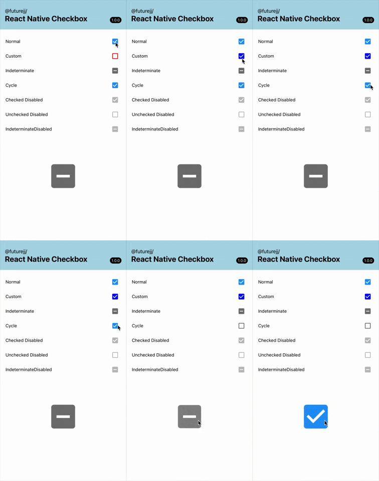
## Features
- ✨ Beautiful animations on state changes
- 🎨 Fully customizable colors and styling
- 📱 Cross-platform (iOS, Android, Web)
- 🔄 Three states: checked, unchecked, and indeterminate
- ♿ Accessibility support built-in
- 📏 Customizable size for various design needs
- 🔌 Works with Expo and standard React Native
- 🔍 TypeScript support with full type definitions
## Installation
```bash
yarn add @futurejj/react-native-checkbox
# or
npm install @futurejj/react-native-checkbox
```
### Icon Dependencies
This component uses Material Community Icons. You'll need to install either:
- `@expo/vector-icons` (if using Expo - built-in)
- `react-native-vector-icons` (if using React Native CLI - follow the installation instructions for `react-native-vector-icons`)
## Usage
### Basic Example
```jsx
import React, { useState } from 'react';
import { View } from 'react-native';
import { Checkbox } from '@futurejj/react-native-checkbox';
export default function CheckboxExample() {
const [checked, setChecked] = useState(false);
const toggleCheckbox = () => {
setChecked(!checked);
};
return (
);
}
```
### Customization
```jsx
{}} // handle press events
color="#6200ee" // color when checked
uncheckedColor="#757575" // color when unchecked
size={32} // customize size (default: 24)
style={{ marginRight: 8 }} // additional styles for the container
/>
```
## API Reference
### Props
| Prop | Type | Default | Description |
| ---------------- | --------------------------------------------- | ----------- | ------------------------------------ |
| `status` | `'checked' OR 'unchecked' OR 'indeterminate'` | Required | Current status of the checkbox |
| `disabled` | `boolean` | `false` | Whether the checkbox is disabled |
| `onPress` | `(e: GestureResponderEvent) => void` | Required | Callback when checkbox is pressed |
| `color` | `string` | `'#2196F3'` | Color of the checkbox when checked |
| `uncheckedColor` | `string` | `'#757575'` | Color of the checkbox when unchecked |
| `size` | `number` | `24` | Size of the checkbox icon |
| `testID` | `string` | - | Test ID for testing frameworks |
| `style` | `StyleProp` | - | Additional styles for container |
## Animation
The checkbox includes smooth animations:
- Scale animation when transitioning between states
- Custom border animation for a more engaging interaction
## Accessibility
This component is built with accessibility in mind:
- Proper role assignment (`checkbox`)
- Correct states reported to screen readers
- Live region updates for dynamic changes
## Contributing
See the [contributing guide](CONTRIBUTING.md) to learn how to contribute to the repository and the development workflow.
## License
MIT
---
## 🙏 Support the project


## ❤️ Thanks to
- Module built using [create-react-native-library](https://github.com/callstack/react-native-builder-bob)
- Heavily Inspired by [React Native Paper's Checkbox.Android](https://callstack.github.io/react-native-paper/docs/components/Checkbox/CheckboxAndroid) component
- Readme is edited using [Typora](https://typora.io/)
