# @furo/precompiled
The @furo/precompiled is for those who want to use the furo componetnt directly in HTML.
There is no build step needed. It is a convenient way to use the components to prototype some ideas or just play around
with FBP without a complex installation procedure. When you know that your ideas work, transfer them 1:1 to a web component,
so others can install, use and extend them.
> **Warning** This package was created teach furo FBP and for creating our demo systems , so we can use and show our components in a HUGO generated page.
Some of the files are very big at the moment, because they are not optimized yet.
## Demo
Run `npm run stard-cdn-sample` to start the cdn based sample.
## Installation
The version of this package represents the versioning of @furo/collection.
> **Note**
> Keep in mind that you can not mix CDN , NPM and self builded variants of the installation.
### CDN
You can use the components by refering to them via the CDN. This is good when your project is public and your server is slower then the CDN.
```html
```
### NPM
When your clients are in a closed environment and can not reach the real internet, prefer this variant. All files are delivered
from your servers.
```bash
npm i -S @furo/precompiled
```
### Build by your self and using `/dist`
When you need some other components, which are not installable as precompiled versions. Or you want to add your own components or compositions,
you can clone this repository and extend it by your own component, or the installed components.
Make sure that they are referenced by `collection.js` via a file that represents your *package*.
You can also add it as an entry point in the `rollup.config.js`.
You can copy the /dist folder to your project or make it available for your projects on some other way. Do this by pushing them to npm or by serving them via your CDN.
> This kind of installation is only one step away from a set up with open wc and working with [web dev server](https://modern-web.dev/docs/dev-server/overview/), which
> do not need a build step during the development phase. Consider to switch to this variant if your project gains complexity.
## Usage
To use the components you have to load the package where they reside in. You will notice, that some components have their
own js file. This is because they are used from different packages and is needed to keep a clean dependeny tree. It is ok
to load this components directly, when you do not need something other, or load the package where they reside. It has no
side effect if load them twice. Your browser knows what it have to do.
```html
```
## The init file [optional]
When you want to use the **data** components you have to install the specs that you have gerated with furo. This is a good
place to do it. Maybe you want to set the locales or install your translations too.
To load the `init.js` from your page, do the following in your index.html.
> Load the init.js before you load the other packages.
> Because some of them are dependant to the settings you do in the init and some will switch to a default setup.
[*index.html*]
```html
```
[*/config/init.js*]
```javascript
import { Init, i18n, Env } from '/dist/framework.js'
import {Types,Services} from "./data_environment.js";
/**
* Register resource bundle i18n
*/
import { Translations } from './translations.js';
i18n.registerResBundle(Translations);
/**
* Register the types and services which was generated by furo
*/
Init.registerApiTypes(Types);
Init.registerApiServices(Services);
/**
* register the API prefix based on the APPROOT.
* This information is used for furo-deep-link and furo-reverse-deep-link to resolve the api address.
*
* We use /api here, because we do not have a dedicated host like api.xxx.com for the api services
* @type {string}
*/
Env.api.prefix = `/api`;
Init.applyCustomApiPrefixToServicesAndTypes(Env.api.prefix);
/**
* Translate static messages in SPEC
*/
let locale = 'de_ch';
if (i18n.resbundle[Env.locale.toLowerCase().replace('-', '_')]) {
locale = Env.locale.toLowerCase().replace('-', '_');
}
Init.translateStaticTypeMessages(locale);
```
## Compatibility Table

## Package Structure
The packages structured and named like the modules from [components.furo.pro](https://components.furo.pro).
This module contains some additional files like `DOMFBP.js` which is needed when you want the fbp features on ``.
### Addtional files:
- **fixed-tooltip-display.js** Tooltip display for pages which scrolls the hole page.
- **DOMFBP.js** Append FPB to any dom node, even *body*
- **light-bulb.js** A nice example component used in the docs
- **ui5DisplayRegistry.js** A UI5 display registry for the dynamic type renderers.
- **ui5Icons.js** The complete iconset, because we can not expose them individually (sorry)
### collection.js
This file contains the full set of the precompiled package and is huge.
#### Elements
- [furo-app-bar-top](https://components.furo.pro/?t=FuroAppBarTop) Toolbar to place on top
- [furo-app-drawer](https://components.furo.pro/?t=FuroAppDrawer) Application drawer
- [furo-card](https://components.furo.pro/?t=FuroCard) Material design card element
- [furo-loading-indicator-bar](https://components.furo.pro/?t=FuroLoadingIndicator) An ugly progress bar
- [furo-tooltip](https://components.furo.pro/?t=FuroTooltip) displays a tooltip
- [furo-tooltip-display](https://components.furo.pro/?t=FuroTooltipDisplay) helper component for tooltip
### config.js
Furo config components
#### Elements
- [furo-config](https://components.furo.pro/?t=FuroConfig) access config data
- [furo-config-loader](https://components.furo.pro/?t=FuroConfigLoader) load config files
### data.js
This package contains the furo data components.
#### Elements
- [furo-api-fetch](https://components.furo.pro/?t=FuroApiFetch) fetch data from network
- [furo-collection-agent](https://components.furo.pro/?t=FuroCollectionAgent) interface component to handle collection requests
- [furo-custom-method](https://components.furo.pro/?t=FuroCustomMethod) interface component to handle custom methods
- [furo-data-object](https://components.furo.pro/?t=FuroDataObject) Typed data object, the heart of all furo-data related components
- [furo-deep-link](https://components.furo.pro/?t=FuroDeepLink) Resolve deep links HATEOAS based on query params
- [furo-entity-agent](https://components.furo.pro/?t=FuroEntityAgent) interface component to handle entity requests
- [furo-rel-exists](https://components.furo.pro/?t=FuroRelExists) checks for a specific rel in links
- [furo-reverse-deep-link](https://components.furo.pro/?t=FuroReverseDeepLink) create query param object from HATEOAS
- [furo-sortby-container](https://components.furo.pro/?t=FuroSortbyContainer) create query param object for sort
- ...
#### Elements
- [furo-data-bool-icon](https://components.furo.pro/?t=FuroDataBoolIcon) Displays a icon/symbol for a boolean value
- [furo-data-checkbox-input](https://components.furo.pro/?t=FuroDataCheckboxInput) binds to a furo data checkbox input element
- [furo-data-collection-dropdown](https://components.furo.pro/?t=FuroDataCollectionDropdown) bindable dropdown
- [furo-data-color-input](https://components.furo.pro/?t=FuroDataColorInput) Binds a entityObject field to a furo-color-input field
- [furo-data-date-input](https://components.furo.pro/?t=FuroDataDateInput) Bind a entityObject.field to a date input
- [furo-data-display](https://components.furo.pro/?t=FuroDataDisplay) Displays a data field
- [furo-data-file-input](https://components.furo.pro/?t=FuroDataFileInput) Binds a entityObject field to a furo-file-input field
- [furo-data-money-input](https://components.furo.pro/?t=FuroDataMoneyInput) Binds a entityObject field google.type.Money to a furo-number-input and currency dropdown fields
- [furo-data-number-input](https://components.furo.pro/?t=FuroDataNumberInput) Bind a entityObject.field to a number input
- [furo-data-password-input](https://components.furo.pro/?t=FuroDataPasswordInput) Bind a entityObject.field to a password input
- [furo-data-property](https://components.furo.pro/?t=FuroDataProperty) display and bind types of type any
- [furo-data-property-display](https://components.furo.pro/?t=FuroDataPropertyDisplay) helper for furo-data-property
- [furo-data-radio-buton-input](https://components.furo.pro/?t=FuroDataRadioButtonInput) furo data radio-button input element
- [furo-data-range-input](https://components.furo.pro/?t=FuroDataRangeInput) Bind a entityObject.field to a range input
- [furo-data-reference-search](https://components.furo.pro/?t=FuroDataReferenceSearch) autocomplete searcher for referenced types
- [furo-data-repeat](https://components.furo.pro/?t=FuroDataRepeat) automatic display of repeated fields
- [furo-data-search-input](https://components.furo.pro/?t=FuroDataSearchInput) Bind a entityObject.field to a search input
- [furo-data-sign-pad](https://components.furo.pro/?t=FuroDataSignPad) Bind a entityObject.field to a sign-pad input
- [furo-data-text-input](https://components.furo.pro/?t=FuroDataTextInput) Bind a entityObject.field to a text input
- [furo-data-textarea-input](https://components.furo.pro/?t=FuroDataTextareaInput) Bind a entityObject.field to a textarea input
- [furo-data-time-input](https://components.furo.pro/?t=FuroDataTimeInput) Bind a entityObject.field to a time input
- ...
#### Elements
- [furo-data-context-menu](https://components.furo.pro/?t=FuroDataContextMenu) a context menu
- [furo-data-table](https://components.furo.pro/?t=FuroDataTable) type based data table
- [furo-data-table-toggle](https://components.furo.pro/?t=FuroDataTableToggle) helper for furo-data-table
- [furo-data-hide-content](https://components.furo.pro/?t=FuroDataHideContent) hide content container with boolean fields
- [furo-type-renderer](https://components.furo.pro/?t=FuroTypeRenderer) display component to render fields according of the type
- ...
#### Elements
- [furo-append-object](https://components.furo.pro/?t=FuroAppendObject) append data to object literals
### doc-helper.js
Utils for the documentation system.
#### Elements
- [furo-button-bar](https://components.furo.pro/?t=FuroButtonBar) automatic button bar
- [furo-collapsible-box](https://components.furo.pro/?t=FuroCollapsibleBox) collapsible box with head
- [furo-form](https://components.furo.pro/?t=FuroForm) form container
- [furo-form-layouter](https://components.furo.pro/?t=FuroFormLayouter) form auto layouter
- [furo-input-row](https://components.furo.pro/?t=FuroInputRow) *DEPRECATED* label slot layout
- ...
### framework.js
This package contains the furo "framework" classes.
### Classes
- [Env](https://components.furo.pro/?t=Env) stores your environment data
- **furo.js** Export bundle for all framework classes
- [i18n](https://components.furo.pro/?t=i18n) Base i18n class
- [iconset](https://components.furo.pro/?t=Iconset) Icon set loader
- [Sys](https://components.furo.pro/?t=Sys) Set your locale
- [Init](https://components.furo.pro/?t=Init) App init stuff
- [Theme](https://components.furo.pro/?t=Theme) Theming stuff
### furo-fbp.js
The core furo FBP packages and classes. Read more on [fbp.furo.pro](fbp.furo.pro)
#### Elements
- [furo-icon](https://components.furo.pro/?t=FuroIcon) displays an icon
#### Elements
- [furo-button](https://components.furo.pro/?t=FuroButton) a md button
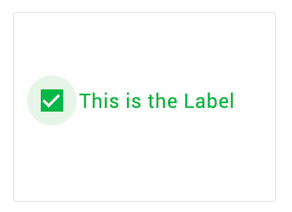
- [furo-checkbox](https://components.furo.pro/?t=FuroCheckbox) checkbox input box
- [furo-checkbox-input](https://components.furo.pro/?t=FuroCheckboxInput) checkbox input element with label
- 
- [furo-chip](https://components.furo.pro/?t=FuroChip) chips
- [furo-color-input](https://components.furo.pro/?t=FuroColorInput) color input element
- [furo-date-input](https://components.furo.pro/?t=FuroDateInput) date input element
- [furo-file-dialog](https://components.furo.pro/?t=FuroFileDialog) file input element
- [furo-file-drop](https://components.furo.pro/?t=FuroFileDrop) dropzone for files
- [furo-icon-button](https://components.furo.pro/?t=FuroIconButton) icon button element
- [furo-input-chip](https://components.furo.pro/?t=FuroInputChip) input chips
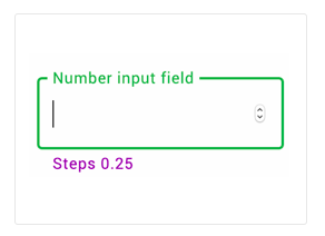
- [furo-number-input](https://components.furo.pro/?t=FuroNumberInput) number input element
- 
- [furo-password-input](https://components.furo.pro/?t=FuroPasswordInput) password input element
- [furo-radio-button](https://components.furo.pro/?t=FuroRadioButton) radio input circle
- [furo-radio-button-input](https://components.furo.pro/?t=FuroRadioButtonInput) radio input with label
- [furo-range-input](https://components.furo.pro/?t=FuroRangeInput) range slider
- [furo-search-input](https://components.furo.pro/?t=FuroSearchInput) search input element
- [furo-select-input](https://components.furo.pro/?t=FuroSelectInput) select input (dropdown)
- [furo-sign-pad](https://components.furo.pro/?t=FuroSignPad) draw or sign
- [furo-text-input](https://components.furo.pro/?t=FuroTextInput) text input element
- [furo-textarea-input](https://components.furo.pro/?t=FuroTextareaInput) textarea input element
- [furo-time-input](https://components.furo.pro/?t=FuroTimeInput) time input element
- ...
### layout.js
Layout components. Sometimes it is hard to describe the elements with text.
Just take a look at the demos and you will get the idea.
#### Elements
- [furo-snackbar](https://components.furo.pro/?t=FuroSnackbar) a snackbar
- [furo-empty-spacer](https://components.furo.pro/?t=FuroEmptySpacer) fill the space in a furo-xxxx-flex
- [furo-horizontal-flex](https://components.furo.pro/?t=FuroHorizontalFlex) horizontal alignment
- [furo-panel](https://components.furo.pro/?t=FuroPanel) content panel with predefined margins
- [furo-ripple](https://components.furo.pro/?t=FuroRipple) add a ripple effect
- [furo-split-view](https://components.furo.pro/?t=FuroSplitView) splitted layout
- [furo-vertical-flex](https://components.furo.pro/?t=FuroVerticalFlex) vertical alignment of stuff
- [furo-vertical-scroller](https://components.furo.pro/?t=FuroVerticalScroller) vertical scroll
- ...
**needs a furo spec to work**
#### Elements
- [furo-panel-coordinator-tabs](https://components.furo.pro/?t=FuroPanelCoordinatorTabs) tab navigation for panel-coordinator
- [furo-panel-head](https://components.furo.pro/?t=FuroPanelHead) dislay a navigationNode as title
- [furo-tree](https://components.furo.pro/?t=FuroTree) tree navigation menu
#### Elements
- [furo-snackbar](https://components.furo.pro/?t=FuroSnackbar) a snackbar
- [furo-snackbar-display](https://components.furo.pro/?t=FuroSnackbarDisplay) helper component to show a snackbar
- [furo-banner](https://components.furo.pro/?t=FuroBanner) a banner
- [furo-banner-display](https://components.furo.pro/?t=FuroBannerDisplay) helper component to show a banner
- ...
### route.js
Furo routing components
#### Elements
- [furo-app-flow](https://components.furo.pro/?t=FuroAppFlow) Application Flow => routing
- [furo-app-flow-router](https://components.furo.pro/?t=FuroAppFlowRouter) Application Flow => routing
- [furo-location](https://components.furo.pro/?t=FuroLocation) url watcher
- [furo-pages](https://components.furo.pro/?t=FuroPages) Simple content switcher
- [furo-panel-coordinator](https://components.furo.pro/?t=FuroPanelCoordinator) Complex content switcher based on furo-tree
- [furo-qp-changer](https://components.furo.pro/?t=FuroQpChanger) deep linking helper
- ...
#### Elements
- [furo-de-bounce](https://components.furo.pro/?t=FuroDeBounce) event de bouncer
- [furo-interval-pulse](https://components.furo.pro/?t=FuroIntervalPulse) trigger an event in intervals
- ...
### util.js
A collection of utility elements.
#### Elements
- [furo-fetch-json](https://components.furo.pro/?t=FuroFetchJson) fetch json data
- [furo-get-clipboard](https://components.furo.pro/?t=FuroGetClipboard) get clipboard content
- [furo-head-tail](https://components.furo.pro/?t=FuroHeadTail) split an array
- [furo-key-filter](https://components.furo.pro/?t=FuroKeyFilter) keyboard event filter
- [furo-keydown](https://components.furo.pro/?t=FuroKeydown) keyboard event listener
- [furo-markdown](https://components.furo.pro/?t=FuroMarkdown) renders markdown data
- [furo-navigation-pad](https://components.furo.pro/?t=FuroNavigationPad) keyboard navigation helper
- [furo-pretty-json](https://components.furo.pro/?t=FuroPrettyJson) pretty prints json data
- [furo-put-clipboard](https://components.furo.pro/?t=FuroPutClipboard) write content to clipboard
- ...
### ui5.js
Enterprise-flavored sugar on top of native APIs!
Compliant to SAP Fiori design language. Rich feature set. Includes all enterprise standards, such as accessibility, i18n, theming, etc
- [https://sap.github.io/ui5-webcomponents/](https://sap.github.io/ui5-webcomponents/)
- [https://github.com/SAP/ui5-webcomponents](https://github.com/SAP/ui5-webcomponents)
## What is inside
For seamless integration into the Furo environment, we have slightly extended some UI5 components.
> All not listed components can be obtained directly from SAP
#### Elements
- [furo-ui5-data-text-input](https://components.furo.pro/?t=FuroUi5DataTextInput) a text input component
- [furo-ui5-data-textarea-input](https://components.furo.pro/?t=FuroUi5DataTextareaInput) a text area input component
- [furo-ui5-data-number-input](https://components.furo.pro/?t=FuroUi5DataNumberInput) a number input component
- [furo-ui5-data-password-input](https://components.furo.pro/?t=FuroUi5DataPasswordInput) a password input component
- [furo-ui5-data-date-picker](https://components.furo.pro/?t=FuroUi5DataDatePicker) a date input component
- [furo-ui5-data-collection-dropdown](https://components.furo.pro/?t=FuroUi5DataCollectionDropdown) a dropdown component
- [furo-ui5-data-checkbox-input](https://components.furo.pro/?t=FuroUi5DataCheckboxInput) a checkbox component
- [furo-ui5-data-radio-button](https://components.furo.pro/?t=FuroUi5DataRadioButton) a radio button component
- [furo-ui5-data-money-input](https://components.furo.pro/?t=FuroUi5DataMoneyInput) a type money input component
- [furo-ui5-data-property](https://components.furo.pro/?t=FuroUi5DataProperty) a dynamic property component
- [furo-ui5-data-radio-button](https://components.furo.pro/?t=FuroUi5DataRadioButton) a radio button component
- [furo-ui5-data-reference-search](https://components.furo.pro/?t=FuroUi5DataReferenceSearch) a reference search component
- [furo-ui5-data-segmented-button](https://components.furo.pro/?t=FuroUi5DataSegmentedButton) a segmented button component
- [furo-ui5-data-toggle-button](https://components.furo.pro/?t=FuroUi5DataToggleButton) a toggle button component
- [furo-ui5-data-display](https://components.furo.pro/?t=FuroUi5DataDisplay) a display field component
- [furo-ui5-button](https://components.furo.pro/?t=FuroUi5Button) a simple button with convenience functions
- [furo-ui5-busyindicator](https://components.furo.pro/?t=FuroUi5Busyindicator) component to signal that some operation is going on
- [furo-ui5-data-table](https://components.furo.pro/?t=FuroUi5DataTable) component to display data in tabular form
### Compositions
- [furo-ui5-pagination](https://components.furo.pro/?t=FuroUI5Pagination) a pagination bar
- [furo-ui5-data-text-input-labeled](https://components.furo.pro/?t=FuroUi5DataTextInputLabeled) a labeled text input component
- [furo-ui5-data-textarea-input-labeled](https://components.furo.pro/?t=FuroUi5DataTextareaInputLabeled) a labeled text area input component
- [furo-ui5-data-number-input-labeled](https://components.furo.pro/?t=FuroUi5DataNumberInputLabeled) a labeled number input component
- [furo-ui5-data-password-input-labeled](https://components.furo.pro/?t=FuroUi5DataPasswordInputLabeled) a labeled password input component
- [furo-ui5-form-field-container](https://components.furo.pro/?t=FuroUi5FormFieldContainer) a form field container
- [furo-ui5-data-radio-button-group](https://components.furo.pro/?t=FuroUi5DataRadioButtonGroup) a radio button group component
- [furo-ui5-radio-button-group](https://components.furo.pro/?t=FuroUi5RadioButtonGroup) a radio button group component
- [furo-ui5-notification-list](https://components.furo.pro/?t=FuroUi5NotificationList) a notification component