# Text
In the short term, the new `Text` control is named `TextV1` while it clashes with the existing older control. Once we deprecate the old control, it will be renamed to `Text`. It may be useful to rename the control to `Text` using the import syntax to simplify the rename:
```ts
import { TextV1 as Text } from '@fluentui-react-native/text';
```
FURN components that have imported from experimental-text now use the above syntax to use `TextV1`.
## Background
The `Text` component is for displaying text, and supports nesting, styling, and touch handling.
## Requirements
If using FURN's theming, the `Text` requires use of the `ThemeProvider` from `@fluentui-react-native/theme` to work properly with themes. Please see [this page](../../../docs/pages/Guides/UpdateThemeProvider.md) for information on updating your `ThemeProvider` if using the version from `@uifabricshared/theming-react-native`.
## Sample Code
Basic example:
```jsx
Hello World
```
More examples on the [Test pages for Text](../../../apps/tester-core/src/TestComponents/TextV1). Instructions on running the tester app can be found [here](../../../apps/fluent-tester/README.md).
## Visual Examples
Win32:

```jsx
This line has been underlined and striked through
```
```jsx
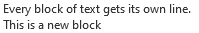
<>
Every block of text gets its own line.
This is a new block
```

```jsx
Text components inside a parent text component is inline text
This entire block is a RichLabel.
```

```jsx
const RedCaptionBold = Text.customize({ variant: 'captionStandard', fontWeight: '700', color: '#ff0000' });
RedCaptionBold;
```
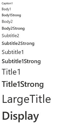
V1 `Text` component supports variant types that have preset font family, size, and weight values.
```jsx
Caption1
Body1
Body1Strong
Body2
Body2Strong
Subtitle2
Subtitle2Strong
Subtitle1
Subtitle1Strong
Title1
Title1Strong
LargeTitle
Display
```
```jsx
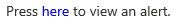
Press{' '}
here
{' '}
to view an alert.
```
## API
The `Text` control is rendered as a `react-native` Text(`RNText`). However, `RNText`and `Text` do not align in their set of props entirely.
### Props
Below is the set of props the Text supports:
```ts
export type TextProps = TBase &
FontVariantTokens & {
/**
* foreground text color
*/
color?: ColorValue;
/**
* Aligns text based on the parent container.
*
* @defaultValue start
*/
align?: TextAlign;
/**
* Applies a block display for the content.
*
* @defaultValue false
*/
block?: boolean;
/**
* Applies the font family to the content.
*
* @defaultValue base
*/
font?: TextFont;
/**
* Applies the italic font style to the content.
*
* @defaultValue false
*/
italic?: boolean;
/**
* Applies the strikethrough text decoration to the content.
*
* @defaultValue false
*/
strikethrough?: boolean;
/**
* Applies font size and line height based on the theme tokens.
*
* @defaultValue 300
*/
size?: TextSize;
/**
* Truncate overflowing text for block displays.
*
* @defaultValue false
*/
truncate?: boolean;
/**
* Applies the underline text decoration to the content.
*
* @defaultValue false
*/
underline?: boolean;
/**
* Applies font weight to the content.
*
* @defaultValue regular
*/
weight?: TextWeight;
/**
* Wraps the text content on white spaces.
*
* @defaultValue true
*/
wrap?: boolean;
};
8/1/22 Notes:
- `block` => On win32, instead of setting it as a boolean prop, block display is applied by default, and is overridden as inline when `` is wrapped by a parent ``.
- `font` => According to design token redlines, `font` prop is given a giant string with a delimiter of font families for each enum type (`base`/`numeric`/`monospace`), We currently don't have a way to deal with this fontFamily format. We only support a single font family for each font type.
```
### Styling Tokens
Tokens can be used to customize the styling of the control by using the `customize` function on the `Text`. For more information on using the `customize` API, please see [this page](../../framework/composition/README.md). The `Text` has the following tokens:
```ts
export type TextTokens = FontTokens & IForegroundColorTokens & TextStyle;
```
## Behaviors
### Pressable Text
`Text` can be rendered as pressable.
### Interaction
#### Keyboard interaction
The following is a set of keys that interact with the `Text` component:
| Key | Description |
| ------- | -------------------------------------------------------------- |
| `Tab` | If `onPress` or `focusable` is set, component will gain focus. |
| `Space` | Executes the function passed into the `onPress` prop. |
#### Cursor interaction for Pressable Text
- Cursor moves onto pressable text: Should immediately change the styling of the `Text` so that it appears to be hovered.
- Cursor moves out of pressable text: Should immediately remove the hovered styling of the `Text`.
- Mouse click: Should handle `onPress` event of `Text` and move focus to its target.
#### Touch interaction
The same behavior as above translated for touch events. This means that there is no equivalent for `onHoverIn` and `onHoverOut`, which makes it so that the hovered state cannot be accessed.
## Accessibility
### Expected behavior
- Should mix in the accessibility props expected for a `Text` component.
- Should be keyboard tabbable and focusable.
- onAccessibilityTap defaults to onPress unless set otherwise