# Shadow
## Background
A `Shadow` is a component that can be used to add Fluent shadows to other components.
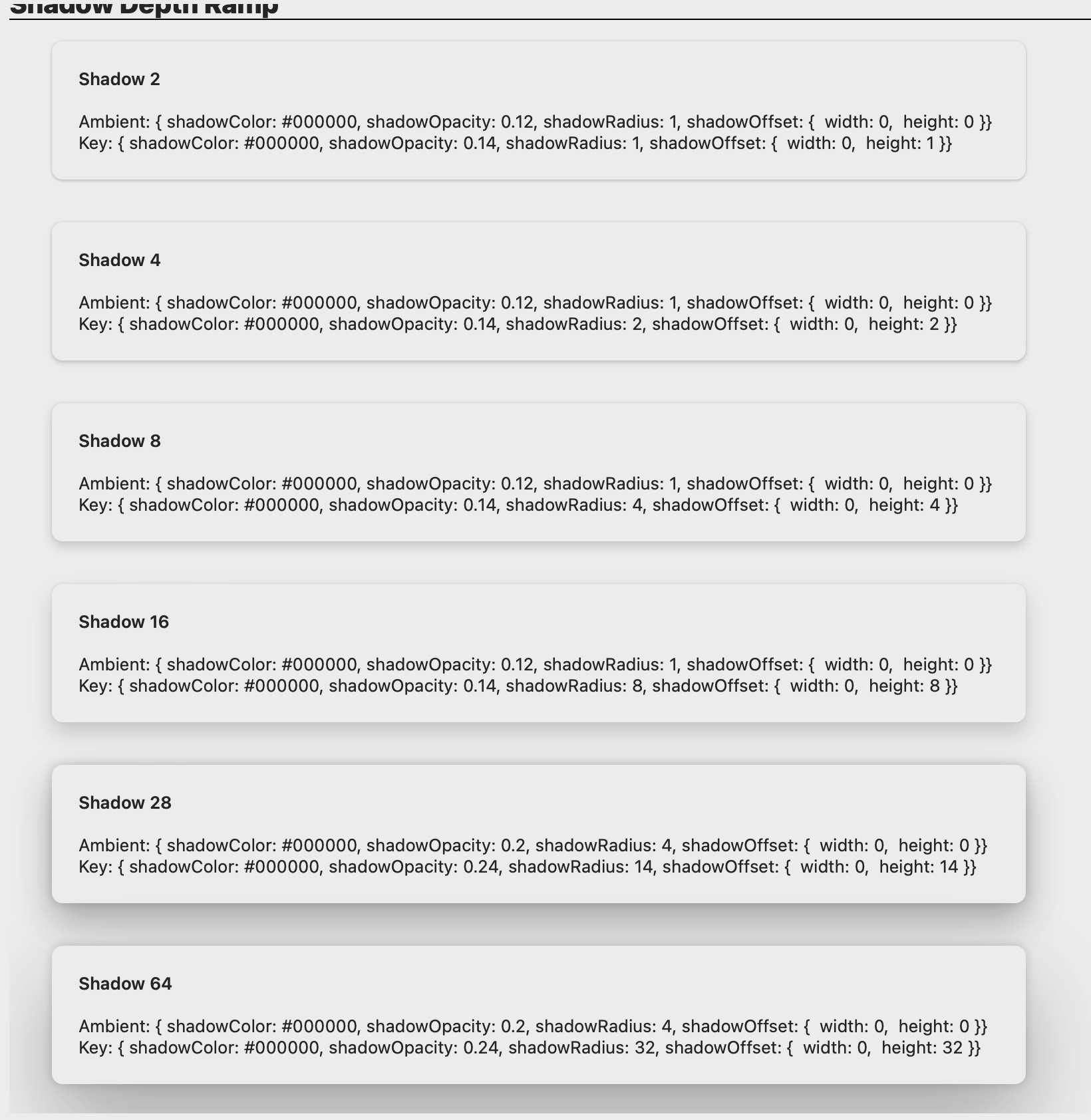
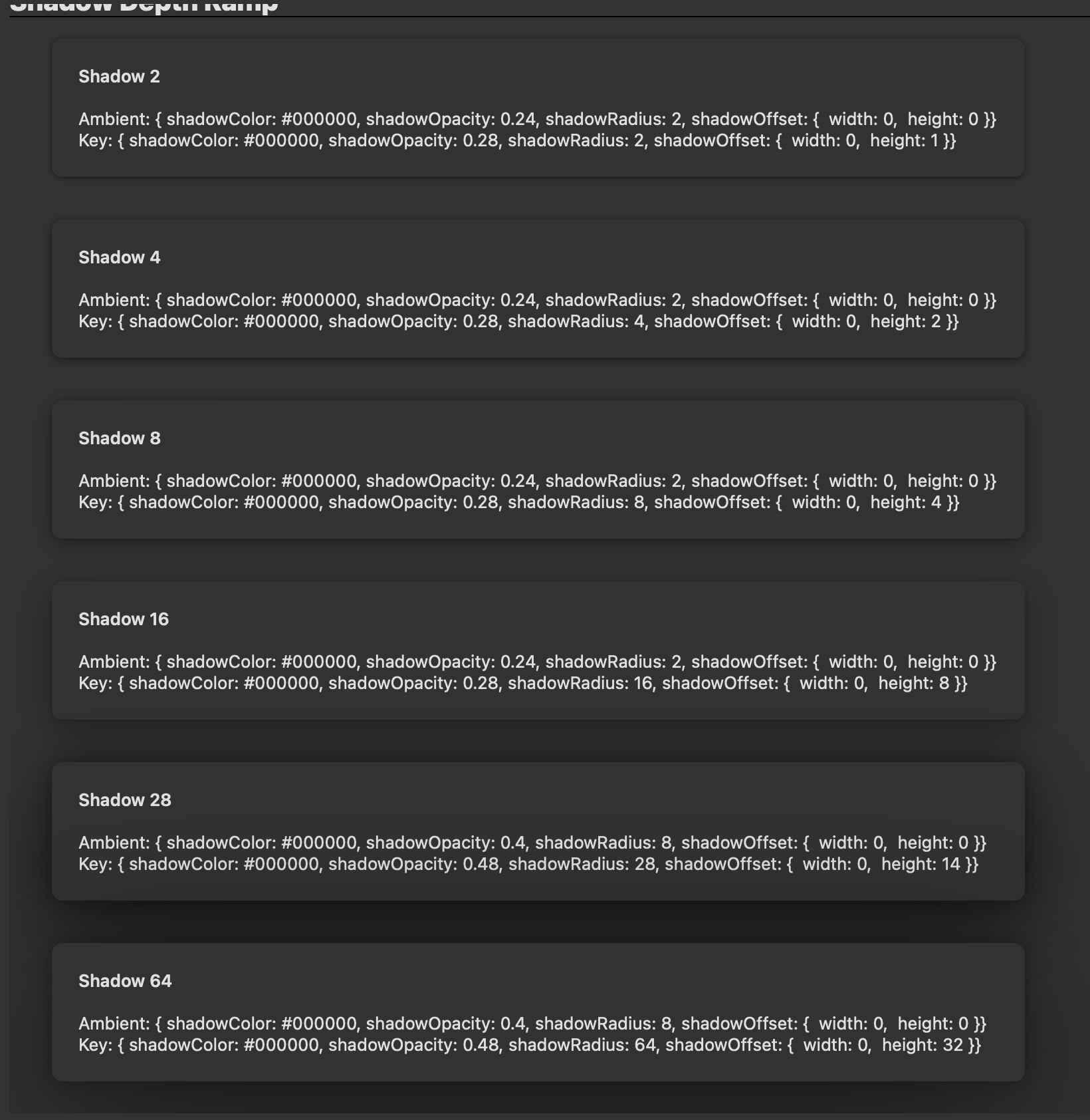
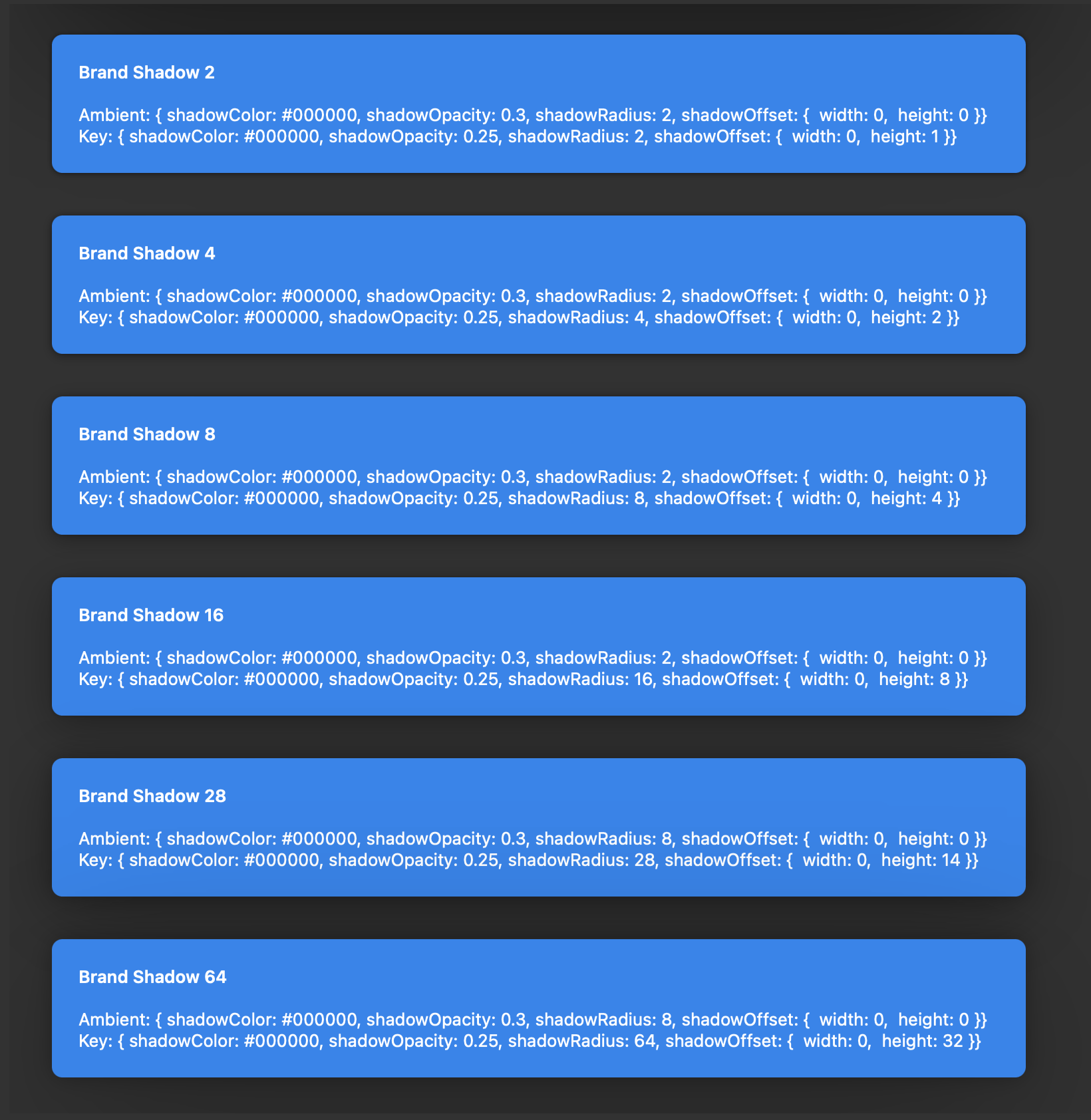
Shadows defined in the Fluent design system are actually comprised of two shadows. The **key shadow** is used to create a feeling of distance, and the **ambient shadow** is used to define the edges of the shape.
The `Shadow` component is different from other components in that it was created to address limitations with React Native - Views in React Native can only have one Shadow set at a time. This component provides an easy way to add a Fluent shadow to another component.
## Shadow Depth Ramp
These are the current `Shadow` variants:
| | Light mode | Dark mode |
| --------------- | ----------------------------------------------------------------------------------------------------------------------------------------------- | ---------------------------------------------------------------------------------------------------------------------------------------------- |
| Regular shadows | | |
| Brand shadows | | |
## Sample Code
Examples adding some Shadows to a Button:
```tsx
```
```tsx
```
For more examples of using Shadow, please see the [ShadowTest test page](https://github.com/microsoft/fluentui-react-native/tree/main/apps/tester-core/src/TestComponents/Shadow) in the [Fluent Tester app](https://github.com/microsoft/fluentui-react-native/blob/main/apps/fluent-tester/README.md).
For an example of adding a Shadow as a slot to a Fluent component, please see the [FAB component](https://github.com/microsoft/fluentui-react-native/tree/main/packages/components/Button/src/FAB) - this component exists on both iOS and Android, but currently only the iOS version uses the Shadow component. The [Notification component](https://github.com/microsoft/fluentui-react-native/tree/main/packages/components/Notification) is another example that uses the Shadow component.
## API
### Props
The `Shadow` component takes in one prop called `ShadowToken`. The variants of ShadowToken are all defined in the theme.
If `undefined` is passed into the `shadowToken` prop, no shadow will be rendered.
`Shadow` must take exactly one child, which must be of type View.
## Implementation details
In order to get around the React Native restriction of one Shadow per View, the Shadow component adds an extra View around the original View. One of the shadows is placed on the original View and the other is placed on the extra View. The Shadow component smartly extracts the original View's style props so that the extra View isn't noticable (ex. will always be the same size as the original View, padding/margins are set correctly, etc.)
## Notes
- Known issue: The Shadow component does not currently work if you are wrapping an Animated component.
- Known issue: there may be some slight rounding discrepancies due to hex to decimal rounding errors, ex. opacity 0.24 may end up at 0.25.
- One additional adjustment that was needed on Apple platforms was to divide the blur radius token value by 2. This was needed because shadow blur/radius looks different across platforms - more information here: https://github.com/microsoft/apple-ux-guide/blob/gh-pages/Shadows.md
 |
|  |
| Brand shadows |
|
| Brand shadows | 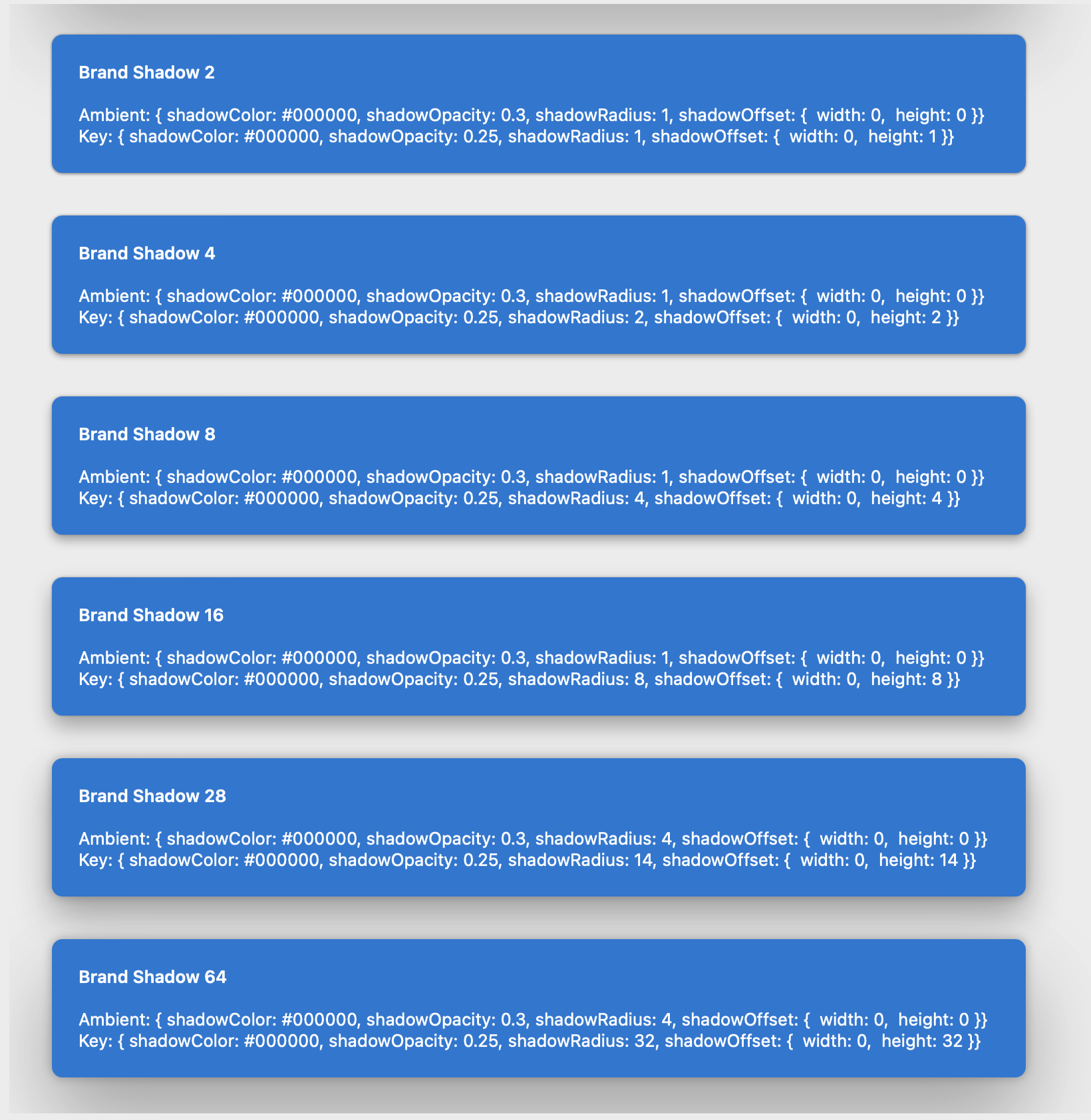 |
|  |
## Sample Code
Examples adding some Shadows to a Button:
```tsx
|
## Sample Code
Examples adding some Shadows to a Button:
```tsx