# Chip
## Background
Chips are compact representations of entities (most commonly, people) that can be typed in, deleted or dragged easily.
```ts
import { Chip } from '@fluentui-react-native/chip';
```
## Sample Code
Basic examples:
```jsx
Chip
```
More examples on the [Test pages for the Chip](../../../apps/tester-core/src/TestComponents/Chip). Instructions on running the tester app can be found [here](../../../apps/fluent-tester/README.md).
## Visual Examples
##### Dark Mode
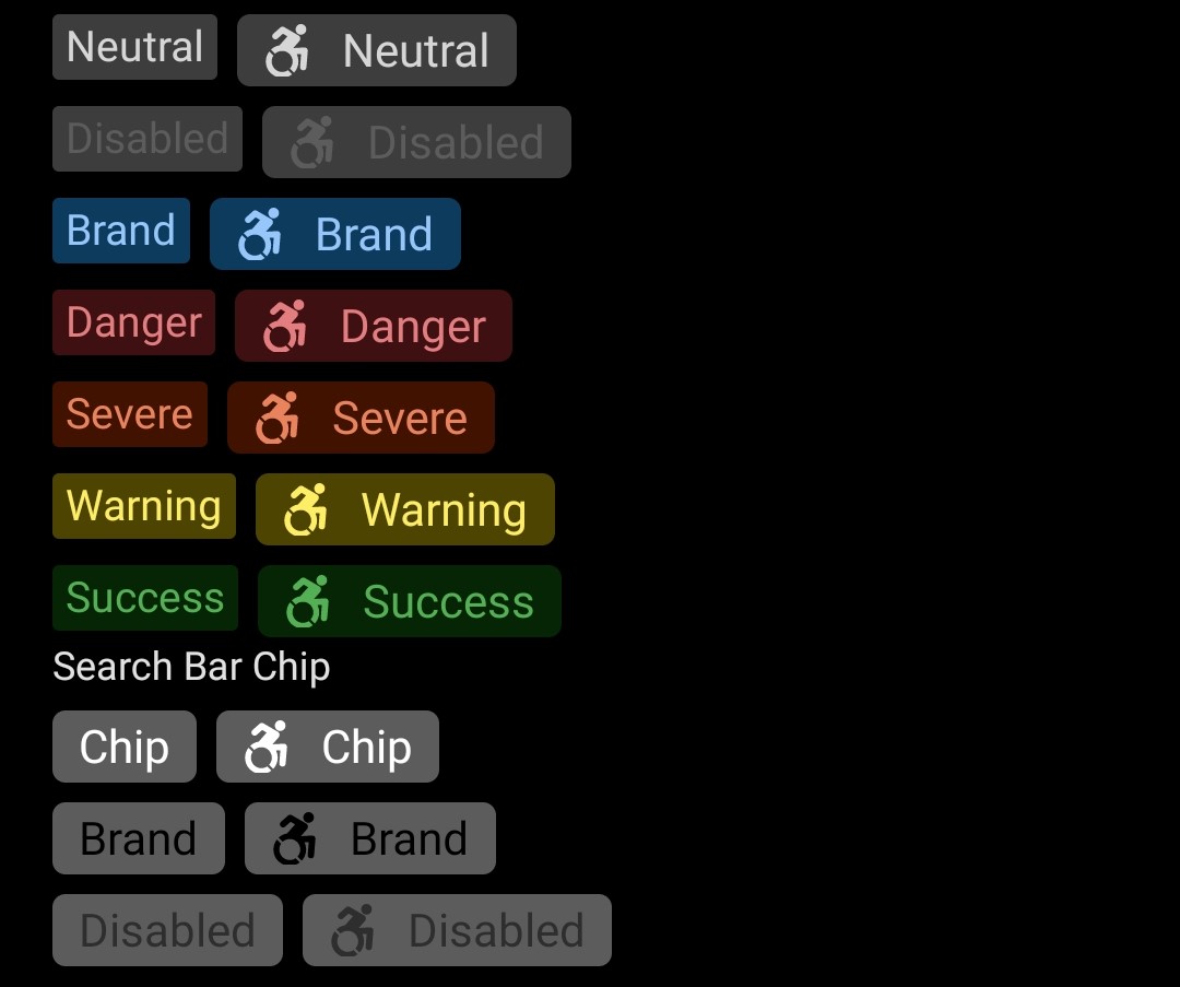
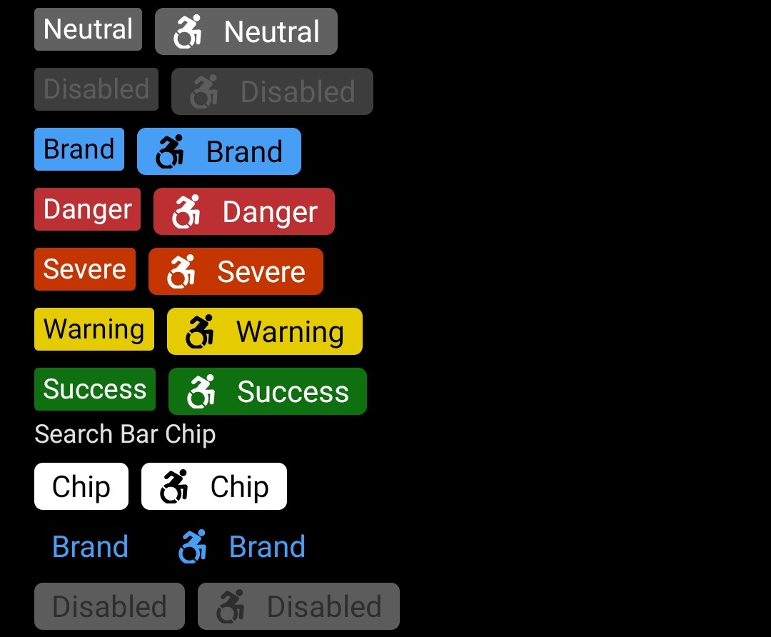
Clicking on the chip toggles the selected state.
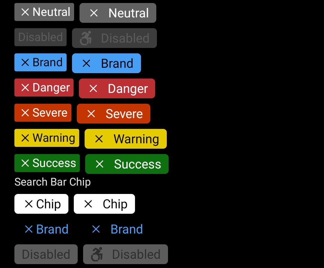
Chip can show a close icon in selected state.
##### Light Mode
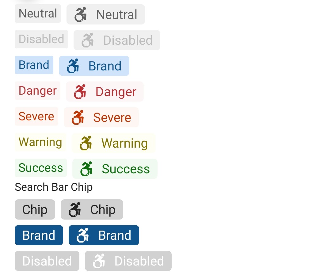
Clicking on the chip toggles the selected state.
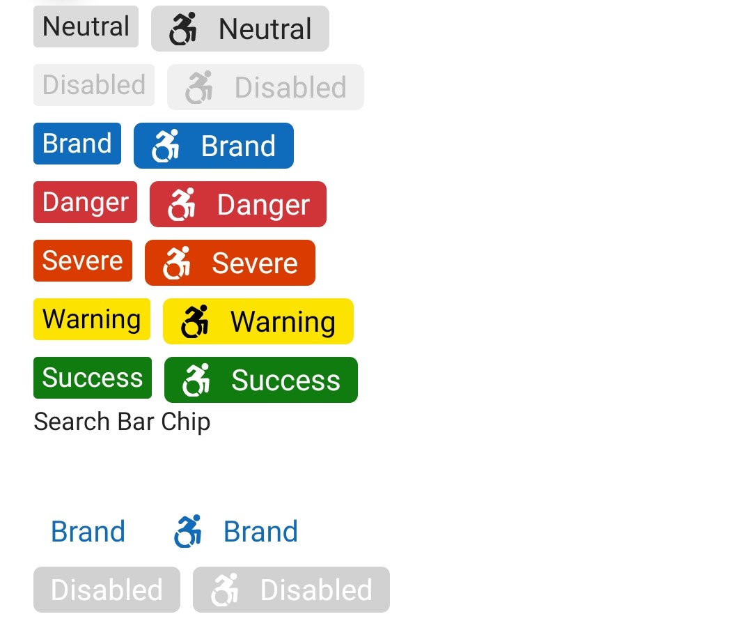
Chip can show a close icon in selected state.
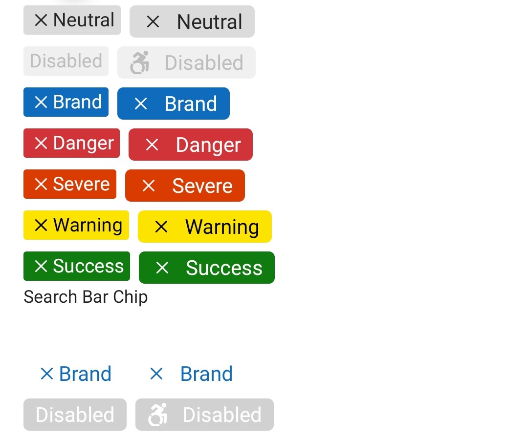
## Chip
## Variants
### Sizes
`Chip` supports sizes: `small`, `medium`.
### Color
The Chip supports preset and custom colors: `neutral`, `brand`, `danger`, `severe`, `success`, `warning`, with `neutral` being the default.
### Icon
The `Chip` component can include an `icon`.
Out of `small` and `medium` sizes, the `icon` is shown only for `medium` size. Chip also supports a default close icon in `selected` state. This is controlled by `showCloseIcon` prop.
Note - Close icon is shown even for `small` size.
### Image
An `image` can be added to the Chip as an optional content.
Example:
```jsx
Chip with
optional content
```
### Content
Content is passed as part of `children` prop.
For long Chips it's up to consumer how they want to truncate/hide the content.
### Search Bar Chip
Special styling is applied when the `Chip` is used in a `SearchBar` component.
To enable this pass the `searchBar` prop to the `Chip`.
### States
The following section describes the additional states a `Chip` can have.
#### Selected state
A selected `Chip` changes styling to communicate that the chip is currently selected or toggled.
## API
### Slots
The `Chip` component has the following slots:
- `root` - The outer container representing the `Chip` wrapper.
- `icon` - If specified, renders an `icon`.
- `text` - This slot is used to render text content.
- `iconPressable` - This provides the press target for the `icon`.
The slots can be modified using the `compose` function on the `Chip`. For more information on using the `compose` API, please see [this page](../../framework/composition/README.md).
### Props
```ts
export interface ChipConfigurableProps {
/*
* Source URL or name of the icon to show on the Chip.
*/
icon?: IconSourcesType;
/**
* The icon color.
*/
iconColor?: ColorValue;
}
```
```ts
export interface ChipProps extends IViewProps, ChipConfigurableProps {
/**
* A Chip can be one of preset colors.
* @defaultvalue neutral
*/
chipColor?: ChipColor;
/** Sets style of Chip to a preset size style
* @defaultvalue medium
*/
size?: ChipSize;
/**
* Whether the Chip is disabled or not.
* @defaultvalue false
*/
disabled?: boolean;
/**
* Selected state. Mutually exclusive to 'defaultSelected'. Use this if you control the selected state at a higher level
* and plan to pass in the correct value based on handling onChange events and re-rendering.
* @defaultvalue false
*/
selected?: boolean;
/**
* Default selected state. Mutually exclusive to 'selected'. Use this if you want an uncontrolled component, and
* want the Chip instance to maintain its own state.
*/
defaultSelected?: boolean;
/**
* Callback that is called when the selected value has changed.
*/
onSelectionChange?: (e: InteractionEvent, isSelected: boolean) => void;
/**
* Apply when chip is intended to be used in a search bar.
* Special styling is applied to the chip.
*/
searchBar?: boolean;
/**
* Show close icon when in 'selected' state.
* @defaultvalue false
*/
showCloseIcon?: boolean;
/**
* Close icon's accessibility label.
*/
closeIconAccessibilityLabel?: string;
/**
* A callback to call on close icon click event.
*/
closeIconOnPress?: (e: InteractionEvent) => void;
}
```
### Styling Tokens
Tokens can be used to customize the styling of the control by using the `customize` function on the `Chip`. For more information on using the `customize` API, please see [this page](../../framework/composition/README.md). The `Chip` has the following tokens:
```ts
export interface ChipTokens extends LayoutTokens, FontTokens, IBorderTokens, Omit, ChipConfigurableProps {
/**
* Set the text color
*/
color?: ColorValue;
/**
* Set the bottom edge of the Chip
*/
bottom?: FlexStyle['bottom'];
/**
* The icon size.
*/
iconSize?: number;
/**
* Set the left edge of the Chip
*/
left?: FlexStyle['left'];
/**
* Set the right edge of the Chip
*/
right?: FlexStyle['right'];
/**
* Set padding for text container when Chip contains
* icons or images
*/
textMargin?: number;
/**
* Sizes of the Chip
*/
small?: ChipTokens;
medium?: ChipTokens;
/**
* When isRTL - applies Chip from the left side
*/
rtl?: ChipTokens;
/**
* Colors of the Chip
*/
neutral?: ChipTokens;
brand?: ChipTokens;
danger?: ChipTokens;
severe?: ChipTokens;
success?: ChipTokens;
warning?: ChipTokens;
disabled?: ChipTokens;
searchBar?: ChipTokens;
/**
* Selected state tokens for Chip
*/
selected?: ChipTokens;
}
```
### Accessibility
Chips recieve focus and are accessible. They can be toggled.
Information about the chip should be added to the element that hosts the Chip through the element's `accessibilityLabel`.