# Compound Button
## Background
The `CompoundButton` is a `Button` that is designed to show an extra line of text.
Does not render on mobile (Android/iOS).
## Requirements
If using FURN's theming, the `CompoundButton` requires use of the `ThemeProvider` from `@fluentui-react-native/design/theming` to work properly with themes. Please see [this page](../../../../../docs/pages/Guides/UpdateThemeProvider.md) for information on updating your `ThemeProvider` if using the version from `@uifabricshared/theming-react-native`.
## Sample Code
Basic examples:
```jsx
Text
Text
Text
Text
Text
```
More examples on the [Test pages for the Button](../../../../../apps/tester-core/src/TestComponents/Button). Instructions on running the tester app can be found [here](../../../../../apps/fluent-tester/README.md).
## Visual Examples
Win32:
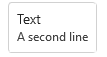
```tsx
Text
```

```tsx
Text
```
## Variants
Variant options are the same as the base `Button` component. This section will note main differences in design from the the base `Button` component.
### Icon
The space for the icon is larger in a `CompoundButton`. The `CompoundButton` is designed so that it can hold an illustration in the place of an icon.
## API
### Slots
The `CompoundButton` component has three slots, or parts. The slots behave as follows:
- `root` - The outer container representing the `CompoundButton` itself that wraps everything passed via the `children` prop.
- `icon` - If specified, renders an `icon` either before or after the `children` as specified by the `iconPosition` prop.
- `contentContainer` - An inner container which wraps the text of the control.
- `content` - If specified, renders the first entry of `children` as text.
- `secondaryContent` - If specified, renders `text`, usually in a smaller font than the `content` slot to show that it is descriptive text.
The slots can be modified using the `compose` function on the `CompoundButton`. For more information on using the `compose` API, please see [this page](../../../../framework/composition/README.md).
### Props
```ts
export interface CompoundButtonProps extends ButtonProps {
/**
* Second line of text that describes the action this button takes.
*/
secondaryContent?: string;
}
```
### Styling Tokens
Tokens can be used to customize the styling of the control by using the `customize` function on the `Button`. For more information on using the `customize` API, please see [this page](../../../../framework/composition/README.md). The `CompoundButton` has the following tokens:
```ts
export interface CompoundButtonTokens extends ButtonTokens {
/**
* Font of the second line of text on the button.
*/
secondaryContentFont?: FontTokens;
/**
* Color of the second line of text on the button.
*/
secondaryContentColor?: ColorValue;
/**
* States that can be applied to a button.
* These can be used to modify styles of the button when under the specified state.
*/
hovered?: CompoundButtonTokens;
focused?: CompoundButtonTokens;
pressed?: CompoundButtonTokens;
disabled?: CompoundButtonTokens;
primary?: CompoundButtonTokens;
subtle?: CompoundButtonTokens;
small?: CompoundButtonTokens;
medium?: CompoundButtonTokens;
large?: CompoundButtonTokens;
}
```
## Behaviors
Same as base `Button`.