) that contains the visualization and can be embedded in any html document.
owidVis.OWIDTrendChart(data).node()
## Building the library
You can download the code from this respository and then
Install dependencies:
$ npm i
Build javascript code from Typescript sources (we use rolloutjs to create umd bundles)
$ npm run build
Distribution library can be found at *dist/owid-vis-poc.umd.js* or *dist/owid-vis-poc.umd.min.js*
The library depends on "lodash" (which is included in the bundel) and d3js (which is **not** included in the bundle)
Users are expected to import d3.js in their projects
## Characteristics of OWID data
Current OWID Grappher consumes data from a MySQL database that is publicly distributed. When we look at the data model, we can identify some key concepts
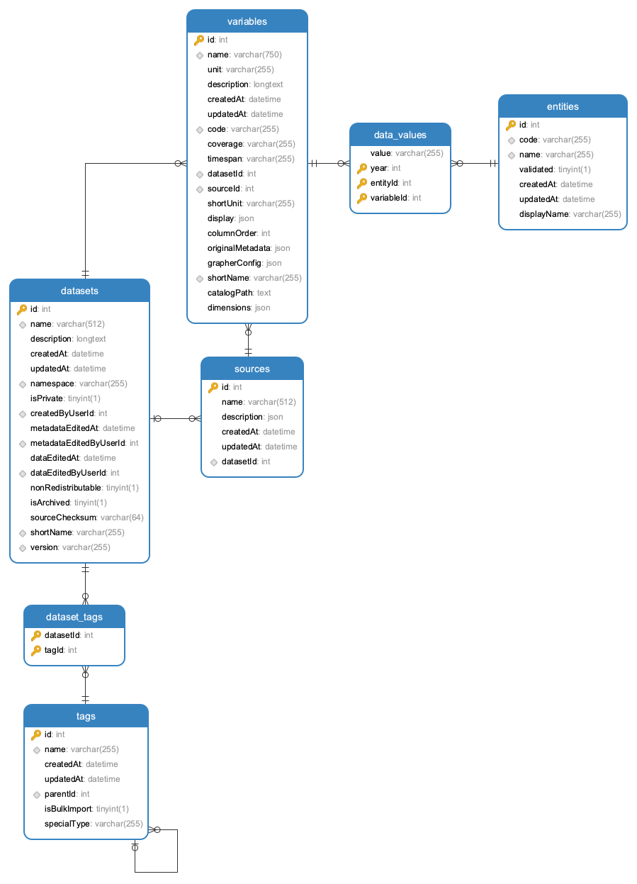
* Datasets: are associated to a specific source and can contain a collection of *variables* (metrics)
* Tags: descriptors that are associated to **datasets** (e.g. "Population Growth"). Tags can have tag parents which allows to build a hierarchical structure of tags (e.g. "Population Growth" is a child of "Population Growth & Vital Statistics")
* Variables: multiple variables can be associated to a **dataset**. Each variable (e.g. "Fertility Rate") has a unit (e.g. "children per woman") and is associated to a table that contains a collection of **data-values**
* Data-Values: the actual data for a specific variable. Collection of records with **values** associated to time (**year**) and **entities** (countries, continents, ...).
* Entities have a name (e.g. "United Kingdom") and id (e.g. 1) and a code (e.g. GBR)
Once the user has selected a domain and dataset (e.g. "World Development Indicators - Economic Policy & Debt") and a specific variable from that dataset (e.g. "GDP per capita, PPP (constant 2011 international $)") then we are dealing with a selection of data values that will be used for visualizations.
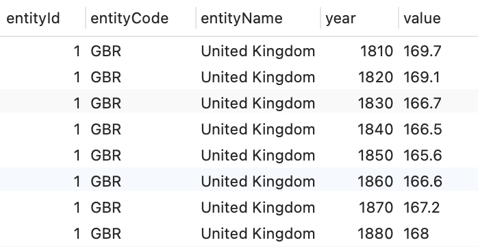
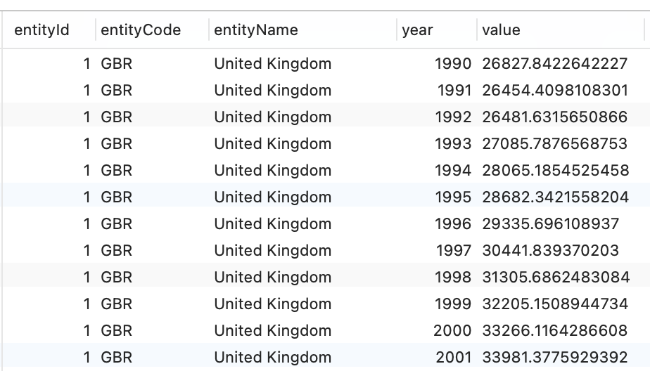
The original Data Model has a normalized structure with a relationship between data-values and entities

For visualization purposes we will assume that data will be provided to the visualization in a denormalized form:
 You can see this in action in a html page with pure Javascript at https://elaval.github.io/owid-vis-demo-basic/index.html.
 The data should also have an associated "unit" description that is part of the respective dataset metadata.
### Library classes
The visualization library will export an object - **owidVIS** - that will provide a collection of chart building functions. For example:
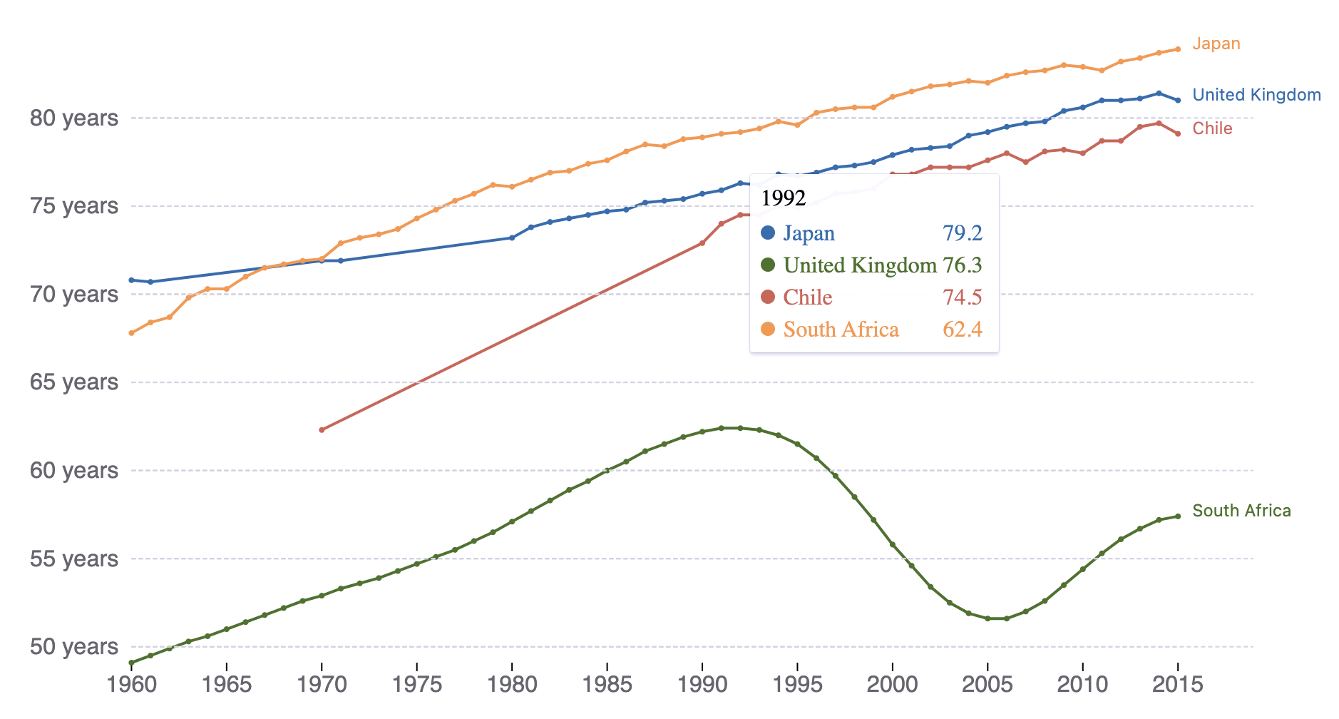
* **OWIDTrendChart()**: Creates a line chart with values over years for available entities (countries)
* **OWIDBarChart()**: Creates a bar chart with values for different entities in a specific year
* **OWIDMap()**: Creates a world map with values for entities in a specific year
...
In the source code, all visualization are Javascript (actually TypeScript) classes that are derived from a parent class - **OWIDChart** - which provides elements and functions that are common to all visualizations.
Visualizations are represented as visual elements in the DOM which include a \
The data should also have an associated "unit" description that is part of the respective dataset metadata.
### Library classes
The visualization library will export an object - **owidVIS** - that will provide a collection of chart building functions. For example:
* **OWIDTrendChart()**: Creates a line chart with values over years for available entities (countries)
* **OWIDBarChart()**: Creates a bar chart with values for different entities in a specific year
* **OWIDMap()**: Creates a world map with values for entities in a specific year
...
In the source code, all visualization are Javascript (actually TypeScript) classes that are derived from a parent class - **OWIDChart** - which provides elements and functions that are common to all visualizations.
Visualizations are represented as visual elements in the DOM which include a \