[source](https://github.com/rrag/react-stockcharts/blob/master/docs/lib/charts/AreaChart.js), [codesandbox](https://codesandbox.io/s/github/rrag/react-stockcharts-examples2/tree/master/examples/AreaChart)
`data.tsv`
date | close
---------- | -------
2011-01-24 | 5743.25
2011-01-25 | 5687.4
2011-01-27 | 5604.3
2011-01-28 | 5512.15
... | ...
```js
import { timeParse } from "d3-time-format";
import { tsv } from "d3-request";
import { scaleTime } from "d3-scale";
import { format } from "d3-format";
var parseDate = timeParse("%Y-%m-%d");
tsv("path/to/data.tsv", function(err, data) {
data.forEach((d, i) => {
d.date = new Date(parseDate(d.date).getTime());
d.close = +d.close;
});
...
```
```jsx
d.date} xScale={scaleTime()}
xExtents={[new Date(2011, 0, 1), new Date(2013, 0, 2)]}>
d.close}>
d.close}/>
```
Let us review each line
```jsx
d.date} xScale={scaleTime()}
xExtents={[new Date(2011, 0, 1), new Date(2013, 0, 2)]}>
```
Creates an `svg` element with the provided `height` and `width` and creates a `svg:g` element with the provided `margin`. and `data` is used to plot.
- `xAccessor` is self explanatory
- `xScale` knowledge of d3 [scales](https://github.com/mbostock/d3/wiki/Scales) will certainly help. For starters, it is easier to understand scale as a function which converts a `domain` say 2011-01-01 to 2013-01-02 to a `range` say 0 to 500 pixels. This scale can now interpolate an input date to a value in pixels. `d3.scaleTime()` is a linear time scale
- `xExtents` is the start and end points to show on initial render. This is an optional prop
- `seriesName` this does not add value to this simple chart, you will see its use explained better later in the [zoom and pan](#/zoom_and_pan) section
- `type` can take 2 values `svg` or `hybrid`.
Choosing `svg` will create the entire chart using `svg` elements
Choosing `hybrid` will create the contents of the `DataSeries` using `canvas` but the axis and other elements are `svg`
So irrespective of what type you choose, you will have a `svg` element
```jsx
d.close}>
```
There can be one or more `Chart`s in each `ChartCanvas` and hence the need for an `id` attribute.
`Chart` also takes an optional prop `yScale` which defaults to `d3.scaleLinear()`
With SVG & Canvas it is important to understand the coordinate system and where the origin `(0, 0)` is located. for a SVG of size 300x100, the
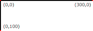
For more details about the coordinate system see [here](http://www.w3.org/TR/SVG/coords.js)
Back to scales,
X Axis uses a time scale
A time scale converts a date/time domain to a range, this is used as the xScale, the xDomain is calculated from the input `data` and the `xExtents` prop, and the range is calculated as `width - margin.left - margin.right`.
Y Axis uses a linear scale
A Linear scale converts a `domain` say 10 - 45 to a `range` say 0 to 300 pixels. Like the name represents the data in between is interpolated linear.
```jsx
```
The `ticks` attribute simple passes on the value to the scale, the `XAxis` also has the following optional attributes `innerTickSize, outerTickSize, tickFormat, tickPadding, tickSize, ticks, tickValues` all of which correspond to a function with the same name in [d3-axis](https://github.com/d3/d3-axis).
`axisAt` takes on possible values as `top, middle, bottom` for advanced cases, you can also pass in a number indicating the pixel position where the axis has to be drawn.
`orient` takes on possible values as `top, bottom`, this orients the axis ticks on the top/bottom
```jsx
```
Similar to `XAxis` except left/right instead of top/bottom
```jsx
d.close}/>
```
`yAccessor` is self explanatory
### Highly customizable you say, how?
So you don't want to display the `YAxis` at all, go ahead and just remove that.
Want to display `YAxis` on both left and right? add
```jsx
```
next to the existing `YAxis`
Want to add a `YAxis` with a percent scale on the right? add
```jsx
```
and you get.