# progress-ring
[](https://www.npmjs.com/package/@deftlycreative/progress-ring)
[](https://github.com/deftlycreative/progress-ring/actions/workflows/ci.yml)
[](./LICENSE)
A lightweight, scalable circular progress bar built as a Web Component. Works in plain HTML/PHP, Vue 3, and React with a single shared implementation — no framework dependencies required.
---
## Features
- SVG-based — scales to any size without blurring
- Zero dependencies
- Works in plain HTML, PHP loops, Vue 3, and React
- Fully customizable via attributes/props
- CSS animation with configurable duration and delay
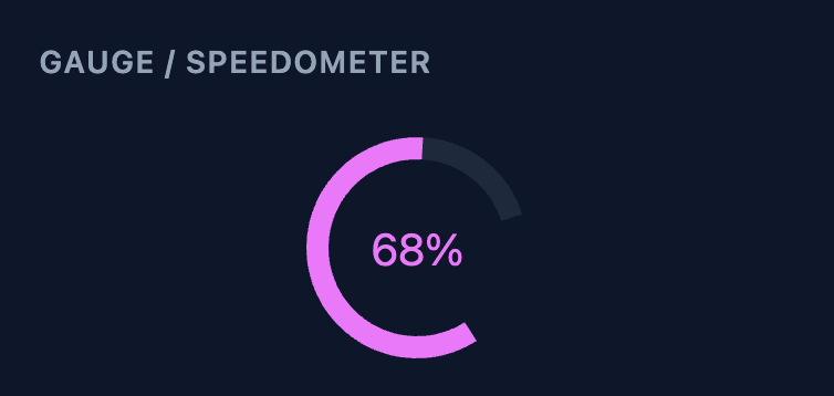
- Gauge/speedometer mode via `cut` + `rotation`
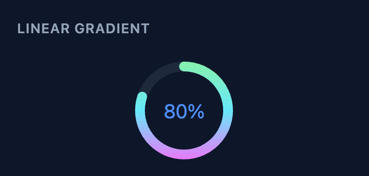
- Linear gradient arc stroke
- Avatar image inside the circle (replaces the label)
- Accessible (`role="progressbar"` + `aria-valuenow/min/max` + customisable `aria-label`)
- Shadow DOM encapsulation prevents style conflicts
---
## Preview
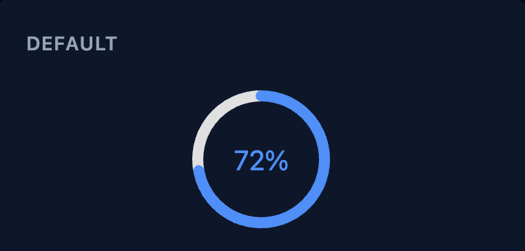
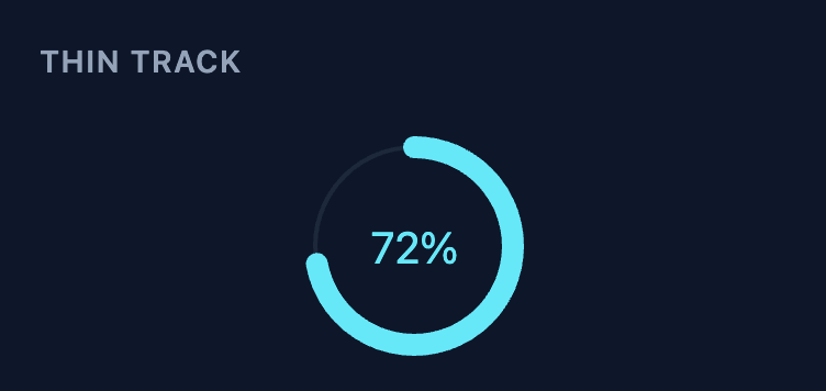
Default Thin Track Linear Gradient
Gauge / Speedometer Avatar Team Progress
---
## Installation
### CDN / Plain HTML / PHP
```html
```
You can also use [jsDelivr](https://www.jsdelivr.com/package/npm/@deftlycreative/progress-ring):
```html
```
> **Note:** ES modules require an HTTP server — they will not load over `file://`. Use a local dev server or serve the file from your web root.
### npm (Vue / React)
```bash
npm install @deftlycreative/progress-ring
```
### Vue 3
```js
import ProgressRing from '@deftlycreative/progress-ring/vue';
```
### React
```js
import ProgressRing from '@deftlycreative/progress-ring/react';
```
---
## Usage
### Plain HTML / PHP
```html
```
### React
```jsx
import ProgressRing from '@deftlycreative/progress-ring/react';
export default function App() {
return (