---
id: version-1.0.0-beta4-searchbar
title: SearchBar
original_id: searchbar
---
## Default SearchBar
 ## Platform specific SearchBar
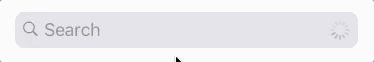
**iOS**
## Platform specific SearchBar
**iOS**
 **Android**
 ```js
import { SearchBar } from 'react-native-elements'
```
### Props
> This component inherits [all native TextInput props that come with a standard React Native TextInput element](https://facebook.github.io/react-native/docs/textinput.html), along with the following:
* [`clearIcon`](#clearicon)
* [`containerStyle`](#containerstyle)
* [`icon`](#icon)
* [`inputContainerStyle`](#inputcontainerstyle)
* [`inputStyle`](#inputstyle)
* [`leftIconContainerStyle`](#lefticoncontainerstyle-platform-android-ios)
* [`rightIconContainerStyle`](#righticoncontainerstyle-platform-android-ios)
* [`lightTheme`](#lighttheme)
* [`loadingProps`](#loadingprops)
* [`noIcon`](#noicon)
* [`onChangeText`](#onchangetext)
* [`onClear`](#onclear)
* [`placeholder`](#placeholder)
* [`placeholderTextColor`](#placeholdertextcolor)
* [`round`](#round)
* [`showLoading`](#showloading)
* [`underlineColorAndroid`](#underlinecolorandroid)
* [`cancelButtonTitle`](#cancelbuttontitle)
* [`onCancel`](#oncancel)
* [`platform`](#platform)
---
# Reference
### `clearIcon`
specify color, styling, or another [Material Icon Name](https://design.google.com/icons/) (Note: pressing on this icon clears text inside the searchbar)
| Type | Default |
| :----------------------------------------------------: | :---------------------------------: |
| object {name (string), color (string), style (object)} | { color: '#86939e', name: 'close' } |
---
### `containerStyle`
style the container of the SearchBar
| Type | Default |
| :------------: | :---------------: |
| object (style) | inherited styling |
---
### `icon`
specify type, name, color, and styling of the icon
| Type | Default |
| :-------------------------------------------------------------------: | :----------------------------------------------------: |
| object {type (string), name (string), color (string), style (object)} | { type: 'material', color: '#86939e', name: 'search' } |
---
### `inputContainerStyle`
style the container of the TextInput
| Type | Default |
| :------------: | :---------------: |
| object (style) | inherited styling |
---
### `inputStyle`
style the TextInput
| Type | Default |
| :------------: | :---------------: |
| object (style) | inherited styling |
---
### `leftIconContainerStyle` (platform="android|ios")
style the icon container on the left side
| Type | Default |
| :------------: | :---------------: |
| object (style) | inherited styling |
---
### `rightIconContainerStyle` (platform="android|ios")
style the icon container on the right side
| Type | Default |
| :------------: | :---------------: |
| object (style) | inherited styling |
---
### `lightTheme`
change theme to light theme
| Type | Default |
| :-----: | :-----: |
| boolean | false |
---
### `loadingProps`
props passed to ActivityIndicator
| Type | Default |
| :----: | :-----: |
| object | { } |
---
### `noIcon`
remove icon from textinput
| Type | Default |
| :-----: | :-----: |
| boolean | false |
---
### `onChangeText`
method to fire when text is changed
| Type | Default |
| :------: | :-----: |
| function | none |
---
### `onClear`
method to fire when input is cleared
| Type | Default |
| :------: | :-----: |
| function | none |
---
### `placeholder`
set the placeholder text
| Type | Default |
| :----: | :-----: |
| string | '' |
---
### `placeholderTextColor`
set the color of the placeholder text
| Type | Default |
| :----: | :-------: |
| string | '#86939e' |
---
### `round`
change TextInput styling to rounded corners
| Type | Default |
| :-----: | :-----: |
| boolean | false |
---
### `showLoading`
show the loading ActivityIndicator effect
| Type | Default |
| :-----: | :-----: |
| boolean | false |
---
### `underlineColorAndroid`
specify other than the default transparent underline color
| Type | Default |
| :------------: | :---------: |
| string (color) | transparent |
---
### `cancelButtonTitle`
**(iOS only)** title of the cancel button on the right side
| Type | Default |
| :----: | :------: |
| string | "Cancel" |
---
### `onCancel`
callback fired when pressing the cancel button (iOS) or the back icon (Android)
| Type | Default |
| :------: | :-----: |
| function | null |
---
### `platform`
choose the look and feel of the search bar. One of "default", "ios", "android"
| Type | Default |
| :----: | :-------: |
| string | "default" |
---
## Interaction methods
| method | description |
| ------ | ------------------------------------------------------------------------------------------------------------------------------------------------------------------------------------------------ |
| focus | call focus on the textinput ([example](#calling)) |
| blur | call blur on the textinput ([example](#calling)) |
| clear | call clear on the textinput ([example](#calling)) |
| cancel | **(Android and iOS SearchBars only)** call cancel on the SearchBar (left arrow on Android, Cancel button on iOS). This will basically blur the input and hide the keyboard ([example](#calling)) |
#### Calling methods on SearchBar
Store a reference to the SearchBar in your component by using the ref prop provided by React ([see docs](https://facebook.github.io/react/docs/refs-and-the-dom.html)):
```js
this.search = search}
...
/>
```
You can then access SearchBar methods like so:
```
this.search.focus();
this.search.blur();
this.search.clear();
this.search.cancel(); // Only available if `platform` props is "ios" | "android"
```
```js
import { SearchBar } from 'react-native-elements'
```
### Props
> This component inherits [all native TextInput props that come with a standard React Native TextInput element](https://facebook.github.io/react-native/docs/textinput.html), along with the following:
* [`clearIcon`](#clearicon)
* [`containerStyle`](#containerstyle)
* [`icon`](#icon)
* [`inputContainerStyle`](#inputcontainerstyle)
* [`inputStyle`](#inputstyle)
* [`leftIconContainerStyle`](#lefticoncontainerstyle-platform-android-ios)
* [`rightIconContainerStyle`](#righticoncontainerstyle-platform-android-ios)
* [`lightTheme`](#lighttheme)
* [`loadingProps`](#loadingprops)
* [`noIcon`](#noicon)
* [`onChangeText`](#onchangetext)
* [`onClear`](#onclear)
* [`placeholder`](#placeholder)
* [`placeholderTextColor`](#placeholdertextcolor)
* [`round`](#round)
* [`showLoading`](#showloading)
* [`underlineColorAndroid`](#underlinecolorandroid)
* [`cancelButtonTitle`](#cancelbuttontitle)
* [`onCancel`](#oncancel)
* [`platform`](#platform)
---
# Reference
### `clearIcon`
specify color, styling, or another [Material Icon Name](https://design.google.com/icons/) (Note: pressing on this icon clears text inside the searchbar)
| Type | Default |
| :----------------------------------------------------: | :---------------------------------: |
| object {name (string), color (string), style (object)} | { color: '#86939e', name: 'close' } |
---
### `containerStyle`
style the container of the SearchBar
| Type | Default |
| :------------: | :---------------: |
| object (style) | inherited styling |
---
### `icon`
specify type, name, color, and styling of the icon
| Type | Default |
| :-------------------------------------------------------------------: | :----------------------------------------------------: |
| object {type (string), name (string), color (string), style (object)} | { type: 'material', color: '#86939e', name: 'search' } |
---
### `inputContainerStyle`
style the container of the TextInput
| Type | Default |
| :------------: | :---------------: |
| object (style) | inherited styling |
---
### `inputStyle`
style the TextInput
| Type | Default |
| :------------: | :---------------: |
| object (style) | inherited styling |
---
### `leftIconContainerStyle` (platform="android|ios")
style the icon container on the left side
| Type | Default |
| :------------: | :---------------: |
| object (style) | inherited styling |
---
### `rightIconContainerStyle` (platform="android|ios")
style the icon container on the right side
| Type | Default |
| :------------: | :---------------: |
| object (style) | inherited styling |
---
### `lightTheme`
change theme to light theme
| Type | Default |
| :-----: | :-----: |
| boolean | false |
---
### `loadingProps`
props passed to ActivityIndicator
| Type | Default |
| :----: | :-----: |
| object | { } |
---
### `noIcon`
remove icon from textinput
| Type | Default |
| :-----: | :-----: |
| boolean | false |
---
### `onChangeText`
method to fire when text is changed
| Type | Default |
| :------: | :-----: |
| function | none |
---
### `onClear`
method to fire when input is cleared
| Type | Default |
| :------: | :-----: |
| function | none |
---
### `placeholder`
set the placeholder text
| Type | Default |
| :----: | :-----: |
| string | '' |
---
### `placeholderTextColor`
set the color of the placeholder text
| Type | Default |
| :----: | :-------: |
| string | '#86939e' |
---
### `round`
change TextInput styling to rounded corners
| Type | Default |
| :-----: | :-----: |
| boolean | false |
---
### `showLoading`
show the loading ActivityIndicator effect
| Type | Default |
| :-----: | :-----: |
| boolean | false |
---
### `underlineColorAndroid`
specify other than the default transparent underline color
| Type | Default |
| :------------: | :---------: |
| string (color) | transparent |
---
### `cancelButtonTitle`
**(iOS only)** title of the cancel button on the right side
| Type | Default |
| :----: | :------: |
| string | "Cancel" |
---
### `onCancel`
callback fired when pressing the cancel button (iOS) or the back icon (Android)
| Type | Default |
| :------: | :-----: |
| function | null |
---
### `platform`
choose the look and feel of the search bar. One of "default", "ios", "android"
| Type | Default |
| :----: | :-------: |
| string | "default" |
---
## Interaction methods
| method | description |
| ------ | ------------------------------------------------------------------------------------------------------------------------------------------------------------------------------------------------ |
| focus | call focus on the textinput ([example](#calling)) |
| blur | call blur on the textinput ([example](#calling)) |
| clear | call clear on the textinput ([example](#calling)) |
| cancel | **(Android and iOS SearchBars only)** call cancel on the SearchBar (left arrow on Android, Cancel button on iOS). This will basically blur the input and hide the keyboard ([example](#calling)) |
#### Calling methods on SearchBar
Store a reference to the SearchBar in your component by using the ref prop provided by React ([see docs](https://facebook.github.io/react/docs/refs-and-the-dom.html)):
```js
this.search = search}
...
/>
```
You can then access SearchBar methods like so:
```
this.search.focus();
this.search.blur();
this.search.clear();
this.search.cancel(); // Only available if `platform` props is "ios" | "android"
```