[](https://badge.fury.io/js/react-native-modal-dropdown)
# react-native-modal-dropdown
A react-native dropdown/picker/selector component for both Android & iOS.
## Features
- Pure JS.
- Compatible with both iOS and Android.
- Auto position. (Won't be covered or clipped by the edge of screen.)
- Zero configuration. (Options are needed of course or a loading indicator will show.)
- Highly customizable.
- Controllable with API by code. (Show/Hide/Select)
- Change everything into a dropdown list trigger.
## Demo
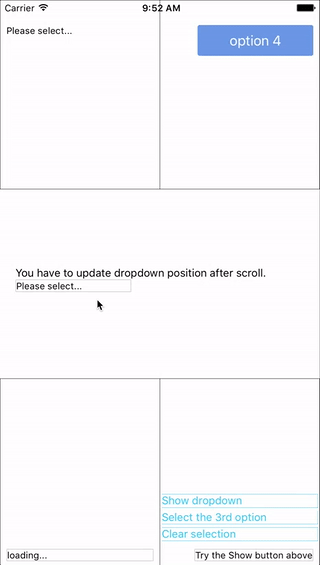
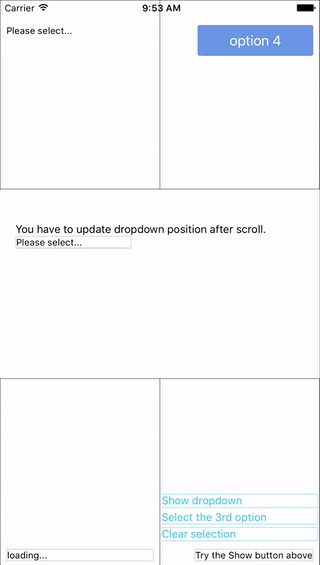 You can find them in the example.
## Update History
### v0.6.2
- Fix [#139](https://github.com/sohobloo/react-native-modal-dropdown/issues/139) `renderButtonText` renders \[object Object] if there is a call to `setState` in `onSelect` or `renderButtonText` functions
### v0.6.1
- Fix [#127](https://github.com/sohobloo/react-native-modal-dropdown/issues/127) `renderButtonText` does not work on `select(idx)` (Thanks to [@swb2016](https://github.com/swb2016))
- Code optimization.
### v0.6.0
- Introduce `renderButtonText` property to extract button text from object array data.
[Full update history list](https://github.com/sohobloo/react-native-modal-dropdown/wiki/Update-History)
## Installation
```sh
npm i react-native-modal-dropdown -save
```
## Usage
### Basic
Import this module:
```javascript
import ModalDropdown from 'react-native-modal-dropdown';
```
Use as a component:
```javascript
```
Use as a wrapper / container:
```javascript
...
```
### Customization
Give the style props as your choice:
- `style`: Change the style of the button (basic mode) / container (wrapper mode).
- `textStyle`: Change the style of text of the button. *Invalid in wrapper mode.*
- `dropdownStyle`: Change the style of dropdown container.
You can also render your option row and row separator by implement `renderRow` and `renderSeparator` function.
## API
### Props
Prop | Type | Optional | Default | Description
------------------- | -------- | -------- | --------- | -----------
`disabled` | bool | Yes | false | disable / enable the component.
`defaultIndex` | number | Yes | -1 | Init selected index. `-1`: None is selected. **This only change the highlight of the dropdown row, you have to give a `defaultValue` to change the init text.**
`defaultValue` | string | Yes | Please select... | Init text of the button. **Invalid in wrapper mode.**
`options` | array | Yes | | Options. **The dropdown will show a loading indicator if `options` is `null`/`undefined`.**
`animated` | bool | Yes | true | Disable / enable fade animation.
`showsVerticalScrollIndicator` | bool | Yes | true | Show / hide vertical scroll indicator.
`style` | object | Yes | | Style of the button.
`textStyle` | object | Yes | | Style of the button text. **Invalid in wrapper mode.**
`dropdownStyle` | object | Yes | | Style of the dropdown list.
`dropdownTextStyle` | object | Yes | | Style of the dropdown option text.
`dropdownTextHighlightStyle` | object | Yes | | Style of the dropdown selected option text.
`adjustFrame` | func | Yes | | This is a callback after the frame of the dropdown have been calculated and before showing. You will receive a style object as argument with some of the props like `width` `height` `top` `left` and `right`. Change them to appropriate values that accord with your requirement and **make the new style as the return value of this function**.
`renderRow` | func | Yes | | Customize render option rows: `function(option,index,isSelected)` **Will render a default row if `null`/`undefined`.**
`renderSeparator` | func | Yes | | Customize render dropdown list separators. **Will render a default thin gray line if `null`/`undefined`.**
`renderButtonText` | func | Yes | | Use this to extract and return text from option object. This text will show on button after option selected. **Invalid in wrapper mode.**
`onDropdownWillShow`| func | Yes | | Trigger when dropdown will show by touching the button. **Return `false` can cancel the event.**
`onDropdownWillHide`| func | Yes | | Trigger when dropdown will hide by touching the button. **Return `false` can cancel the event.**
`onSelect` | func | Yes | | Trigger when option row touched with selected `index` and `value`. **Return `false` can cancel the event.**
`accessible` | bool | Yes | true | Set accessibility of dropdown modal and dropdown rows
`keyboardShouldPersistTaps` | enum('always', 'never', 'handled') | Yes | 'never' | See react-native `ScrollView` props
### Methods
Method | Description
----------------- | -----------
`show()` | Show the dropdown. **Won't trigger `onDropdownWillShow`.**
`hide()` | Hide the dropdown. **Won't trigger `onDropdownWillHide`.**
`select(idx)` | Select the specified option of the `idx`. Select `-1` will reset it to display `defaultValue`. **Won't trigger `onSelect`.**
## Next version
Any suggestion is welcome.
You can find them in the example.
## Update History
### v0.6.2
- Fix [#139](https://github.com/sohobloo/react-native-modal-dropdown/issues/139) `renderButtonText` renders \[object Object] if there is a call to `setState` in `onSelect` or `renderButtonText` functions
### v0.6.1
- Fix [#127](https://github.com/sohobloo/react-native-modal-dropdown/issues/127) `renderButtonText` does not work on `select(idx)` (Thanks to [@swb2016](https://github.com/swb2016))
- Code optimization.
### v0.6.0
- Introduce `renderButtonText` property to extract button text from object array data.
[Full update history list](https://github.com/sohobloo/react-native-modal-dropdown/wiki/Update-History)
## Installation
```sh
npm i react-native-modal-dropdown -save
```
## Usage
### Basic
Import this module:
```javascript
import ModalDropdown from 'react-native-modal-dropdown';
```
Use as a component:
```javascript
```
Use as a wrapper / container:
```javascript
...
```
### Customization
Give the style props as your choice:
- `style`: Change the style of the button (basic mode) / container (wrapper mode).
- `textStyle`: Change the style of text of the button. *Invalid in wrapper mode.*
- `dropdownStyle`: Change the style of dropdown container.
You can also render your option row and row separator by implement `renderRow` and `renderSeparator` function.
## API
### Props
Prop | Type | Optional | Default | Description
------------------- | -------- | -------- | --------- | -----------
`disabled` | bool | Yes | false | disable / enable the component.
`defaultIndex` | number | Yes | -1 | Init selected index. `-1`: None is selected. **This only change the highlight of the dropdown row, you have to give a `defaultValue` to change the init text.**
`defaultValue` | string | Yes | Please select... | Init text of the button. **Invalid in wrapper mode.**
`options` | array | Yes | | Options. **The dropdown will show a loading indicator if `options` is `null`/`undefined`.**
`animated` | bool | Yes | true | Disable / enable fade animation.
`showsVerticalScrollIndicator` | bool | Yes | true | Show / hide vertical scroll indicator.
`style` | object | Yes | | Style of the button.
`textStyle` | object | Yes | | Style of the button text. **Invalid in wrapper mode.**
`dropdownStyle` | object | Yes | | Style of the dropdown list.
`dropdownTextStyle` | object | Yes | | Style of the dropdown option text.
`dropdownTextHighlightStyle` | object | Yes | | Style of the dropdown selected option text.
`adjustFrame` | func | Yes | | This is a callback after the frame of the dropdown have been calculated and before showing. You will receive a style object as argument with some of the props like `width` `height` `top` `left` and `right`. Change them to appropriate values that accord with your requirement and **make the new style as the return value of this function**.
`renderRow` | func | Yes | | Customize render option rows: `function(option,index,isSelected)` **Will render a default row if `null`/`undefined`.**
`renderSeparator` | func | Yes | | Customize render dropdown list separators. **Will render a default thin gray line if `null`/`undefined`.**
`renderButtonText` | func | Yes | | Use this to extract and return text from option object. This text will show on button after option selected. **Invalid in wrapper mode.**
`onDropdownWillShow`| func | Yes | | Trigger when dropdown will show by touching the button. **Return `false` can cancel the event.**
`onDropdownWillHide`| func | Yes | | Trigger when dropdown will hide by touching the button. **Return `false` can cancel the event.**
`onSelect` | func | Yes | | Trigger when option row touched with selected `index` and `value`. **Return `false` can cancel the event.**
`accessible` | bool | Yes | true | Set accessibility of dropdown modal and dropdown rows
`keyboardShouldPersistTaps` | enum('always', 'never', 'handled') | Yes | 'never' | See react-native `ScrollView` props
### Methods
Method | Description
----------------- | -----------
`show()` | Show the dropdown. **Won't trigger `onDropdownWillShow`.**
`hide()` | Hide the dropdown. **Won't trigger `onDropdownWillHide`.**
`select(idx)` | Select the specified option of the `idx`. Select `-1` will reset it to display `defaultValue`. **Won't trigger `onSelect`.**
## Next version
Any suggestion is welcome.