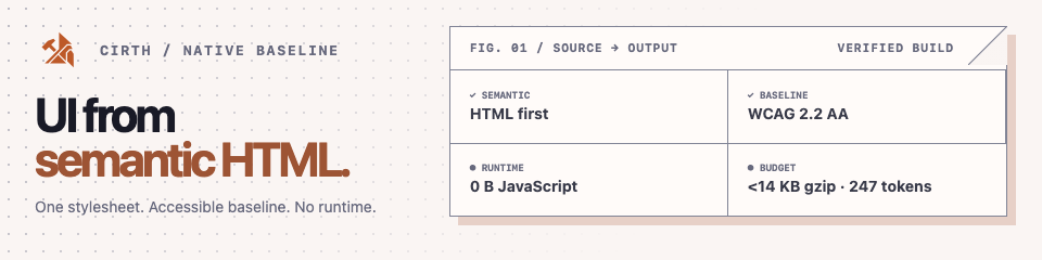
Cirth turns native HTML elements into accessible, themeable interfaces.
Load one stylesheet, customize it with runtime design tokens, and ship
with no JavaScript runtime and no required build step. Small and
monitored · 0 B JS runtime · WCAG 2.2 AA baseline.
## Quickstart
Include one stylesheet and write ordinary semantic HTML. Add the print
sheet too if your pages get printed — it is separate so it does not weigh
on the first paint.
```html
```
```html
Settings
```
The npm package name is `@cirthcss/cirth`.
```sh
npm install @cirthcss/cirth
```
```js
import "@cirthcss/cirth/dist/cirth.min.css";
```
Release archives are available from
[GitHub Releases](https://github.com/cirthcss/cirth/releases).
## Builds
The main generated stylesheets are:
| File | Purpose |
| --- | --- |
| `dist/cirth.min.css` | Default semantic build. |
| `dist/cirth.classless.min.css` | Classless build for pages with even less markup. |
| `dist/cirth.scoped.min.css` | Scoped build for embedding Cirth under `.cirth`. |
| `dist/cirth.classless.scoped.min.css` | Scoped classless build. |
All four builds share Cirth's one official theme (copper), with light and
dark variants. `plain` and `playroom` are optional presets, not separate theme
builds — see [Presets](#presets) below and [Colors](docs/src/pages/colors.md).
### Classless
The classless build styles `body > header`, `body > main`, and `body > footer`
as page containers.
```html
```
### Scoped
The scoped build styles only markup inside a `.cirth` container. It is useful
when embedding Cirth into an existing page, CMS, widget, or application shell.
```html
Settings
```
## Presets
`plain` and `playroom` are optional presets: stylesheets that override an
existing set of custom properties (color, shadow, type, spacing, motion) on
top of the default theme. They're worked examples of restyling the system,
not independently maintained themes — load one after the main stylesheet.
- **`plain`** — the conventional application baseline: a familiar blue
accent, a plain white page, headings in the body face. Five declarations:
two colour inputs and three role choices. Accent states and the complete
surface ladder derive on their own.
- **`playroom`** — the expressive end: a soft violet accent, surfaces
tinted toward it, large radii, a rounded system face, generous spacing,
springy motion. Reaches across colour, geometry, typography, motion and
depth, and overrides two derived tokens on purpose so its hover lightens
instead of darkening.
Between them they are one worked example read from both ends: how little a
retheme can be, and how far one can go.
Like the default theme, presets stick to fonts that ship with every major
OS — no `@import`, no webfont, zero network requests.
```html
```
```js
import "@cirthcss/cirth/presets/plain";
```
See [Colors](docs/src/pages/colors.md) for what each preset changes.
## Customization
Cirth is CSS-first. Override custom properties in your own stylesheet after
loading the framework.
```css
:root {
--cirth-font-family: Inter, system-ui, sans-serif;
--cirth-primary: #2563eb;
--cirth-primary-surface: #2563eb;
--cirth-primary-border: #2563eb;
--cirth-border-radius: 0.375rem;
--cirth-spacing: 1rem;
}
```
For scoped builds, put the overrides on the scoped root:
```css
.cirth {
--cirth-font-family: Inter, system-ui, sans-serif;
--cirth-primary: #2563eb;
}
```
The generated CSS in `dist/cirth.css` is the most reliable reference for the
current custom property surface. The [Customization](docs/src/pages/customization.md)
page covers the token layers, color groups, and light/dark switching in
detail.
## Documentation
The full documentation is published at
[cirthcss.github.io/cirth](https://cirthcss.github.io/cirth/), built from
[`docs/`](docs/) as an [Eleventy](https://11ty.dev) site with live
examples. The site itself is styled with Cirth's own default build — the
header, sidebar, prose, and every demo are ordinary semantic HTML dogfooding
the framework.
Run it locally:
```sh
npm install
npm run docs:dev
```
- **Getting started** —
[Get Started](docs/src/pages/get-started.md) ·
[Customization](docs/src/pages/customization.md) ·
[Colors](docs/src/pages/colors.md) ·
[About Cirth](docs/src/pages/about.md)
- **Layout** —
[Document](docs/src/pages/layout/document.md) ·
[Landmarks](docs/src/pages/layout/landmarks.md) ·
[Section](docs/src/pages/layout/section.md) ·
[Container](docs/src/pages/layout/container.md) ·
[Grid](docs/src/pages/layout/grid.md) ·
[Overflow auto](docs/src/pages/layout/overflow-auto.md)
- **Content** —
[Typography](docs/src/pages/content/typography.md) ·
[Link](docs/src/pages/content/link.md) ·
[Button](docs/src/pages/content/button.md) ·
[Table](docs/src/pages/content/table.md) ·
[Code](docs/src/pages/content/code.md) ·
[Figure](docs/src/pages/content/figure.md) ·
[Embedded content](docs/src/pages/content/embedded.md) ·
[Misc](docs/src/pages/content/misc.md)
- **Forms** —
[Overview](docs/src/pages/forms/index.md) ·
[Checkbox, radio, switch](docs/src/pages/forms/checkbox-radio-switch.md) ·
[Input color](docs/src/pages/forms/input-color.md) ·
[Input date](docs/src/pages/forms/input-date.md) ·
[Input file](docs/src/pages/forms/input-file.md) ·
[Input range](docs/src/pages/forms/input-range.md) ·
[Input search](docs/src/pages/forms/input-search.md)
- **Components** —
[Accordion](docs/src/pages/components/accordion.md) ·
[Card](docs/src/pages/components/card.md) ·
[Dropdown](docs/src/pages/components/dropdown.md) ·
[Group](docs/src/pages/components/group.md) ·
[Loading](docs/src/pages/components/loading.md) ·
[Meter](docs/src/pages/components/meter.md) ·
[Modal](docs/src/pages/components/modal.md) ·
[Nav](docs/src/pages/components/nav.md) ·
[Popover](docs/src/pages/components/popover.md) ·
[Progress](docs/src/pages/components/progress.md)
- **Utilities** —
[Accessibility](docs/src/pages/utilities/accessibility.md) ·
[High contrast](docs/src/pages/utilities/high-contrast.md) ·
[Reduce motion](docs/src/pages/utilities/reduce-motion.md) ·
[Print](docs/src/pages/utilities/print.md)
- **Project** —
[Examples](docs/src/pages/examples.md) ·
[Contributions](docs/src/pages/contributions.md) ·
[Brand](docs/src/pages/brand.md) ·
[Changelog](CHANGELOG.md)
## Contributing
Start with [Contributions](docs/src/pages/contributions.md). It explains the local
setup, the source layout, the package exports, and the project constraints
that matter most when changing Cirth.
For pull requests, issue triage, and the exact collaboration workflow, read
[`.github/CONTRIBUTING.md`](.github/CONTRIBUTING.md); for how a version
reaches npm, [`RELEASING.md`](RELEASING.md). If your change touches
the visual identity, check [Brand](docs/src/pages/brand.md) first; if it changes the
public package surface, update [CHANGELOG.md](CHANGELOG.md) in the same
branch.
Useful local checks before opening a PR:
```sh
npm run build
npm run docs:build
npm pack --dry-run
```
## Browser Support
Cirth is designed and tested for the latest stable Chrome, Edge, Firefox,
and Safari releases, on desktop and mobile. The compiled CSS is processed
with Lightning CSS against this Browserslist target:
```json
[
"Chrome >= 123",
"ChromeAndroid >= 123",
"Edge >= 123",
"Firefox >= 130",
"FirefoxAndroid >= 130",
"iOS >= 18.2",
"Opera >= 109",
"OperaMobile >= 73",
"Safari >= 18.2",
"Samsung >= 27"
]
```
Opera 109 and Samsung Internet 27 are the releases built on the same
Chromium as Chrome 123, so every entry above describes one engine floor,
not ten independent ones. Together they account for roughly 78% of global
browser usage, and the number rises on its own as old versions retire.
The floor is set by what the library needs, not by age: `popover`,
`@starting-style`, `transition-behavior: allow-discrete` and
`scrollbar-gutter` are what let components open, close and animate
without JavaScript, and `:has()`, `color-mix()` and `light-dark()` are
what let the theme express relationships instead of baking them.
No version of Internet Explorer is supported, and neither is the legacy
Android Browser — on any current Android device that name refers to
Chrome, which `ChromeAndroid` already covers.
## Design principles
Cirth is an HTML-native CSS framework: standard HTML elements carry most of
the structure, meaning, and styling burden before a class is needed.
- Style semantic HTML by default; add classes only where HTML semantics run
out.
- Keep layout primitives small and structural, not a broad component
catalog.
- Customize through runtime CSS custom properties, not a build step.
- Ship no JavaScript runtime; interactive patterns use native element
behavior. The claim is about what the package contains, not about what an
application built on it may do.
- Keep every shipped stylesheet under its own gzipped size budget, checked
on every build — a regression guard rather than a number to design
against. See
[About Cirth](docs/src/pages/about.md#size-and-what-it-is-a-budget-for)
for what the budget is for, and what it deliberately does not buy.
## License
Licensed under the [Apache License 2.0](LICENSE.md). See [NOTICE.md](NOTICE.md) for attribution to the original Pico CSS project this is forked from.