
# Slider
A React package for creating a ready to use and fully customizable slider for your items.
#### It uses emotion/css for styling so it'll be installed as part of the package.
 [](https://packagephobia.com/result?p=@benavente/slider)
### Installation
```sh
npm install @benavente/slider
```
```sh
yarn add @benavente/slider
```
### Usage
```sh
import Slider from "@benavente/slider"
Put your items here!
Each
separate
element
will
be
interpeted
as a
separate
scrollable
item
```
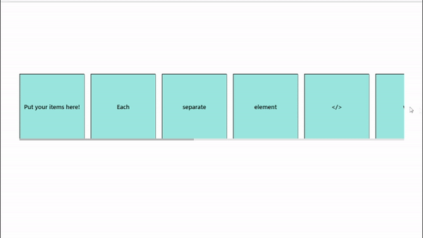
Result:
### Props
| Prop | Description | Usage Example |
| -------------------- | ------------------------------------------------------------------------------------------------------------------------ | --------------------------------------------------------------------------------- |
| id | Adds an id to the most outer div of the slider | `{items}` |
| threshold | Default: 0.5; Between 0 and 1 indicating the percentage that should be visible to be counted as visible in the slider. | `{items}` |
| spacing | Adds a margin between the elements | `{items}` |
| buttonLeft | A custom button element to display instead of the default buttons | `}">{items}` |
| buttonRight | A custom button element to display instead of the default buttons | `}">{items}` |
| time | (in ms) Time of the slide animation | `{items}` |
| width | Sets the width of the slider without considering buttons | `{items}` |
| outerContainerStyles | Styles for the outer container of the slider | `` {items} `` |
| innerContainerStyles | Styles for the inner container of the slider (items container) | `` {items} `` |
| buttonLeftStyles | Styles for the left button | `` {items} `` |
| buttonRightStyles | Styles for the left button | `` {items} `` |
| disableScrollbar | True -> scrollbar won't show up and Slider will only be usable via buttons. Default: false | `{items}` |
| showButtons | True -> Buttons will be visible. Default: true | `{items}` |
| disappearingButtons | By default, buttons only show up when hovering over slider. By setting this to false, buttons will be statically visible | `{items}` |
### License: MIT