# @banegasn/m3-switch
> Material Design 3 Switch web component — framework-agnostic, built with Lit.
[](https://www.npmjs.com/package/@banegasn/m3-switch)
[](../../LICENSE)
An accessible **M3 Switch** web component following the [Material Design 3 switch specifications](https://m3.material.io/components/switch/overview). A switch allows users to toggle between on and off states. Works in Angular, React, Vue, Svelte, or plain HTML — no build step required.
## Features
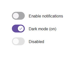
- On/off toggle with expressive M3 animation
- Disabled state support
- Form integration (name, value, form attributes)
- Accessible with ARIA `switch` role
- Keyboard navigation (Space and Enter keys)
- Framework-agnostic custom element
## Installation
```bash
npm install @banegasn/m3-switch
# or
pnpm add @banegasn/m3-switch
# or
yarn add @banegasn/m3-switch
```
## CDN Usage (no build step)
```html
M3 Switch Demo
```
## npm Usage
```js
import '@banegasn/m3-switch';
```
```html
```
## With JavaScript
```javascript
import '@banegasn/m3-switch';
const switchElement = document.querySelector('m3-switch');
switchElement.addEventListener('switch-change', (e) => {
console.log('Switch is now:', e.detail.checked);
});
```
### With React
```jsx
import '@banegasn/m3-switch';
function App() {
const [checked, setChecked] = useState(false);
return (
setChecked(e.detail.checked)}
/>
);
}
```
### With Angular
```typescript
import '@banegasn/m3-switch';
@Component({
template: `
`
})
export class MyComponent {
isChecked = false;
onSwitchChange(event: CustomEvent) {
this.isChecked = event.detail.checked;
}
}
```
### With Vue
```vue
```
## Properties
| Property | Type | Default | Description |
|----------|------|---------|-------------|
| `checked` | `boolean` | `false` | Whether the switch is checked (on) |
| `disabled` | `boolean` | `false` | Disables the switch |
| `name` | `string` | `null` | Name attribute for form submission |
| `value` | `string` | `null` | Value attribute for form submission |
| `form` | `string` | `null` | Form attribute to associate switch with a form |
| `aria-label` | `string` | `null` | ARIA label for accessibility |
| `aria-labelledby` | `string` | `null` | ARIA labelled by for accessibility |
## Events
| Event | Detail | Description |
|-------|--------|-------------|
| `switch-change` | `{ checked: boolean, name: string \| null, value: string \| null }` | Fired when the switch state changes |
## Methods
| Method | Description |
|--------|-------------|
| `focus()` | Focuses the switch |
| `blur()` | Removes focus from the switch |
## CSS Custom Properties
You can customize the switch appearance using CSS custom properties:
```css
m3-switch {
--md-switch-track-width: 52px;
--md-switch-track-height: 32px;
--md-switch-thumb-size: 24px;
--md-switch-track-shape: 16px;
--md-switch-thumb-shape: 12px;
--md-sys-color-primary: #6750a4;
--md-sys-color-on-primary: #ffffff;
--md-sys-color-on-surface: #1d1b20;
--md-sys-color-surface-container-highest: #e6e0e9;
}
```
## Accessibility
The switch component follows Material Design 3 accessibility guidelines:
- Uses proper ARIA attributes (`role="switch"`, `aria-checked`, `aria-disabled`)
- Supports keyboard navigation (Space and Enter keys)
- Provides focus indicators
- Supports screen readers with `aria-label` and `aria-labelledby`
## Browser Support
- Chrome/Edge (latest)
- Firefox (latest)
- Safari (latest)
- All modern browsers that support Web Components
## Resources
- [Material Design 3 Switch](https://m3.material.io/components/switch/overview)
- [GitHub Repository](https://github.com/banegasn/components)
## License
MIT