# @banegasn/m3-card
> Material Design 3 Card web component — framework-agnostic, built with Lit.
[](../../LICENSE)
[](https://www.npmjs.com/package/@banegasn/m3-card)
An accessible **M3 Card** web component following the [Material Design 3 card specifications](https://m3.material.io/components/cards/guidelines). Supports elevated, filled, and outlined variants with media, header, content, and action slots. Works in Angular, React, Vue, Svelte, or plain HTML — no build step required.
## 🎯 Features
- 3 Card Variants: Elevated, Filled, and Outlined
- Fully Interactive: Clickable cards with hover, focus, pressed, and dragged states
- Accessible: keyboard navigation support
- Framework Agnostic: Works with Angular, React, Vue, Svelte, or vanilla JavaScript
- Flexible Layout: Supports media, header, content, and action slots
- Customizable: CSS custom properties for theming
- TypeScript Support: Full type definitions included
- Material Design 3 Compliant: Follows official [Material 3 card specifications](https://m3.material.io/components/cards/guidelines)
## 📦 Installation
```bash
npm install @banegasn/m3-card
# or
pnpm add @banegasn/m3-card
# or
yarn add @banegasn/m3-card
```
## CDN Usage (no build step)
```html
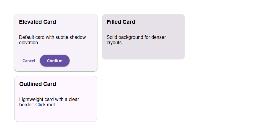
M3 Card Demo
Elevated Card
Default card with subtle shadow elevation.
Cancel
Confirm
Filled Card
Solid background for denser layouts.
Outlined Card
Lightweight card with a clear border. Click me!
```
## 🚀 Usage
### Basic Usage
```typescript
import '@banegasn/m3-card';
```
```html
Card Title
This is a simple card with some content.
Filled card with solid background
Outlined card with border
```
### Card with Media
```html

Beautiful Image
Card with an image at the top
```
### Card with Actions
```html
Action Card
Card with action buttons at the bottom
Cancel
Confirm
```
### Clickable Card
```html
Interactive Card
Click anywhere on this card to trigger an action
```
### Complete Card Example
```html

This is a detailed description of the product with all the
important information you need to know.
```
## 📚 API
### Properties
| Property | Type | Default | Description |
|----------|------|---------|-------------|
| `variant` | `'elevated' \| 'filled' \| 'outlined'` | `'elevated'` | Card visual style variant |
| `clickable` | `boolean` | `false` | Makes the card interactive and clickable |
| `disabled` | `boolean` | `false` | Disables card interaction |
| `dragged` | `boolean` | `false` | Shows the card in dragged state |
| `width` | `'auto' \| 'full' \| 'fixed'` | `'auto'` | Controls card width behavior |
| `aria-label` | `string \| null` | `null` | Accessibility label (required if clickable) |
| `role` | `string \| null` | `null` | ARIA role (auto-set to 'button' if clickable) |
### Slots
| Slot | Description |
|------|-------------|
| (default) | Main content area of the card |
| `media` | Media content (images, videos) at the top |
| `header` | Header content (title, subtitle) |
| `actions` | Action buttons at the bottom |
### Events
| Event | Detail | Description |
|-------|--------|-------------|
| `card-click` | `{ variant, width }` | Fired when clickable card is clicked |
### Methods
| Method | Description |
|--------|-------------|
| `focus()` | Focuses the card (if clickable) |
| `blur()` | Removes focus from the card |
### CSS Custom Properties
| Property | Default | Description |
|----------|---------|-------------|
| `--md-card-container-shape` | `12px` | Border radius of the card |
| `--md-card-container-color` | varies | Background color (overrides default) |
| `--md-card-elevation` | varies | Box shadow elevation |
| `--md-card-width` | `320px` | Fixed width (when width="fixed") |
| `--md-sys-color-surface-container-low` | `#f7f2fa` | Elevated card background |
| `--md-sys-color-surface-container-highest` | `#e6e0e9` | Filled card background |
| `--md-sys-color-surface` | `#fef7ff` | Outlined card background |
| `--md-sys-color-outline-variant` | `#c9c5d0` | Outlined card border |
| `--md-sys-color-on-surface` | `#1d1b20` | State layer overlay color |
## 🎨 Card Variants
### Elevated Card
**Use when:** You want subtle elevation with a shadow effect.
```html
Elevated card with shadow
```
- Background: Surface container low
- Elevation: Level 1 shadow
- Best for: Default cards, product cards
### Filled Card
**Use when:** You want a solid background with more visual weight.
```html
Filled card with solid background
```
- Background: Surface container highest
- Elevation: None
- Best for: Dense UIs, secondary content
### Outlined Card
**Use when:** You want a lightweight card with clear boundaries.
```html
Outlined card with border
```
- Background: Surface
- Border: Outline variant
- Best for: Lists, grouped content
## ♿ Accessibility
### Clickable Cards
When using `clickable`, always provide an `aria-label`:
```html
```
### Keyboard Navigation
- **Tab**: Focus on clickable cards
- **Enter** or **Space**: Activate clickable cards
- **Escape**: Remove focus (standard browser behavior)
### Screen Reader Support
- Non-clickable cards: Regular div structure
- Clickable cards: Automatically assigned `role="button"`
- Disabled cards: `aria-disabled="true"`
## 🎯 Best Practices
1. **Use appropriate variants:**
- Elevated: Default choice, good for most use cases
- Filled: Dense layouts, grouped content
- Outlined: Lists, minimal designs
2. **Keep content organized:**
- Use `header` slot for titles
- Use `media` slot for images/videos
- Use `actions` slot for buttons
- Keep main content in default slot
3. **Make clickable cards accessible:**
- Always provide `aria-label` for clickable cards
- Describe the action, not just the content
4. **Responsive design:**
- Use `width="full"` for mobile layouts
- Use `width="fixed"` for desktop grids
- Test on different screen sizes
5. **Action buttons:**
- Limit to 1-3 actions per card
- Use text buttons for secondary actions
- Use filled button for primary action
## 🌐 Framework Integration
### Angular
```typescript
import '@banegasn/m3-card';
@Component({
selector: 'app-card-demo',
template: `
{{ title }}
{{ description }}
`
})
export class CardDemoComponent {
title = 'Card Title';
description = 'Card description';
handleClick(event: CustomEvent) {
console.log('Card clicked:', event.detail);
}
}
```
### React
```tsx
import '@banegasn/m3-card';
function CardDemo() {
const handleClick = (event: any) => {
console.log('Card clicked:', event.detail);
};
return (
Card Title
Card description
);
}
```
### Vue
```vue
{{ title }}
{{ description }}
```
## 📖 Resources
- [Material Design 3 Cards Guidelines](https://m3.material.io/components/cards/guidelines)
- [Material Design 3 Cards Specs](https://m3.material.io/components/cards/specs)
- [GitHub Repository](https://github.com/banegasn/components)
## 🤝 Contributing
Contributions are welcome! Please see the [main repository](https://github.com/banegasn/components) for contribution guidelines.
## 📄 License
MIT © [banegasn](https://github.com/banegasn)