# @astraicons/vue
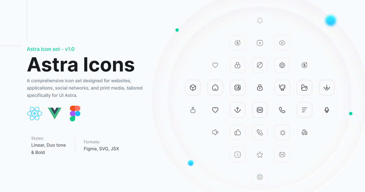
Beautiful Vue 3 icons from the Astra Icons collection. 900+ icons across 5 styles.


## Installation
```bash
npm install @astraicons/vue
# or
yarn add @astraicons/vue
# or
pnpm add @astraicons/vue
```
## Usage
Import icons from their respective style directories:
```vue
```
## Icon Styles
### Linear (288 icons)
Outline icons with 1.5px stroke width. Perfect for modern, minimalist interfaces.
```js
import { ActivityIcon, BellIcon, CameraIcon } from '@astraicons/vue/linear';
```
### Bold (288 icons)
Filled or bold stroke icons for emphasis and better visibility at smaller sizes.
```js
import { ActivityIcon, BellIcon, CameraIcon } from '@astraicons/vue/bold';
```
### Duotone (288 icons)
Two-tone icons that combine filled and outline styles for depth and visual interest.
```js
import { ActivityIcon, BellIcon, CameraIcon } from '@astraicons/vue/duotone';
```
### Brand (18 icons)
Company and service logos including social media platforms and popular brands.
```js
import { AppleIcon, GoogleIcon, TwitterIcon } from '@astraicons/vue/brand';
```
### 3D (32 icons)
Modern three-dimensional style icons with depth and perspective for contemporary interfaces.
```js
import { CubeIcon, FolderIcon, BoxIcon } from '@astraicons/vue/3d';
```
## Props
All icons are functional components that accept standard HTML attributes:
```vue
```
## Examples
### With Tailwind CSS
```vue
```
### With inline styles
```vue
```
### In a button
```vue
```
### With Vue 3 Composition API
```vue
```
## TypeScript Support
All icons are fully typed. TypeScript will provide autocomplete for all available icons.
```vue
```
## Tree Shaking
This package is optimized for tree shaking. Only the icons you import will be included in your bundle.
```js
// ✅ Good - only imports what you need
import { HomeIcon } from '@astraicons/vue/linear';
// ❌ Avoid - imports entire style directory
import * as Icons from '@astraicons/vue/linear';
```
## Package Info
- **Package Size**: ~14MB total (unpacked)
- **Files**: 3,524 files (JS + TypeScript definitions)
- **Tree-shakeable**: Yes - only imported icons are bundled
- **Peer Dependencies**: Vue >= 3
## Available Icons
View the complete list of icons:
- [Browse on UNPKG](https://unpkg.com/browse/@astraicons/vue/) - View package contents
- [Interactive Gallery](https://uiastra.com) - Search and preview icons
- [React Icon List](https://github.com/uiastra/astraicons/blob/main/react/ICON_LIST.md) - Complete list (same icons available in Vue)
## Browser Support
- Chrome (latest)
- Firefox (latest)
- Safari (latest)
- Edge (latest)
## Contributing
We welcome contributions to enhance the project. Our current focus:
- ✅ Bug fixes for existing icons
- ✅ TypeScript improvements
- ✅ Documentation updates
- ❌ New icon contributions (not accepted at this time)
## Related Packages
- [@astraicons/react](https://www.npmjs.com/package/@astraicons/react) - React components
- [astraicons](https://www.npmjs.com/package/astraicons) - SVG icon files
## Credits
- Icon design by [UI Astra](https://uiastra.com)
- Build system inspired by [Heroicons](https://github.com/tailwindlabs/heroicons)
## License
MIT © [UI Astra](https://uiastra.com)
## Links
- [GitHub Repository](https://github.com/uiastra/astraicons)
- [Icon Gallery](https://uiastra.com)
- [Report Issues](https://github.com/uiastra/astraicons/issues)