///
import type { PublicLitElement as LitElement } from "@arcgis/lumina";
import type { T9nMeta } from "@arcgis/lumina/controllers";
import type { Popover as Popover } from "@esri/calcite-components/components/calcite-popover";
/**
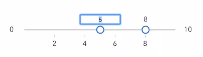
* The slider component is used to filter data or collect numeric input from users. It supports single or multiple thumbs, configured via the
* [values](https://developers.arcgis.com/javascript/latest/references/common-components/components/arcgis-slider/#values) property. The slider can be displayed in a horizontal or vertical [layout](https://developers.arcgis.com/javascript/latest/references/common-components/components/arcgis-slider/#layout), and it supports snapping to defined [steps](https://developers.arcgis.com/javascript/latest/references/common-components/components/arcgis-slider/#steps),
* configurable value [precision](https://developers.arcgis.com/javascript/latest/references/common-components/components/arcgis-slider/#precision), and a custom [labelFormatter](https://developers.arcgis.com/javascript/latest/references/common-components/components/arcgis-slider/#labelFormatter). It also includes keyboard interaction,
* optional editable labels, and customizable popover content.
*
* The slider component can be set up with the [arcgis-ticks](https://developers.arcgis.com/javascript/latest/references/common-components/components/arcgis-ticks/) component. See the example below:
* ```html
*
*
*
*
* ```
*
* > [!TIP]
* > Which slider should you use: `arcgis-slider` or `calcite-slider`?
* >
* > Use [calcite-slider](https://developers.arcgis.com/calcite-design-system/components/slider/) by default. It provides a consistent UI/UX and supports most common slider use cases.
* >
* > Choose `arcgis-slider` when you need more advanced behavior, such as:
* >
* > * A vertical slider via [layout](https://developers.arcgis.com/javascript/latest/references/common-components/components/arcgis-slider/#layout).
* > * More than two [values](https://developers.arcgis.com/javascript/latest/references/common-components/components/arcgis-slider/#values) in a single slider.
* > * A display range that extends beyond the interactive range using [fullRangeMin](https://developers.arcgis.com/javascript/latest/references/common-components/components/arcgis-slider/#fullRangeMin) and [fullRangeMax](https://developers.arcgis.com/javascript/latest/references/common-components/components/arcgis-slider/#fullRangeMax).
* > * Additional slotted content using the `content-start`, `content-end`, or `popover` [slots](https://developers.arcgis.com/javascript/latest/references/common-components/components/arcgis-slider/#slots).
*
* @slot [content-start] - A slot for elements before the track.
* @slot [content-end] - A slot for elements after the track.
* @slot [popover] - A slot for custom content to be rendered in the popover.
* @since 5.0
*/
export abstract class ArcgisSlider extends LitElement {
/**
* The active value of the slider, based on which thumb or range (segment) is active. This returns the stored value for the active thumb,
* so it may reflect the thumb’s last set position.
*
*
* It returns:
* - `undefined` when no value is active
* - a `number` when a single value is active
* - `"all"` when the range (segment) is active
*
* Listen to [@arcgisActiveValueChange](https://developers.arcgis.com/javascript/latest/references/common-components/components/arcgis-slider/#event-arcgisActiveValueChange) to be notified when a value becomes active or inactive.
*
* @see [@arcgisActiveValueChange](https://developers.arcgis.com/javascript/latest/references/common-components/components/arcgis-slider/#event-arcgisActiveValueChange)
*/
get activeValue(): number | "all" | undefined;
/**
* When `true`, allows multiple thumbs to overlap by sharing the same value.
* When `false`, thumbs are prevented from overlapping.
*
* @default false
*/
accessor allowValuesOverlap: boolean;
/**
* If true, the component will not be destroyed automatically when it is
* disconnected from the document. This is useful when you want to move the
* component to a different place on the page, or temporarily hide it. If this
* is set, make sure to call the [destroy()](https://developers.arcgis.com/javascript/latest/references/common-components/components/arcgis-slider/#destroy) method when you are done to
* prevent memory leaks.
*
* @default false
*/
accessor autoDestroyDisabled: boolean;
/**
* Indicates whether the slider is disabled.
*
* @default false
*/
accessor disabled: boolean;
/**
* Controls where the filled segment is displayed on the track for single-thumb sliders.
* Range sliders always display the fill between the min and max thumbs.
*
* @default "start"
*/
accessor fillPlacement: "end" | "none" | "start";
/**
* Sets the maximum value of the slider's displayed range.
* When specified, the slider track is scaled from [fullRangeMin](https://developers.arcgis.com/javascript/latest/references/common-components/components/arcgis-slider/#fullRangeMin) to `fullRangeMax`, while
* the thumbs remain constrained to the interactive range defined by [min](https://developers.arcgis.com/javascript/latest/references/common-components/components/arcgis-slider/#min) and [max](https://developers.arcgis.com/javascript/latest/references/common-components/components/arcgis-slider/#max).
*
* The `fullRangeMax` must be greater than or equal to [max](https://developers.arcgis.com/javascript/latest/references/common-components/components/arcgis-slider/#max) property of the slider.
*
* @see [fullRangeMin](https://developers.arcgis.com/javascript/latest/references/common-components/components/arcgis-slider/#fullRangeMin)
* @example
* ```html
*
*
* ```
*/
accessor fullRangeMax: number | undefined;
/**
* Sets the minimum value of the slider's displayed range.
* When specified, the slider track is scaled from `fullRangeMin` to [fullRangeMax](https://developers.arcgis.com/javascript/latest/references/common-components/components/arcgis-slider/#fullRangeMax), while
* the thumbs remain constrained to the range defined by [min](https://developers.arcgis.com/javascript/latest/references/common-components/components/arcgis-slider/#min) and [max](https://developers.arcgis.com/javascript/latest/references/common-components/components/arcgis-slider/#max).
*
* The `fullRangeMin` must be less than or equal to [min](https://developers.arcgis.com/javascript/latest/references/common-components/components/arcgis-slider/#min) property of the slider.
*
* @see [fullRangeMax](https://developers.arcgis.com/javascript/latest/references/common-components/components/arcgis-slider/#fullRangeMax)
* @example
* ```html
*
*
* ```
*/
accessor fullRangeMin: number | undefined;
/**
* Controls how many "small" keyboard increments are applied in order to move a thumb or range faster using the
* keyboard. The following keys are considered "large" increment keys:
*
* - PageUp/PageDown
* - Shift + Arrow keys
*
* @default 10
* @internal
*/
accessor keyboardLargeStep: number;
/**
* Allows customizing how slider labels are formatted for [min](https://developers.arcgis.com/javascript/latest/references/common-components/components/arcgis-slider/#min), [max](https://developers.arcgis.com/javascript/latest/references/common-components/components/arcgis-slider/#max), and thumb values.
* The formatted value is used for the visible labels and for the thumb’s accessible value text via `aria-valuetext`.
* Return `null` or `undefined` to use the default formatting.
*
* @example
* ```js
* // Format labels to use "K" for thousands and "M" for millions
* // and use "start" and "end" for min and max labels respectively.
* slider.labelFormatter = (value, type, defaultFormatter) => {
* if (type === "min") return "start";
* if (type === "max") return "end";
* if (type !== "value") return defaultFormatter(value);
*
* const abs = Math.abs(value);
* if (abs >= 1_000_000) {
* const num = (value / 1_000_000).toLocaleString(undefined, { maximumSignificantDigits: 3 });
* return `${num} M`;
* }
*
* if (abs >= 1_000) {
* const num = (value / 1_000).toLocaleString(undefined, { maximumSignificantDigits: 3 });
* return `${num} K`;
* }
* return defaultFormatter(value);
* };
* ```
*/
accessor labelFormatter: (value: number, type: "max" | "min" | "value", defaultFormatter: (value: number) => string) => string | null | undefined;
/**
* Determines the layout/orientation of the Slider component. By default, the slider will render horizontally with the min value on the left side
* of the track.
*
* @default "horizontal"
* @see [mirrored](https://developers.arcgis.com/javascript/latest/references/common-components/components/arcgis-slider/#mirrored)
*/
accessor layout: "horizontal" | "vertical";
/**
* The maximum value for the slider thumbs. Thumbs will not move past this value.
*
* To display the `max` label on the slider, set [showRangeLabels](https://developers.arcgis.com/javascript/latest/references/common-components/components/arcgis-slider/#showRangeLabels) to `true`.
* To allow the end user to modify the `max` value, set [rangeLabelsEditingEnabled](https://developers.arcgis.com/javascript/latest/references/common-components/components/arcgis-slider/#rangeLabelsEditingEnabled) to `true`.
*
* @see [rangeLabelsEditingEnabled](https://developers.arcgis.com/javascript/latest/references/common-components/components/arcgis-slider/#rangeLabelsEditingEnabled)
* @see [showRangeLabels](https://developers.arcgis.com/javascript/latest/references/common-components/components/arcgis-slider/#showRangeLabels)
* @see [fullRangeMax](https://developers.arcgis.com/javascript/latest/references/common-components/components/arcgis-slider/#fullRangeMax)
*/
accessor max: number;
/**
* Replace localized message strings with your own strings.
*
* _**Note**: Individual message keys may change between releases._
*/
accessor messageOverrides: {
componentLabel?: string | undefined;
maximumValue?: string | undefined;
minimumValue?: string | undefined;
rangeMaximum?: string | undefined;
rangeMinimum?: string | undefined;
sliderValue?: string | undefined;
};
/** @internal */
protected messages: Partial<{
componentLabel: string;
maximumValue: string;
minimumValue: string;
rangeMaximum: string;
rangeMinimum: string;
sliderValue: string;
}> & T9nMeta<{
componentLabel: string;
maximumValue: string;
minimumValue: string;
rangeMaximum: string;
rangeMinimum: string;
sliderValue: string;
}>;
/**
* The minimum value for the slider thumbs. Thumbs will not move past this value.
* To display the `min` label on the slider, set [showRangeLabels](https://developers.arcgis.com/javascript/latest/references/common-components/components/arcgis-slider/#showRangeLabels) to `true`.
* To allow the end user to modify the `min` value, set [rangeLabelsEditingEnabled](https://developers.arcgis.com/javascript/latest/references/common-components/components/arcgis-slider/#rangeLabelsEditingEnabled) to `true`.
*
* @see [rangeLabelsEditingEnabled](https://developers.arcgis.com/javascript/latest/references/common-components/components/arcgis-slider/#rangeLabelsEditingEnabled)
* @see [showRangeLabels](https://developers.arcgis.com/javascript/latest/references/common-components/components/arcgis-slider/#showRangeLabels)
*/
accessor min: number;
/**
* When `true`, the slider will display values from high to low. This inverts the direction of the slider.
*
* @default false
* @see [layout](https://developers.arcgis.com/javascript/latest/references/common-components/components/arcgis-slider/#layout)
*/
accessor mirrored: boolean;
/**
* The accessible label for the popover. This label is used by assistive technologies and does not affect the visible UI.
*
* @default ""
* @see [Calcite popover](https://developers.arcgis.com/calcite-design-system/components/popover/#api-reference-properties-label)
*/
accessor popoverLabel: Popover["label"];
/**
* Determines which side of the track the popover is placed on.
* The popover is the floating container that displays the content from the `popover` slot.
* * `"start"`: Positions the popover above a horizontal slider or to the left of a vertical slider.
* * `"end"`: Positions the popover below a horizontal slider or to the right of a vertical slider.
*
* @default "start"
* @example
* ```js
* const slider = document.querySelector("arcgis-slider");
* slider.popoverPlacement = "end";
*
* // Example: Dynamic popover content based on slider value
* const popover = document.getElementById("popover");
* const unitCost = 12.5;
* const numberFormatter = new Intl.NumberFormat();
* const usd = new Intl.NumberFormat(undefined, { style: "currency", currency: "USD" });
*
* const renderPopover = () => {
* const value = Number(slider.values?.[0] ?? 0); // 0-100
* const annualCost = (value / 100) * 800 * 365 * unitCost;
* popover.textContent = `Est. annual cost: ${usd.format(annualCost)} (at ${numberFormatter.format(value)}%)`;
* slider.popoverLabel = `Cost estimate ${usd.format(annualCost)} at ${numberFormatter.format(value)} percent`;
* };
*
* slider.addEventListener("arcgisInput", renderPopover);
* slider.addEventListener("arcgisChange", renderPopover);
* renderPopover();
* ```
*/
accessor popoverPlacement: "end" | "start";
/**
* Defines how slider thumb values should be rounded. This number indicates the number
* of decimal places slider thumb _values_ should round to when they have been moved.
*
* This value also indicates the precision of thumb labels when the data range
* is less than `10` (i.e. `(max - min) < 10`).
*
* When the data range is larger than `10`, labels display with a precision of
* no more than two decimal places, though actual slider thumb values will maintain the
* precision specified in this property.
*
* For example, given the default precision of `4`, and the following slider configuration,
* The labels of the thumbs will display two decimal places, but the precision of the actual
* thumb values will not be lost even when the user slides or moves the thumb.
*
* Keep in mind this property rounds thumb [values](https://developers.arcgis.com/javascript/latest/references/common-components/components/arcgis-slider/#values) and shouldn't be used exclusively
* for formatting purposes. To format thumb `labels`, use the [labelFormatter](https://developers.arcgis.com/javascript/latest/references/common-components/components/arcgis-slider/#labelFormatter)
* property.
*
* @default 4
* @example
* ```html
*
*
*
* ```
*/
accessor precision: number;
/**
* When `true`, users can edit the [min](https://developers.arcgis.com/javascript/latest/references/common-components/components/arcgis-slider/#min) and [max](https://developers.arcgis.com/javascript/latest/references/common-components/components/arcgis-slider/#max) range labels via keyboard input.
* Editing these labels updates the slider’s interactive range.
*
* @default false
*/
accessor rangeLabelsEditingEnabled: boolean;
/**
* Controls where the [min](https://developers.arcgis.com/javascript/latest/references/common-components/components/arcgis-slider/#min) and [max](https://developers.arcgis.com/javascript/latest/references/common-components/components/arcgis-slider/#max) range labels are positioned relative to the track.
* This property only affects the slider when [layout](https://developers.arcgis.com/javascript/latest/references/common-components/components/arcgis-slider/#layout) is `"horizontal"`.
*
* - `"center"` (default): Places the [min](https://developers.arcgis.com/javascript/latest/references/common-components/components/arcgis-slider/#min) and [max](https://developers.arcgis.com/javascript/latest/references/common-components/components/arcgis-slider/#max) labels aligned with the track.
* - `"end"`: Places the range labels below the track.
*
* @default "center"
*/
accessor rangeLabelsPlacement: "center" | "end";
/**
* Indicates if the user can drag the segment between thumbs to update thumb positions.
*
* @default false
*/
accessor segmentsDraggingDisabled: boolean;
/**
* Indicates whether [min](https://developers.arcgis.com/javascript/latest/references/common-components/components/arcgis-slider/#min) and [max](https://developers.arcgis.com/javascript/latest/references/common-components/components/arcgis-slider/#max) range labels are visible on the slider.
*
* @default false
*/
accessor showRangeLabels: boolean;
/**
* Sets intervals on the slider that restrict user
* input to specific values. If an array of numbers is passed to this
* property, the slider thumbs may only be moved to the positions
* specified in the array.
*
* This can be set as comma-separated numbers in the attribute (e.g., ``)
* or programmatically as either a single number or an array of numbers (e.g., `slider.steps = 10`, `slider.steps = [10, 20, 30]`).
*
* If a single number is set, then steps are set along the entire
* slider range at an interval of the provided value. The user may
* only slide the thumbs to values at the provided interval.
* For example, if a value of `0.5` is set and the slider
* [min](https://developers.arcgis.com/javascript/latest/references/common-components/components/arcgis-slider/#min) is `0` and [max](https://developers.arcgis.com/javascript/latest/references/common-components/components/arcgis-slider/#max) is `2`, then the user will
* only be able to update the thumbs to values of 0, 0.5, 1.0, 1.5, and 2.0.
*
* @example
* ```html
*
*
* ```
* @example
* ```html
*
*
* ```
*/
accessor steps: number[] | number | undefined;
/**
* Controls when thumb value labels are displayed.
*
* This property can be set to one of the following values:
* - `"always"`: Always show the labels.
* - `"auto"`: Show the labels only when the thumb representing a value is dragged.
* - `"hidden"`: Never show the labels.
*
* @default "hidden"
*/
accessor valueLabelsDisplay: "always" | "auto" | "hidden";
/**
* Indicates whether to enable editing input values via keyboard input
* when the user clicks a thumb value label. This allows the user to move the slider
* thumb to precise values without sliding the thumbs.
*
* 
*
* @default false
*/
accessor valueLabelsEditingEnabled: boolean;
/**
* Determines whether the thumb value labels are placed before or after the track.
*
* @default "start"
*/
accessor valueLabelsPlacement: "end" | "start";
/**
* An array of numbers representing absolute thumb positions on the slider. This can be set as comma-separated
* numbers in the attribute (e.g., ``) or programmatically as an
* array of numbers (e.g., `slider.values = [10, 20, 30]`).
*/
accessor values: number[];
/** Permanently destroys the component. */
destroy(): Promise;
/**
* Fires when the [activeValue](https://developers.arcgis.com/javascript/latest/references/common-components/components/arcgis-slider/#activeValue) changes as a thumb or the range gains or loses focus.
* This event does not fire when [values](https://developers.arcgis.com/javascript/latest/references/common-components/components/arcgis-slider/#values) change. Use [@arcgisInput](https://developers.arcgis.com/javascript/latest/references/common-components/components/arcgis-slider/#event-arcgisInput) for continuous updates or
* [@arcgisChange](https://developers.arcgis.com/javascript/latest/references/common-components/components/arcgis-slider/#event-arcgisChange) when the interaction is committed.
*
* @example
* ```js
* // Display the active value status of the slider in a div element
* const slider = document.querySelector("arcgis-slider");
* const status = document.getElementById("slider-status");
*
* const renderActive = () => {
* const active = slider.activeValue;
* // active is: undefined (none), number (thumb value), or "all" (range segment)
* status.textContent =
* active === "all"
* ? "Editing range"
* : active == null
* ? "No active thumb"
* : `Editing value: ${active}`;
* };
*
* slider.addEventListener("arcgisActiveValueChange", renderActive);
* // Pair with these when you need value updates:
* slider.addEventListener("arcgisInput", () => console.log("values", slider.values));
* slider.addEventListener("arcgisChange", () => console.log("committed", slider.values));
*
* renderActive();
* ```
* @see [activeValue](https://developers.arcgis.com/javascript/latest/references/common-components/components/arcgis-slider/#activeValue)
*/
readonly arcgisActiveValueChange: import("@arcgis/lumina").TargetedEvent;
/**
* Fires when the thumb or range is released on the slider.
*
* Use [@arcgisInput](https://developers.arcgis.com/javascript/latest/references/common-components/components/arcgis-slider/#event-arcgisInput) for continuous updates during a drag.
*
* @example
* ```js
* const slider = document.querySelector("arcgis-slider");
* slider.popoverPlacement = "end";
*
* // Example: Dynamic popover content based on slider value
* const popover = document.getElementById("popover");
* const unitCost = 12.5;
* const numberFormatter = new Intl.NumberFormat();
* const usd = new Intl.NumberFormat(undefined, { style: "currency", currency: "USD" });
*
* const renderPopover = () => {
* const value = Number(slider.values?.[0] ?? 0); // 0-100
* const annualCost = (value / 100) * 800 * 365 * unitCost;
* popover.textContent = `Est. annual cost: ${usd.format(annualCost)} (at ${numberFormatter.format(value)}%)`;
* slider.popoverLabel = `Cost estimate ${usd.format(annualCost)} at ${numberFormatter.format(value)} percent`;
* };
*
* slider.addEventListener("arcgisChange", renderPopover);
* renderPopover();
* ```
*/
readonly arcgisChange: import("@arcgis/lumina").TargetedEvent;
/**
* Fires continuously while the thumb or range is being dragged.
* This event can fire frequently; consider debouncing or throttling expensive work.
*
* @example
* ```js
* import FeatureEffect from "@arcgis/core/layers/support/FeatureEffect";
* import FeatureFilter from "@arcgis/core/layers/support/FeatureFilter";
*
* slider.addEventListener("arcgisInput", () => {
* const value = slider.values[0] ?? 0;
* layer.featureEffect = new FeatureEffect({
* filter: new FeatureFilter({
* where: `FIELD <= ${value}`,
* }),
* includedEffect: "bloom(1.4, 0.2px, 0.1)",
* excludedEffect: "opacity(20%) grayscale(100%)",
* });
* });
* ```
*/
readonly arcgisInput: import("@arcgis/lumina").TargetedEvent;
/**
* Fires when the slider's range changes.
* This occurs when the user edits the [min](https://developers.arcgis.com/javascript/latest/references/common-components/components/arcgis-slider/#min) or [max](https://developers.arcgis.com/javascript/latest/references/common-components/components/arcgis-slider/#max) range labels (when enabled).
*
* @example
* ```js
* // Example: Keep a "budget" value inside the editable min/max range
* const slider = document.querySelector("arcgis-slider");
*
* const clamp = (val, min, max) => Math.min(max, Math.max(min, val));
*
* const render = () => {
* rangeText.textContent = `Allowed: ${slider.min}–${slider.max}`;
*
* // If your UI stores a single value, keep it inside the new range.
* const current = Number(slider.values?.[0] ?? slider.min);
* const next = clamp(current, slider.min, slider.max);
*
* if (next !== current) {
* slider.values = [next];
* }
*
* valueText.textContent = `Selected: ${next}`;
* };
*
* slider.addEventListener("arcgisRangeChange", render);
* render();
* ```
*/
readonly arcgisRangeChange: import("@arcgis/lumina").TargetedEvent;
readonly "@eventTypes": {
arcgisActiveValueChange: ArcgisSlider["arcgisActiveValueChange"]["detail"];
arcgisChange: ArcgisSlider["arcgisChange"]["detail"];
arcgisInput: ArcgisSlider["arcgisInput"]["detail"];
arcgisRangeChange: ArcgisSlider["arcgisRangeChange"]["detail"];
};
}