<div align="center">

<img src="https://raw.githubusercontent.com/arach/arc/main/public/arc-mark.svg" alt="Arc" width="52" height="52" />

# Arc

### Diagrams as code.

Arc turns typed, diffable config into clean, themeable architecture diagrams.
Design in the visual editor, render with React, or export as **TypeScript, JSON,
SVG, PNG, or crisp ASCII**. The diagram lives with the system it describes.

[![npm version](https://img.shields.io/npm/v/@arach/arc.svg?color=6d5efc&label=%40arach%2Farc)](https://www.npmjs.com/package/@arach/arc)

[![license](https://img.shields.io/npm/l/@arach/arc.svg?color=41b883)](./LICENSE)
[![types](https://img.shields.io/npm/types/@arach/arc.svg?color=3b82f6)](./lib/index.d.ts)

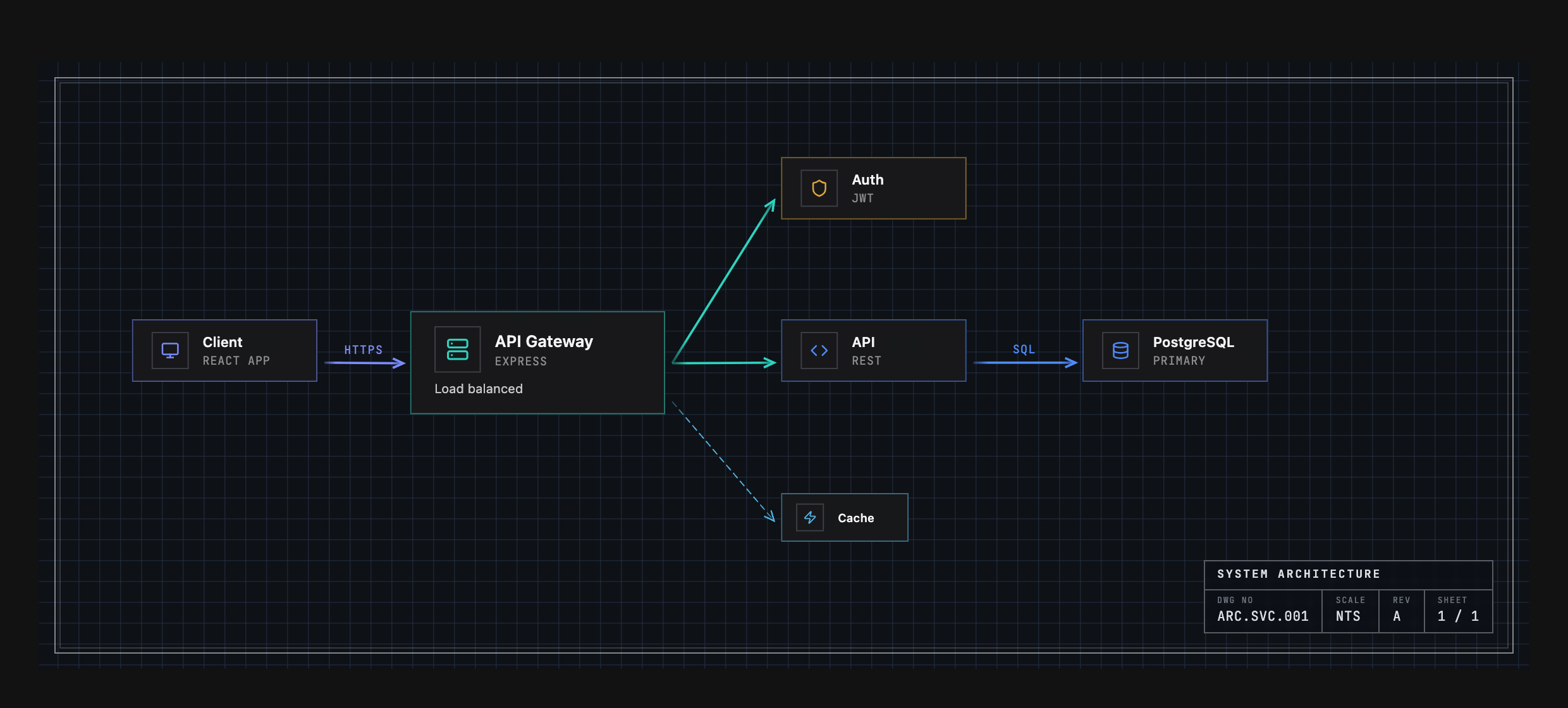
![A microservices architecture rendered by Arc's ArcDiagram component in the Engineering theme](https://raw.githubusercontent.com/arach/arc/main/public/hero.png)

<sub>Not a screenshot of a drawing tool — that's the config in <a href="#example-output">Example Output</a>, rendered by <code>&lt;ArcDiagram /&gt;</code> in the Engineering theme.</sub>

</div>

---

## Install

```bash
npm install @arach/arc
# or:  bun add @arach/arc  ·  pnpm add @arach/arc  ·  yarn add @arach/arc
```

`react` and `react-dom` are peer dependencies. Arc bundles its icon renderer and
has no production dependencies of its own.

## Quick Start

Render any diagram config as a polished, interactive component:

```tsx
import { ArcDiagram } from '@arach/arc'
import type { ArcDiagramData } from '@arach/arc'

export function Architecture() {
  return (
    <ArcDiagram
      data={diagram}      // your ArcDiagramData (see below)
      theme="default"     // seven themes, each with light & dark
      mode="dark"         // light · dark
      defaultZoom="fit"   // auto-fit to the container
    />
  )
}
```

You get pan/zoom, hover highlighting, light/dark modes, and seven color themes
out of the box.

### Key props

| Prop | Type | Notes |
|------|------|-------|
| `data` | `ArcDiagramData` | The diagram config (required) — see [Example Output](#example-output). |
| `theme` | `'default' \| 'warm' \| 'cool' \| 'mono' \| 'engineering' \| 'workbench' \| 'tactical'` | Palette + drafting grammar (grid, frame, type). |
| `mode` | `'light' \| 'dark'` | Appearance. |
| `frame` | `'hairline' \| 'inset' \| 'brackets' \| 'ticks' \| 'cropmarks' \| 'corners' \| 'sheet' \| 'none'` | Override the theme's edge treatment. |
| `interactive` | `boolean` | Pan/zoom controls. |
| `defaultZoom` | `number \| 'fit'` | Initial zoom, or `'fit'` to auto-fit (`maxFitZoom` caps it). |
| `showControls` / `showMinimap` | `boolean` | Zoom controls / minimap for read-only chrome. |
| `hoverEffects` | `boolean \| { dim, lift, glow, highlightEdges }` | Hover highlighting (granular). |
| `label` | `string` | Override the bottom-left label. |

## The Studio

Prefer to design visually? Arc ships a full drag-and-drop **studio** — infinite
canvas, floating toolbar, reusable connector styles, live properties panel, and
a minimap. Clone the repo and open it:

```bash
git clone https://github.com/arach/arc && cd arc
bun install && bun dev      # → http://localhost:5188/editor
```

![The Arc Studio — a drag-and-drop editor for architecture diagrams](https://raw.githubusercontent.com/arach/arc/main/public/studio.png)

Design on the canvas, then **Export** to TypeScript, JSON, SVG, PNG, or a
shareable link — and drop the result straight into `<ArcDiagram />`.

## Features

- **Visual Editor** - Drag-and-drop nodes, connect with arrows
- **Multiple Node Sizes** - Large, medium, small
- **Color Themes** - Violet, emerald, blue, amber, sky, zinc, rose, orange
- **Connector Styles** - Solid/dashed lines, labels, curved paths
- **Export Options** - TypeScript, JSON, SVG, PNG, ASCII, shareable links
- **Interactive Canvas** - Infinite pan/zoom, grid snapping
- **Groups & Images** - Visual grouping, background images
- **Templates** - Quick-start layouts

## Native Mermaid Sequences

`@arach/arc-viewer` turns canonical Mermaid `sequenceDiagram` source into a
typed Arc document and a native, interactive React player—without embedding the
generic Mermaid runtime.

```bash
npm install @arach/arc-viewer
```

```tsx
import { ArcMermaidPlayer } from '@arach/arc-viewer'

const source = `sequenceDiagram
  participant App
  participant API
  App->>API: Load architecture
  API-->>App: Typed diagram`

export function Sequence() {
  return <ArcMermaidPlayer source={source} mode="light" />
}
```

Existing Mermaid flowcharts and state diagrams can also be projected into
`ArcDiagramData`:

```ts
import { importMermaid } from '@arach/arc-viewer'

const { diagram, warnings, unsupported } = importMermaid(source)
```

This compatibility adapter is intentionally lossy. Use the native Mermaid APIs
above when sequence semantics must remain intact. See
[Mermaid architecture projection](./docs/mermaid-import.md) for the supported
grammar and diagnostic contract.

## Themes

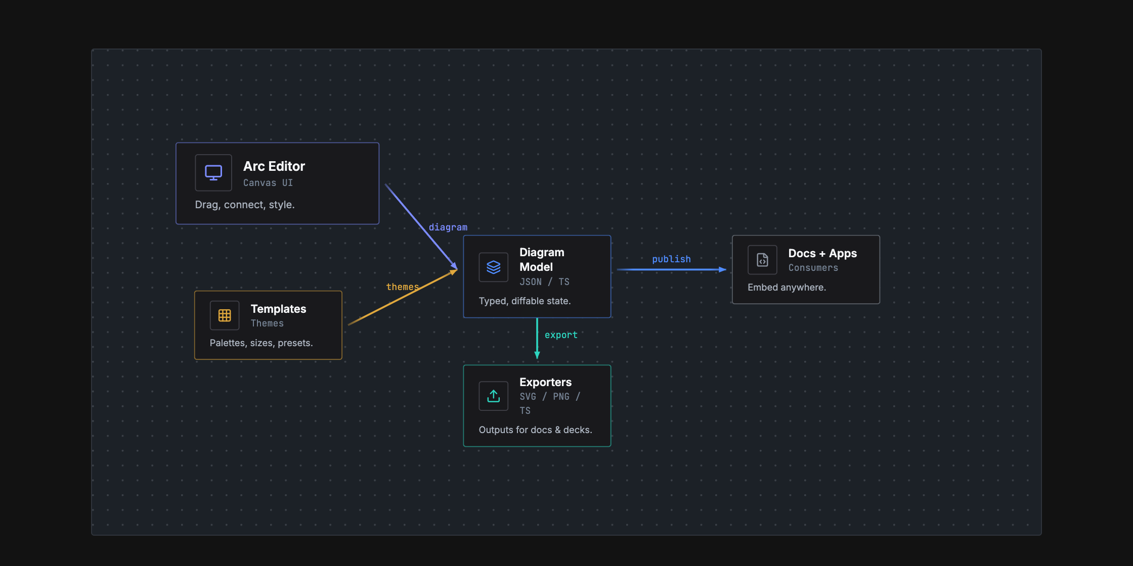
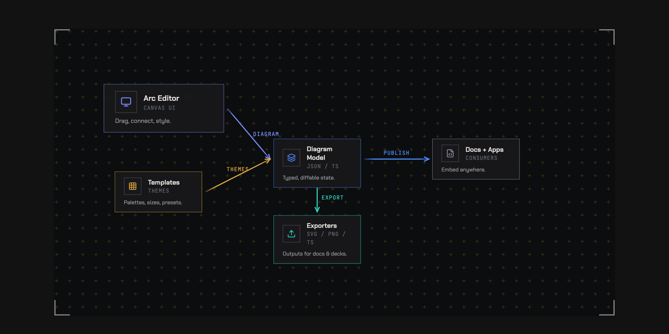
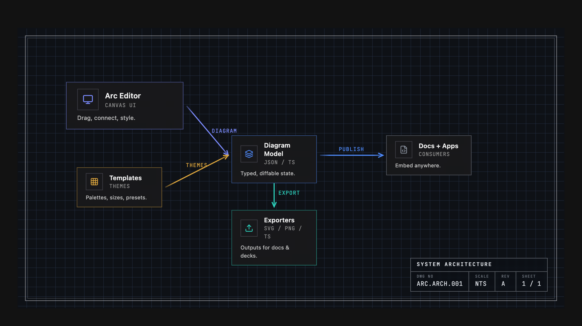
One diagram, several drafting grammars. The nodes and palette stay the same —
what changes is the grid system, edge treatment, type, and geometry. Here's
Arc's own architecture rendered three ways:

<div align="center">
  <img src="https://raw.githubusercontent.com/arach/arc/main/public/theme-engineering.png" alt="Arc's architecture in the Engineering theme" width="840" />
  <br/>
  <sub><strong>Engineering</strong> — graph grid, drawing-sheet border, title block, uppercase mono</sub>
  <br/><br/>
  <img src="https://raw.githubusercontent.com/arach/arc/main/public/theme-workbench.png" alt="Arc's architecture in the Workbench theme" width="840" />
  <br/>
  <sub><strong>Workbench</strong> — dot grid, hairline frame, soft corners</sub>
  <br/><br/>
  <img src="https://raw.githubusercontent.com/arach/arc/main/public/theme-tactical.png" alt="Arc's architecture in the Tactical theme" width="840" />
  <br/>
  <sub><strong>Tactical</strong> — crosshair grid, corner brackets, hard edges</sub>
</div>

Plus `default`, `warm`, `cool`, and `mono` — seven in all, each with light and dark modes.

## Example Output

Arc stores diagrams as plain, typed data — the same config that renders the
diagram at the top of this README:

```typescript
const diagram: ArcDiagramData = {
  layout: { width: 850, height: 340 },
  nodes: {
    client:  { x: 40,  y: 130, size: 'm' },
    gateway: { x: 220, y: 130, size: 'l' },
    auth:    { x: 460, y: 40,  size: 'm' },
    api:     { x: 460, y: 140, size: 'm' },
    cache:   { x: 460, y: 240, size: 's' },
    db:      { x: 680, y: 140, size: 'm' },
  },
  nodeData: {
    client:  { icon: 'Monitor',  name: 'Client',      subtitle: 'React App', color: 'violet' },
    gateway: { icon: 'Server',   name: 'API Gateway', subtitle: 'Express', description: 'Load balanced', color: 'emerald' },
    auth:    { icon: 'Shield',   name: 'Auth',        subtitle: 'JWT', color: 'amber' },
    api:     { icon: 'Code',     name: 'API',         subtitle: 'REST', color: 'blue' },
    cache:   { icon: 'Zap',      name: 'Cache',       color: 'sky' },
    db:      { icon: 'Database', name: 'PostgreSQL',  subtitle: 'Primary', color: 'blue' },
  },
  connectors: [
    { from: 'client',  to: 'gateway', fromAnchor: 'right',       toAnchor: 'left', style: 'https' },
    { from: 'gateway', to: 'auth',    fromAnchor: 'right',       toAnchor: 'left', style: 'internal' },
    { from: 'gateway', to: 'api',     fromAnchor: 'right',       toAnchor: 'left', style: 'internal' },
    { from: 'gateway', to: 'cache',   fromAnchor: 'bottomRight', toAnchor: 'left', style: 'cache' },
    { from: 'api',     to: 'db',      fromAnchor: 'right',       toAnchor: 'left', style: 'sql' },
  ],
  connectorStyles: {
    https:    { color: 'violet',  strokeWidth: 2, label: 'HTTPS' },
    internal: { color: 'emerald', strokeWidth: 2 },
    cache:    { color: 'sky',     strokeWidth: 1, dashed: true },
    sql:      { color: 'blue',    strokeWidth: 2, label: 'SQL' },
  },
}
```

## ASCII Renderer

The same diagram renders as precise monospace text — for READMEs, CLI output, or anywhere you can't embed a React component:

```
                                                     ┌──────────────────┐
                                                     │ ◆ Auth           │
                                                   ┌▶│ JWT              │
                                                   │ └──────────────────┘
                                                   │
┌──────────────────┐   ╔═════════════════════════╗ │
│ ◆ Client         │   ║ ◆ API Gateway           ║ │ ┌──────────────────┐       ┌──────────────────┐
│ React App        │─┐ ║ Express                 ║ │ │ ◆ API            │ SQL   │ ◆ PostgreSQL     │
│                  │ └▶║ Load balanced           ║─┴▶│ REST             │──────▶│ Primary          │
└──────────────────┘   ║                         ║╌┐ └──────────────────┘       └──────────────────┘
                       ╚═════════════════════════╝ ╎
                                                   ╎
                                                   ╎ ┌───────────┐
                                                   └▶│ ◆ Cache   │
                                                     └───────────┘
```

### Programmatic

```typescript
import { renderAscii } from '@arach/arc'

const ascii = renderAscii(diagram)                          // Unicode box-drawing
const plain = renderAscii(diagram, { charset: 'ascii' })    // +-- style
const narrow = renderAscii(diagram, { maxWidth: 80 })       // Auto-scale to 80 cols
```

### CLI

```bash
bunx tsx bin/arc-ascii.mjs diagram.json
cat diagram.json | bunx tsx bin/arc-ascii.mjs
bunx tsx bin/arc-ascii.mjs diagram.json --charset ascii --max-width 80
```

## Requirements

The `ArcDiagram` player component requires:

- **Tailwind CSS v3+** - Component uses Tailwind utility classes for styling
- **Default color palette** - The following colors must be available: `violet`, `emerald`, `blue`, `amber`, `sky`, `zinc`, `rose`, `orange`

If you're using a custom Tailwind config that restricts the color palette, ensure these colors are included.

## Tech Stack

- React 19
- Vite 7
- TailwindCSS 4
- Lucide React (icons)

## License

MIT

### Retro print material

Set `material: 'retro-print'` on an isometric `DiagramConfig` for mineral inks,
warm paper, and deterministic stipple. It works in the React diagram and static
SVG renderer. Omit the option (or use `'standard'`) to keep the existing finish.
React technical styles such as blueprint and cyanotype take precedence over
the material setting.