# Svelte Drawer

A drawer component for Svelte 5, inspired by [Vaul](https://github.com/emilkowalski/vaul).

[![skills.sh](https://skills.sh/b/AbhiVarde/svelte-drawer)](https://skills.sh/AbhiVarde/svelte-drawer)
[![](https://img.shields.io/badge/npm-@abhivarde/svelte--drawer-000?style=flat&logo=npm&logoColor=white)](https://www.npmjs.com/package/@abhivarde/svelte-drawer) [![](https://img.shields.io/badge/npmx-@abhivarde/svelte--drawer-000?style=flat&logo=node.js&logoColor=white)](https://npmx.dev/package/@abhivarde/svelte-drawer)



## Features

- Smooth animations with gesture-driven dragging (mouse and touch)
- Support for multiple directions (bottom, top, left, right)
- Customizable animation duration and easing per drawer
- Snap points for iOS-like multi-height drawers
- Auto height for dynamic content (AI streaming, forms, lists)
- Backdrop blur on the overlay
- Portal rendering to escape z-index conflicts
- Prebuilt variants (default, sheet, dialog, minimal, sidebar)
- Drag handle with auto-adaptive orientation
- Optional header and footer components
- Nested drawer support
- Scrollable content areas
- Persistent state across page reloads
- Configurable dismiss threshold
- Keyboard shortcuts (Escape to close, Tab navigation)
- Focus management (auto-focus, focus trap, focus restoration)
- Fully accessible with keyboard navigation
- Full TypeScript support
- Works with Tailwind CSS

## Installation

```bash
npm install @abhivarde/svelte-drawer
```

## Usage

### Basic

```svelte
<script>
  import { Drawer, DrawerOverlay, DrawerContent, DrawerHandle } from '@abhivarde/svelte-drawer';

  let open = $state(false);
</script>

<button onclick={() => open = true}>Open Drawer</button>

<Drawer bind:open>
  <DrawerOverlay class="fixed inset-0 bg-black/40" />
  <DrawerContent class="fixed bottom-0 left-0 right-0 bg-white rounded-t-lg p-4">
    <DrawerHandle class="mb-8" />
    <h2>Drawer Content</h2>
    <p>This is a drawer component.</p>
    <button onclick={() => open = false}>Close</button>
  </DrawerContent>
</Drawer>
```

### Directions

```svelte
<Drawer bind:open direction="bottom">...</Drawer>
<Drawer bind:open direction="top">...</Drawer>
<Drawer bind:open direction="left">...</Drawer>
<Drawer bind:open direction="right">...</Drawer>
```

### Custom Animation

Control the speed and easing of any drawer independently.

```svelte
<script>
  import { cubicOut, bounceOut, linear } from 'svelte/easing';
</script>

<!-- slower, softer -->
<Drawer bind:open animationDuration={400} animationEasing={cubicOut}>
  ...
</Drawer>

<!-- fast and snappy -->
<Drawer bind:open animationDuration={150} animationEasing={linear}>
  ...
</Drawer>

<!-- playful bounce -->
<Drawer bind:open animationDuration={500} animationEasing={bounceOut}>
  ...
</Drawer>
```

Any easing from `svelte/easing` works, or pass your own `(t: number) => number` function. Default is `220ms` with `expoOut`.

### Side Drawer

```svelte
<Drawer bind:open direction="right">
  <DrawerOverlay class="fixed inset-0 bg-black/40" />
  <DrawerContent class="fixed right-0 top-0 bottom-0 w-80 bg-white p-4">
    <DrawerHandle class="mb-4" />
    <h2>Side Drawer</h2>
  </DrawerContent>
</Drawer>
```

### Backdrop Blur

```svelte
<Drawer bind:open>
  <DrawerOverlay blur="lg" class="fixed inset-0 bg-black/30" />
  <DrawerContent class="fixed bottom-0 left-0 right-0 bg-white rounded-t-lg p-4">
    <DrawerHandle class="mb-8" />
    <h2>Blurred Backdrop</h2>
  </DrawerContent>
</Drawer>
```

Available intensities: `sm`, `md`, `lg`, `xl`, `2xl`, `3xl`. Default is `md`.

### Snap Points

```svelte
<script>
  let open = $state(false);
  let activeSnapPoint = $state(undefined);
</script>

<Drawer
  bind:open
  snapPoints={[0.25, 0.5, 0.9]}
  bind:activeSnapPoint
  onSnapPointChange={(point) => console.log('Snapped to:', point)}
>
  <DrawerOverlay class="fixed inset-0 bg-black/40" />
  <DrawerContent class="fixed bottom-0 left-0 right-0 bg-white rounded-t-lg p-4">
    <DrawerHandle class="mb-8" />
    <p>Current: {activeSnapPoint ? `${(activeSnapPoint * 100).toFixed(0)}%` : 'loading'}</p>
    <button onclick={() => activeSnapPoint = 0.5}>Jump to 50%</button>
  </DrawerContent>
</Drawer>
```

Snap point values range from 0 to 1. The drawer snaps to the nearest point on release. Dragging past the lowest snap point dismisses it.

### Auto Height

Use `autoHeight` on `DrawerContent` when content changes height at runtime, such as AI streaming responses, multi-step forms, or dynamic lists.

```svelte
<script>
  let open = $state(false);
  let streaming = $state(false);
  let text = $state('');

  async function simulate() {
    open = true;
    streaming = true;
    text = '';
    const lines = [
      'Sure! Here is what autoHeight does.',
      '\n\nIt watches your content as it changes.',
      '\n\nWhen content grows, the drawer follows automatically.',
      '\n\nNo magic numbers. No hardcoded heights. Just works.',
    ];
    for (const line of lines) {
      await new Promise(r => setTimeout(r, 500));
      text += line;
    }
    streaming = false;
  }
</script>

<button onclick={simulate}>Ask AI</button>

<Drawer bind:open>
  <DrawerOverlay />
  <DrawerContent
    autoHeight
    class="bg-gray-100 flex flex-col rounded-t-[10px] fixed bottom-0 left-0 right-0 outline-none"
  >
    <div class="p-4 bg-white rounded-t-[10px]">
      <DrawerHandle class="mb-8" />
      <p class="font-medium mb-2 text-gray-900">AI Response</p>
      {#if text}
        <p class="text-sm text-gray-600 leading-relaxed">
          {text}{streaming ? '▌' : ''}
        </p>
      {/if}
    </div>
  </DrawerContent>
</Drawer>
```

### Close Threshold

Control how far the user must drag before the drawer dismisses.

```svelte
<!-- easier to dismiss -->
<Drawer bind:open closeThreshold={0.15}>...</Drawer>

<!-- harder to dismiss -->
<Drawer bind:open closeThreshold={0.5}>...</Drawer>
```

Values range from `0` to `1`. Default is `0.3`.

### Variants

```svelte
<!-- iOS-style sheet -->
<Drawer bind:open>
  <DrawerOverlay class="fixed inset-0 bg-black/40" />
  <DrawerVariants variant="sheet">
    <DrawerHandle class="mb-6" />
    <h2>Sheet</h2>
  </DrawerVariants>
</Drawer>

<!-- sidebar -->
<Drawer bind:open direction="right">
  <DrawerOverlay class="fixed inset-0 bg-black/40" />
  <DrawerVariants variant="sidebar">
    <h2>Sidebar</h2>
  </DrawerVariants>
</Drawer>
```

Available: `default`, `sheet`, `dialog`, `minimal`, `sidebar`.

### Portal

Renders the drawer at the end of `<body>` to avoid z-index and overflow conflicts.

```svelte
<Drawer bind:open portal={true}>
  <DrawerOverlay />
  <DrawerContent class="fixed bottom-0 left-0 right-0 bg-white rounded-t-lg p-4">
    <DrawerHandle class="mb-8" />
    <h2>Portal Drawer</h2>
  </DrawerContent>
</Drawer>
```

Custom container:

```svelte
<Drawer bind:open portal={true} portalContainer="#my-portal">
  ...
</Drawer>

<div id="my-portal"></div>
```

### Header and Footer

Optional pre-styled components for quick layout setup.

```svelte
<Drawer bind:open>
  <DrawerOverlay />
  <DrawerContent class="fixed bottom-0 left-0 right-0 bg-white rounded-t-lg flex flex-col h-[70vh]">
    <DrawerHeader title="Settings" description="Manage your preferences" />
    <div class="p-4 flex-1 overflow-y-auto">
      <p>Content here</p>
    </div>
    <DrawerFooter>
      <button onclick={() => open = false} class="px-4 py-2 bg-gray-200 rounded">Cancel</button>
      <button class="px-4 py-2 bg-black text-white rounded">Save</button>
    </DrawerFooter>
  </DrawerContent>
</Drawer>
```

These are optional. You can use plain HTML instead.

### Persistent State

Saves and restores drawer state across page reloads.

```svelte
<Drawer bind:open persistState={true} persistKey="settings-drawer">
  <DrawerOverlay />
  <DrawerContent class="fixed bottom-0 left-0 right-0 bg-white rounded-t-lg p-6">
    <DrawerHandle class="mb-8" />
    <p>This drawer remembers if it was open.</p>
  </DrawerContent>
</Drawer>
```

With snap points:

```svelte
<Drawer
  bind:open
  snapPoints={[0.25, 0.5, 0.9]}
  bind:activeSnapPoint
  persistState={true}
  persistKey="snap-drawer"
  persistSnapPoint={true}
>
  ...
</Drawer>
```

Clear saved state:

```svelte
<script>
  import { clearDrawerState } from '@abhivarde/svelte-drawer';
</script>

<button onclick={() => clearDrawerState('settings-drawer')}>Reset</button>
```

### Keyboard Shortcuts

- `Escape` to close (disable with `closeOnEscape={false}`)
- `Tab` and `Shift+Tab` to navigate focusable elements
- `Enter` or `Space` on overlay to close

### Focus Management

The drawer auto-focuses the first focusable element when it opens, traps focus while open, and restores focus on close. Disable focus trapping with `trapFocus={false}` on `DrawerContent`.

## API Reference

### Drawer

| Prop                | Type                             | Default   | Description                        |
| ------------------- | -------------------------------- | --------- | ---------------------------------- |
| `open`              | `boolean`                        | `false`   | Controls open state (bindable)     |
| `onOpenChange`      | `(open: boolean) => void`        |           | Callback when open state changes   |
| `direction`         | `bottom \| top \| left \| right` | `bottom`  | Slide-in edge                      |
| `closeOnEscape`     | `boolean`                        | `true`    | Close on Escape key                |
| `closeThreshold`    | `number`                         | `0.3`     | Drag distance to dismiss (0 to 1)  |
| `animationDuration` | `number`                         | `220`     | Animation duration in milliseconds |
| `animationEasing`   | `(t: number) => number`          | `expoOut` | Easing function for animations     |
| `snapPoints`        | `number[]`                       |           | Snap positions between 0 and 1     |
| `activeSnapPoint`   | `number`                         |           | Current snap point (bindable)      |
| `onSnapPointChange` | `(point: number) => void`        |           | Fires when snap point changes      |
| `portal`            | `boolean`                        | `false`   | Render in a portal                 |
| `portalContainer`   | `HTMLElement \| string`          |           | Custom portal target               |
| `persistState`      | `boolean`                        | `false`   | Save state to localStorage         |
| `persistKey`        | `string`                         | `default` | Unique key for saved state         |
| `persistSnapPoint`  | `boolean`                        | `false`   | Also save snap point position      |

### DrawerContent

| Prop         | Type      | Default | Description                  |
| ------------ | --------- | ------- | ---------------------------- |
| `class`      | `string`  |         | CSS classes                  |
| `trapFocus`  | `boolean` | `true`  | Trap keyboard focus inside   |
| `autoHeight` | `boolean` | `false` | Resize to fit content height |

### DrawerOverlay

| Prop    | Type                                            | Default | Description             |
| ------- | ----------------------------------------------- | ------- | ----------------------- |
| `class` | `string`                                        |         | CSS classes             |
| `blur`  | `boolean \| sm \| md \| lg \| xl \| 2xl \| 3xl` |         | Backdrop blur intensity |

### DrawerHandle

| Prop    | Type     | Default | Description |
| ------- | -------- | ------- | ----------- |
| `class` | `string` |         | CSS classes |

Automatically horizontal for `bottom` and `top` drawers, vertical for `left` and `right`.

### DrawerVariants

| Prop        | Type                                               | Default   | Description                |
| ----------- | -------------------------------------------------- | --------- | -------------------------- |
| `variant`   | `default \| sheet \| dialog \| minimal \| sidebar` | `default` | Preset style               |
| `class`     | `string`                                           |           | Additional CSS classes     |
| `trapFocus` | `boolean`                                          | `true`    | Trap keyboard focus inside |

### DrawerHeader

| Prop              | Type         | Default | Description             |
| ----------------- | ------------ | ------- | ----------------------- |
| `title`           | `string`     |         | Header title            |
| `description`     | `string`     |         | Description below title |
| `showCloseButton` | `boolean`    | `true`  | Show close button       |
| `onClose`         | `() => void` |         | Custom close handler    |
| `class`           | `string`     |         | CSS classes             |

### DrawerFooter

| Prop    | Type     | Default | Description |
| ------- | -------- | ------- | ----------- |
| `class` | `string` |         | CSS classes |

## Demo

[drawer.abhivarde.in](https://drawer.abhivarde.in)

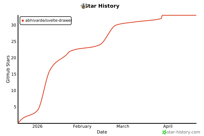
## Star History

[![Star History Chart](https://api.star-history.com/svg?repos=AbhiVarde/svelte-drawer&type=Date)](https://star-history.com/#AbhiVarde/svelte-drawer&Date)

## License

MIT. See [LICENSE](./LICENSE) for details.

## Credits

Inspired by [Vaul](https://github.com/emilkowalski/vaul) by Emil Kowalski.
