# @thesvg/react
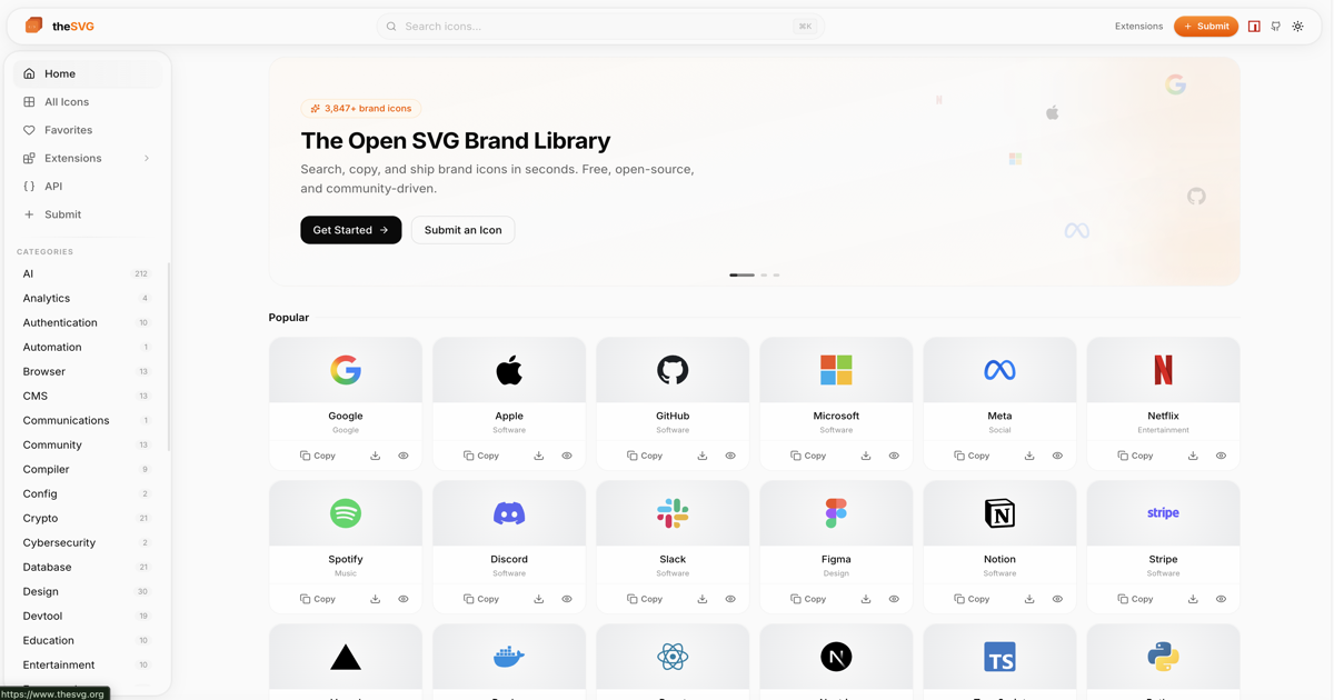
Typed React SVG components for all 3,800+ brand icons from [thesvg.org](https://thesvg.org).
- Zero runtime dependencies (React is a peer dep)
- TypeScript strict mode with full `SVGProps` support
- `forwardRef` on every component for imperative access
- Tree-shakeable ESM, import only what you use
- Individual icon imports for maximum bundle efficiency
- Compatible with Next.js 16, Turbopack, and React 19
- Works as Server Components (no `"use client"` needed)
## Installation
```bash
npm install @thesvg/react
```
```bash
pnpm add @thesvg/react
```
```bash
yarn add @thesvg/react
```
```bash
bun add @thesvg/react
```
React 18 or later is required as a peer dependency.
## Usage
### Named import from barrel (convenient, relies on tree-shaking)
```tsx
import { Github, VisualStudioCode, Figma } from '@thesvg/react';
export function MyComponent() {
return (
);
}
```
### Individual icon import (best for bundle size)
```tsx
import Github from '@thesvg/react/github';
import VisualStudioCode from '@thesvg/react/visual-studio-code';
```
Each icon is a separate module so bundlers that do not support tree-shaking
(e.g. CommonJS environments) will still include only the icons you import.
### With Next.js App Router
Icons work as Server Components by default. No `"use client"` directive needed:
```tsx
// app/page.tsx (Server Component)
import { Github, Figma } from '@thesvg/react';
export default function Page() {
return (
);
}
```
### With Tailwind CSS
```tsx
```
## TypeScript
Every component accepts `SVGProps`. You can import the shared type:
```tsx
import type { SvgIconProps } from '@thesvg/react';
function IconButton({ icon: Icon, ...props }: { icon: React.ComponentType }) {
return ;
}
```
## Props
Every component accepts all standard SVG props via `SVGProps`:
| Prop | Type | Default | Description |
|-------------|----------|------------------------|-------------------------------------|
| `width` | `number \| string` | (SVG default) | Icon width |
| `height` | `number \| string` | (SVG default) | Icon height |
| `className` | `string` | - | CSS class name |
| `style` | `CSSProperties` | - | Inline styles (prefer className) |
| `fill` | `string` | `"none"` | SVG fill color |
| `viewBox` | `string` | from original SVG | Override the viewBox |
| `ref` | `Ref` | - | Forwarded ref |
| `aria-label`| `string` | - | Accessible label |
| ... | ... | - | Any other `SVGProps` |
### Sizing example
```tsx
// Fixed size
// Responsive via CSS
// Scale with font-size (em units)
```
### Forwarded refs
```tsx
import { useRef } from 'react';
import Github from '@thesvg/react/github';
function MyComponent() {
const svgRef = useRef(null);
return ;
}
```
### Accessibility
```tsx
// Meaningful icon - label it
// Decorative icon - hide from screen readers
```
## Component names
Slugs are converted to PascalCase component names:
| Slug | Component name |
|-----------------------|------------------------|
| `github` | `Github` |
| `visual-studio-code` | `VisualStudioCode` |
| `figma` | `Figma` |
| `01dotai` | `I01Dotai` |
| `dotnet` | `Dotnet` |
Slugs that start with a digit are prefixed with `I` to produce a valid
JavaScript identifier.
## Performance
- **Tree-shaking**: Named imports from the barrel (`@thesvg/react`) are tree-shaken by Webpack 5, Rollup, Vite, esbuild, and Turbopack
- **Individual imports**: `@thesvg/react/github` always includes only the single icon regardless of bundler
- **No runtime deps**: Only `react` as a peer dependency
- **Server Components**: Works without `"use client"`, keeping icons out of the client bundle in Next.js
## Compatibility
| Environment | Version | Status |
|-------------|---------|--------|
| React | 18, 19 | Supported |
| Next.js | 13-16 | Supported |
| Turbopack | Latest | Supported |
| Vite | 5+ | Supported |
| Node.js | 18+ | Supported |
| Bun | 1+ | Supported |
## Migration from < 1.0
v1.0.0 fixes the ESM output to emit valid JavaScript (previously `.js` files contained TypeScript syntax that some bundlers could not parse).
Breaking changes:
- `SvgIconProps` is no longer re-exported from the runtime barrel (`index.js`). Import it as a type: `import type { SvgIconProps } from '@thesvg/react'` (the `.d.ts` barrel still exports it, so TypeScript consumers are unaffected).
- SVG `style` attributes are now converted to React style objects. If you were working around string styles, you can remove those workarounds.
## Available icons
Over 3,800 brand icons are available. Browse the full list at
[thesvg.org](https://thesvg.org).
## License
MIT - see [LICENSE](./LICENSE).
Brand icons and logos are the property of their respective trademark holders. See [thesvg.org](https://thesvg.org) for details.