---
description: >-
Fluid Typography (or Fluid Responsive) is an idea that font size changes
fluidly with the screen's width, not just changes at breakpoints.
icon: dolphin
---
# Fluid Typography
S2 Framework adopts the modern **Fluid Type Scale** concept — a combination of **Fluid Typography** and **Type Scale**. To take advantage of both, we use the open-source [**Fluid Type Scale Calculator**](https://www.fluid-type-scale.com) to effortlessly generate all the `clamp()` values we need.
Thanks to Webflow's [Advanced Variable with Function](https://webflow.com/updates/function-variables) feature, the **Fluid Type Scale** values are managed in the **Variables panel** — all in one place, so that you can view and update them very easily.
You only need one base `clamp()` value for each variable or class. This makes management super easy. Once you understand the basic concept, making adjustments becomes quite straightforward.
{% hint style="warning" %}
**If you're happy with the overall font sizes provided by default in the S2 Cloneable and don't need to make changes yet, you may skip this chapter.**
{% endhint %}
## The Concept
The **fluid** behavior is achieved using `clamp()` function in the font-size property, allowing text to scale dynamically with the viewport. And by applying a **type scale** ratio, we can maintain smooth, harmonious typography across screen sizes without guesswork.
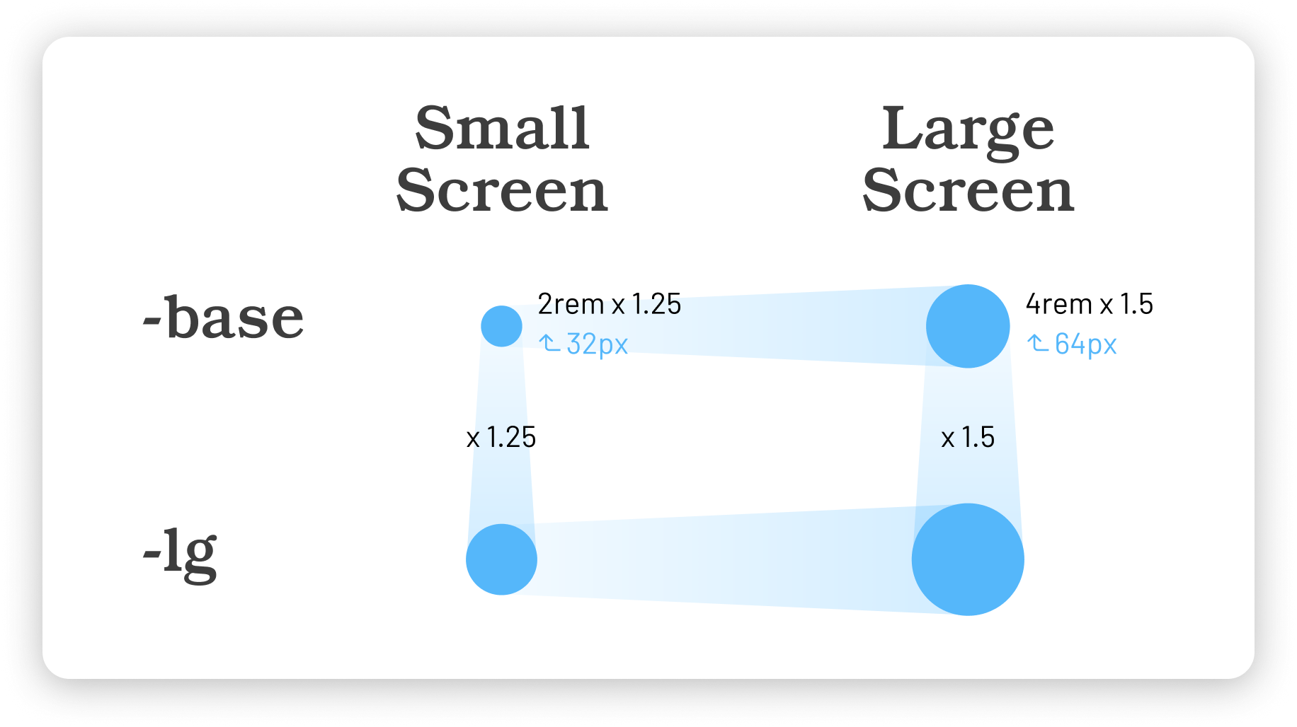
Let’s take a look at the diagram below:
The Concept of Fluid Type Scale
The above diagram explains the basic concept of a [2-step](https://www.fluid-type-scale.com/calculate?minFontSize=32\&minWidth=360\&minRatio=1.25\&maxFontSize=64\&maxWidth=1280\&maxRatio=1.5\&steps=base%2C+lg\&baseStep=base\&prefix=_text---hero-title-\&useContainerWidth=false\&includeFallbacks=false\&useRems=true\&remValue=16\&decimals=3\&previewFont=Playwrite+NZ\&previewText=Almost+before+we+knew+it%2C+we+had+left+the+ground\&previewWidth=1280) Fluid Type Scale example:
```css
/* CSS generated in this example */
--_text---hero-title--base: clamp(2.5rem, 6.087vi + 1.13rem, 6rem);
--_text---hero-title--lg: clamp(3.125rem, 10.217vi + 0.826rem, 9rem);
```
Just another example: a simple [Single-step Configuration](https://www.fluid-type-scale.com/calculate?minFontSize=32\&minWidth=360\&minRatio=1\&maxFontSize=64\&maxWidth=1280\&maxRatio=2\&steps=base\&baseStep=base\&prefix=_text---example-\&useContainerWidth=false\&includeFallbacks=false\&useRems=true\&remValue=16\&decimals=3\&previewFont=Marmelad\&previewText=Almost+before+we+knew+it%2C+we+had+left+the+ground\&previewWidth=1280). This is helpful if you want to apply fluid typography to a specific class or variable.
🤩 Now, with the above basic knowledge, let's explore our default setup.
## Text
Fluid Type Scale has been applied to the Body tag and text classes in the S2 Framework:
**`text-sm`**, **`text-xs`**, **`text-2xs`**, **`text-3xs`**, \
**`Body`** = **`text-base`**, \
&#xNAN;**`text-lg`**, **`text-xl`**, **`text-2xl`**, **`text-3xl`**
Let's first take a look at the default configuration on the larger end of the scale:
**`text-base`**, **`text-lg`**, **`text-xl`**, **`text-2xl`**, **`text-3xl`**
✦ [See our configuration](https://www.fluid-type-scale.com/calculate?minFontSize=16\&minWidth=360\&minRatio=1.057475\&maxFontSize=18\&maxWidth=1280\&maxRatio=1.15475\&steps=base%2Clg%2Cxl%2C2xl%2C3xl\&baseStep=base\&prefix=_text---font-size-\&useContainerWidth=false\&includeFallbacks=false\&useRems=true\&remValue=16\&decimals=3\&previewFont=Inter\&previewText=Almost+before+we+knew+it%2C+we+had+left+the+ground\&previewWidth=1280)
| Key considerations: | |
| ------------------- | --------------------------------------- |
| Min of `base` | Desired min of base is 1rem (16px) |
| Max of `base` | Desired max if base is 1.125rem (18rem) |
| Max of `xl` | 1.5rem, which is a reasonable size |
| Min of `3xl` | 1.25rem |
| Max of `3xl` | 2rem |
Here's what we get for the fluid values:
```
--_text---font-size--base: clamp(1rem, 0.217vi + 0.951rem, 1.125rem);
--_text---font-size--lg: clamp(1.057rem, 0.42vi + 0.963rem, 1.299rem);
--_text---font-size--xl: clamp(1.118rem, 0.664vi + 0.969rem, 1.5rem);
--_text---font-size--2xl: clamp(1.183rem, 0.956vi + 0.967rem, 1.732rem);
--_text---font-size--3xl: clamp(1.25rem, 1.304vi + 0.957rem, 2rem);
```
Let's move on to the smaller sizes!
**`text-sm`**, **`text-xs`**, **`text-2xs`**, **`text-3xs`**
The process is similar for the smaller sizes; the min and max values of the base font size should be constant. (This time, as the sizes are quite small, it will be easier to get the desired results by using `xs` as the baseline step.)
✦ [See our configuration](https://www.fluid-type-scale.com/calculate?minFontSize=13\&minWidth=360\&minRatio=1.1095\&maxFontSize=14\&maxWidth=1280\&maxRatio=1.13375\&steps=3xs%2C2xs%2Cxs%2Csm%2Cbase\&baseStep=xs\&prefix=_text---font-size-\&useContainerWidth=false\&includeFallbacks=false\&useRems=true\&remValue=16\&decimals=3\&previewFont=Inter\&previewText=Almost+before+we+knew+it%2C+we+had+left+the+ground\&previewWidth=1280)
| Key considerations: | |
| ------------------- | ----------------------------- |
| Use `xs` as base | Easier to set up a scale down |
| `base` | Same value |
| Max of `xs` | 0.875rem (14px) |
| Min of `3xs` | Within a reasonable size |
Here's what we get:
```
--_text---font-size--3xs: clamp(0.66rem, 0.036vi + 0.652rem, 0.681rem);
--_text---font-size--2xs: clamp(0.732rem, 0.069vi + 0.717rem, 0.772rem);
--_text---font-size--xs: clamp(0.813rem, 0.109vi + 0.788rem, 0.875rem);
--_text---font-size--sm: clamp(0.901rem, 0.158vi + 0.866rem, 0.992rem);
--_text---font-size--base: clamp(1rem, 0.217vi + 0.951rem, 1.125rem);
```
Want to scale down more aggressively?
Here are two examples for reference:
✦ [Alternative configuration: Scale down more on smaller screens](https://www.fluid-type-scale.com/calculate?minFontSize=12.5\&minWidth=360\&minRatio=1.13125\&maxFontSize=14\&maxWidth=1280\&maxRatio=1.13375\&steps=3xs%2C2xs%2Cxs%2Csm%2Cbase\&baseStep=xs\&prefix=_text---font-size-\&useContainerWidth=false\&includeFallbacks=false\&useRems=true\&remValue=16\&decimals=3\&previewFont=Inter\&previewText=Almost+before+we+knew+it%2C+we+had+left+the+ground\&previewWidth=1280)
✦ [Alternative configuration: Scale down even more](https://www.fluid-type-scale.com/calculate?minFontSize=12\&minWidth=360\&minRatio=1.1545\&maxFontSize=13\&maxWidth=1280\&maxRatio=1.1765\&steps=3xs%2C2xs%2Cxs%2Csm%2Cbase\&baseStep=xs\&prefix=_text---font-size-\&useContainerWidth=false\&includeFallbacks=false\&useRems=true\&remValue=16\&decimals=3\&previewFont=Inter\&previewText=Almost+before+we+knew+it%2C+we+had+left+the+ground\&previewWidth=1280)
## Headings
Fluid Type Scale has also been applied to the heading tags and classes:
**`Heading 1`** to **`Heading 6`**, and **`h1`** to **`h6`**
As before, we can use the **Fluid Type Scale Calculator** to generate fluid values effortlessly for headings. In S2, `h6` serves as the baseline step, matching the font size of `Body`.
✦ [See our Configuration](https://www.fluid-type-scale.com/calculate?minFontSize=16\&minWidth=360\&minRatio=1.24577245\&maxFontSize=18\&maxWidth=1280\&maxRatio=1.347625\&steps=h6%2Ch5%2Ch4%2Ch3%2Ch2%2Ch1\&baseStep=h6\&prefix=_text---heading-\&useContainerWidth=false\&includeFallbacks=false\&useRems=true\&remValue=16\&decimals=3\&previewFont=Inter\&previewText=Almost+before+we+knew+it%2C+we+had+left+the+ground\&previewWidth=1280)
| Key points: | |
| ----------- | ---- |
| Min of `h1` | 3rem |
| Max of `h1` | 5rem |
Here's what we get:
```
--_text---heading--h6: clamp(1rem, 0.217vi + 0.951rem, 1.125rem);
--_text---heading--h5: clamp(1.246rem, 0.47vi + 1.14rem, 1.516rem);
--_text---heading--h4: clamp(1.552rem, 0.854vi + 1.36rem, 2.043rem);
--_text---heading--h3: clamp(1.933rem, 1.426vi + 1.613rem, 2.753rem);
--_text---heading--h2: clamp(2.409rem, 2.264vi + 1.899rem, 3.71rem);
--_text---heading--h1: clamp(3rem, 3.478vi + 2.218rem, 5rem);
```
About **`h7`** and **`h8`**:
Sometimes, you may need smaller headings — that's where `h7` and `h8` come in. These are arbitrary classes created to style smaller headings. Since their sizes are too small to benefit from fluid scaling, we use regular fixed font sizes for simplicity.
## Sup & Sub
**`sup`**, **`sub`**
S2 applies fluid font styles on `sup` (superscript) and `sub` (subscript) elements.
We have prepared a **Fluid Sup / Sub CSS Generator** for the S2 Framework. It is modified from the tool created by [Lorenz Woehr](https://css-tricks.com/fluid-superscripts-and-subscripts/).
✦ [Fluid Sup / Sub CSS Generator](https://codepen.io/realanthonyc/pen/emOXEMz)
The generated values are applied to the Webflow Designer for the **`sup`** and **`sub`** tags, allowing them to scale correctly and maintain proper positioning relative to the font size.
{% hint style="info" %}
Normally, you don't need to adjust the `sup` and `sub` values — S2's default setup scales perfectly with any different font sizes, regardless of your typography settings.
{% endhint %}
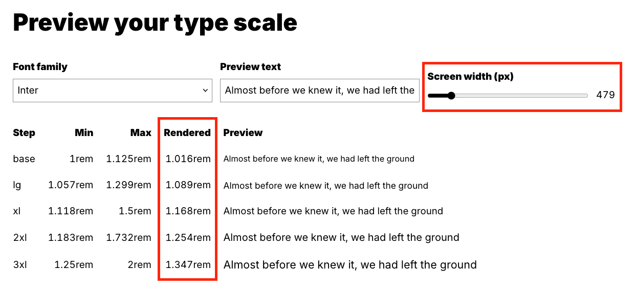
## Preview your setup
You can use the **Fluid Type Scale Calculator** to get the values for each breakpoint in the preview section (please scroll down). In Webflow, the breakpoints are: 1280px, 991px, 767px, and 479px.
Screenshot to show how to get the values for Font Size variables
## Summary
In S2, the fluid values have been applied to the following classes via variables. Editing is super easy!
* **`Body`**, **`text-base`**
* **`text-sm`**, **`text-xs`**, **`text-2xs`**, **`text-3xs`**
* **`text-lg`**, **`text-xl`**, **`text-2xl`**, **`text-3xl`**
* **`Heading 1`** \~ **`Heading 6`**
* **`h1`** \~ **`h6`**
* **`sup`**, **`sub`**
## **Questions?**
How to customize the clamp() values according to my design?
You can start by opening one of our configurations.
In most cases, all you need to update in the **Fluid Type Scale Calculator** are the **min** and **max** values of the base font size to generate a new set of `clamp()` values.
Choose your preferred font in the tool to preview and verify your settings.
Then, apply your custom `clamp()` values directly to the font-size in Webflow Designer.
How to set up a bigger overall font sizes?
If you are happy with S2's default type scales and setup, you can get an overall bigger fluid font size values effortlessly. Just follow these steps:
1. Open the **Fluid Type Scale Calculator** using our configuration links.
2. Change the **Base font size** of **Maximum (Desktop)** into e.g. 22px or 24px.
3. Change the **Base font size** of **Minimum (Mobile)** into e.g. 18px.
Scaling font sizes down for very small devices?
You can use custom CSS to scale fonts down for devices smaller than the iPhone SE (319px or below). Here is an example based on [this configuration](https://www.fluid-type-scale.com/calculate?minFontSize=14\&minWidth=240\&minRatio=1\&maxFontSize=16\&maxWidth=319\&maxRatio=2\&steps=body\&baseStep=body\&prefix=-\&useContainerWidth=false\&includeFallbacks=false\&useRems=true\&remValue=16\&decimals=3\&previewFont=Marmelad\&previewText=Almost+before+we+knew+it%2C+we+had+left+the+ground\&previewWidth=319).
{% code overflow="wrap" %}
```css
/* smaller font size on very small devices */
@media screen and (max-width:319px) { body { font-size: clamp(0.875rem, 2.532vi + 0.495rem, 1rem); } }
```
{% endcode %}
This is optional and usually unnecessary. It is not included in the framework's cloneable yet.
**Extended readings:**
About `clamp()`: [https://developer.mozilla.org/en-US/docs/Web/CSS/clamp](https://developer.mozilla.org/en-US/docs/Web/CSS/clamp)
Fluid Typography: [https://css-tricks.com/snippets/css/fluid-typography/](https://css-tricks.com/snippets/css/fluid-typography/)
Simplified Fluid Typography: [https://css-tricks.com/simplified-fluid-typography/](https://css-tricks.com/simplified-fluid-typography/)
Fluid Superscripts and Subscripts: [https://css-tricks.com/fluid-superscripts-and-subscripts/](https://css-tricks.com/fluid-superscripts-and-subscripts/)